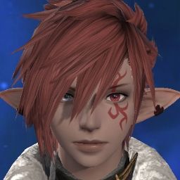
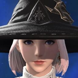
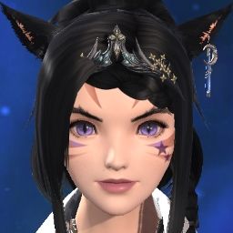
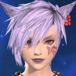
I've def seen plenty of Roegadyn and Lalafell complaints, but we're much fewer in number so it makes sense that not as many would be seen.
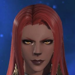
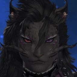
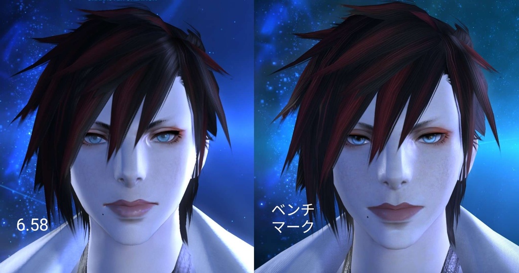
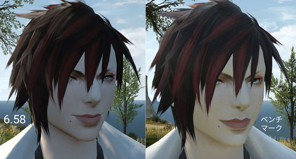
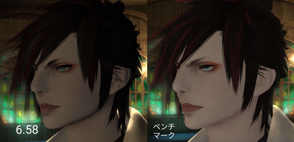
I also feel like the only face for Femroe that was hit particularly hard was face 2. The other three seem great.
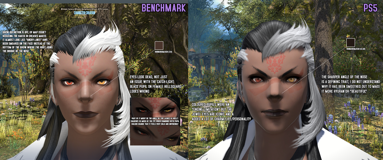
Only complaint I've seen for all faces is that they lightened our Hellsguard ash smudge, and there is a dedicated thread for it.
Lalafells also made their own thread.
I made my post in the other thread;
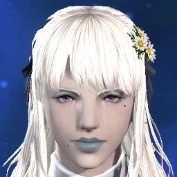
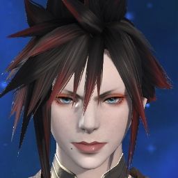
and another notable one post from another thread is;
and I've seen a few on the JP side too;
She is complaining about the nose smudge being lightened
She is complaining about the rounder nose, amongst other things.
Lots of Roe complaints, and this is just the Femroe, I feel like I saw way more male Roe complaints.
-
04-17-2024 09:15 PM #451Player
- Join Date
- Feb 2014
- Location
- Gridania
- Posts
- 1,363
- Character
- Thyn'a Sindyrl
- World
- Siren
- Main Class
- Dragoon Lv 100
(10)Last edited by Anarnee; 04-17-2024 at 09:20 PM.
-
04-17-2024 09:22 PM
Player
-
04-17-2024 09:22 PM #452
Whuh? I don't have much to say since it seems like everything you follow up with is in agreement...? But my useage of the word "trick" was simply a shorthand to explain why people were thinking an image might have a different impression than what we got. I've no malice, only concern and questions. Which feels to be the majority, honestly.
EDIT: Actually, looking back at my response, it feels super disingenuous to snip my response and then imply that I used that word in such a way, when my sentence was "...I actually think people are getting tricked by these still example images..." Come on, man.(8)Last edited by Doopliss; 04-17-2024 at 09:35 PM.
-
04-17-2024 09:48 PM
Player
- Reason
- k
-
04-17-2024 10:08 PM #453
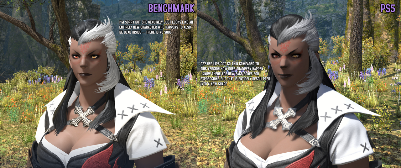
So the two main points are:
- Lip Shape
- 'Depression Line' running the length of the lips and extending slightly to the cheek, creating a dimpled appearance either side of the mouth.
- Shadows appearance around the mouth
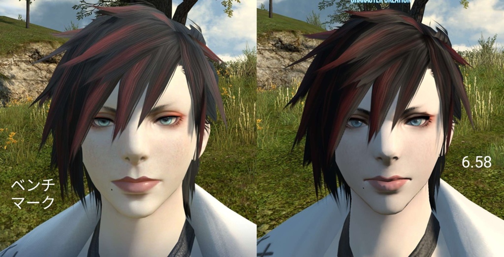
First things to highlight is the obvious difference in lip choice between your own character and that of the example (fuller lips in your own character vs thinner option in the example) and the slightly different position of both characters (the example image and, to a lesser extent, your first image being rotated very slightly to the right. Your own benchmark image being more front-facing).

In the example image:
- The outer lip shape remains largely the same. The only slight difference perhaps is the curves to the lips have been soften slightly.
- The inner line though has been changed. It no longer flexes in the middle to mirror the cupids-bow, it now remains a straight line, perhaps with a marginal upward curve at the edges. Shadows on the top lip and beneath that line have been deepened slightly, giving that curved, depressed appearance, and it extends slightly beyond the lips creating a slight dimple at either side.
- Shadows around the lips are primarily beneath the bottom lip and either side around that extended depression line, creating the dimples.

In your image:
- The top lip appears the same, except the curves have been soften slightly and the colour has become a single block, rather than having smaller shadows within the lip around the cupids-bow (like the example). Perhaps that is the reason for the flatter appearance you say you see?
In regards to the bottom lip, I'm torn as to how much or how little it's changed. Upon first glance it appears a little more boxy, with the lower edge being less of a smooth curve. Though I can't decide whether this is the combined result of both the lower-lip shadow appearance and the lip colour itself being a little less defined in the benchmark or whether this actually is a structure change. The more I look at it, the more I'm leaning towards the former, but let's err on the side of caution and say it's the latter as you claim.
- Like the example image, the inner line is flattened, the top lip is darker (perhaps this is more obvious on your own character because that lip is bigger than in the example), and there is a slight shadow running beneath that line. The line runs beyond the lip edge, into the cheeks (like in the example)
- As for shadows around the lips: the shadows on your benchmark is in the same place as the example (beneath the lower lip and at either edge of the lips at the dimples) One thing I would say is that the shadows are deeper on your benchmark than on the examples, leading to a greater contrast at those dimpled areas making them appear very slightly more pronounced. But this is shadow - not structural. That could be any number of reasons: positioning? lighting? settings? an unfortunate consequence of your own choice of lip shape compared to that of the example?
Ultimately, I think the look is more to do with shadowing/shadow appearance. I know that isn't what you'll want to hear because a physical lip structure change is a far more straightforward reason suggesting a more straightforward solution. I don't doubt you'll strongly disagree with me too.
On a more lighthearted note, I don't think I have ever stared at a character's lips for so long! (4)
(4)Last edited by Scintilla; 04-17-2024 at 10:15 PM.

-
04-17-2024 10:11 PM #454
-
04-17-2024 10:26 PM #455
Seeing so many ppl in the community being so apathetic & dismissive of something that is obviously very important for a large portion of the playerbase (especially in a game so heavily story & character-driven) is kinda more frustrating than the non-consensual plastic surgery my girl (& a lot of us) has had. It's like telling someone with depression to cheer/toughen up because "it's not that bad" or "other ppl have it worse".
(for context, my bun-girl uses face 4. The other bun-girl faces have had the expected glo-up ("looks the same but better" as I saw someone put it) but face 4's lips have completely changed shape. And sadly with the current restrictive CC locking features to specific faces there is no amount of fantasia I can throw at her that will let me slap face 1's lips (which look fairly similar to 4's current ones) onto face 4 so she looks like my character again... so RIP)
For ppl who didn't have much change on their character, aren't particularly attached to their character in the first place, or who get bored with theirs and fanta every few months, it might not seem like much for an issue. But for the ppl who are attached to their character (which is clearly a lot of ppl), it is a big deal (especially when they were under the impression that this wouldn't happen) & having others telling you to get over it, it's not that bad, to stop nitpicking/overreacting, you're just not used to it, etc (like I've seen a lot of ppl doing) just adds to the frustration.
How would you like it if you went to get a haircut/trim, somehow dozed off & woke up with implants that you definitely did not ask for? And then you had ppl tell you to stop overreacting when you try to explain how/why you're so upset about it?
If you're one of those folks that wasn't impacted that much by the update, that's great! But please, try not to downplay/dismiss other ppl's disappointment/frustrations. Most ppl here aren't complaining for the sake of complaining, they trying to give constructive feedback (often with examples) which is what the forums are for. And yes, not all feedback has to be negative & we're not saying don't share how much you love your character's new look, it's just not necessary (or helpful) to minimise other ppl's less-than-positive experiences in the process.
On a more positive note, really happy that there are so many ppl that are happy/content with their characters. In general, I think the update looks great so far (textures on the clothes look particularly good). Obviously it's not perfect, there's still quite a lot than could/should be improved/fixed but hopefully they will address the community's biggest concerns as soon as they're able. *huffs the copium* lol
Also, optimisation team seems to have done a really good job. I've seen a lot of happy comments from ppl, who were worried that their potato wouldn't be able to handle DT, having their benchmark results come back a lot higher than they expected (18)
(18)
-
04-17-2024 10:30 PM #456Player

- Join Date
- Feb 2014
- Location
- Gridania
- Posts
- 1,363
- Character
- Thyn'a Sindyrl
- World
- Siren
- Main Class
- Dragoon Lv 100


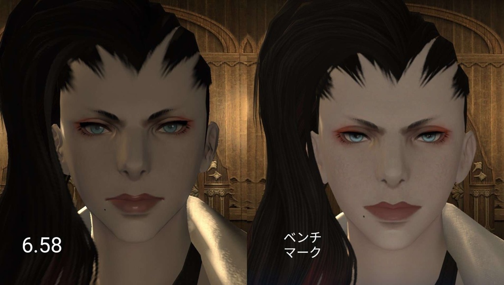
I feel like this def has to be a lot more than lighting. A lot of these remodels have been deceptive in 2D, I couldn't tell why my femroes lips looks so much flatter at first and then I tilted the camera some more and you can easily see the difference in the shape. Even if the new lips were not just flat across the board I'd just believe her cause I've been seeing everyone else find these differences with the lips in particular. It also def looks like the original lips rest in a smile and the new ones... I don't know what that's doing.(14)
-
04-17-2024 10:35 PM #457
You have to look at this objectively though. A large proportion of people here have sought to be empathetic and supportive, tried to offer advice (changing maps, watching the benchmark before making any hasty judgement, altering graphics settings and Gamma Correction etc.), tried to offer reassurance (the lighting in the CC isn't the best and things may not look so bad once you actually get into the game, hope that SE will make adjustments in the future to fix a few of these issues etc.) but in return, all they are met with is hostility. If you want sympathy and support, don't harass your supporters.
(6)
-
04-17-2024 10:37 PM #458Player

- Join Date
- Feb 2014
- Location
- Gridania
- Posts
- 1,363
- Character
- Thyn'a Sindyrl
- World
- Siren
- Main Class
- Dragoon Lv 100
I could not agree more, especially since I've seen everyone being rather respectful with their feedback, while trying to battle with the heavy feelings of it... At times it seems like folks are trying to gaslight people into believing they're not seeing something that they're clearly seeing. No one is going after the folks that are saying that they like their characters in the threads, but everyone trying to point out clear flaws are constantly getting told "it looks better now" "It looks the same" and it's feeling severely disrespectful.
(13)
-
04-17-2024 10:38 PM #459Player
- Join Date
- Apr 2024
- Posts
- 28
- Character
- Verrot Mielnoireu
- World
- Leviathan
- Main Class
- Black Mage Lv 100
This brings up a very interesting point I have been meaning to articulate on these forums. I am a professional artist as well, and beyond my commercial client work, my supplemental (and sometimes primary) income is private commissions for clients. Most of these clients are FFXIV players. For the last 5+ years, drawing peoples FFXIV characters and warriors of light has, quite literally, been a breadwinner.
If other artists see no changes, that's okay! Artists are not uniform. We all look at the world differently and translate it visually ; that's what makes our "style."
However, when I look at a lot of the changes I've seen on this forum (especially to eyes, lips, noses, and jawlines) I immediately see how I would draw that character differently. Even my own character no longer has a defined brow bridge and nose hook ; defining traits that I have stylized in my own artwork of him. They make him who he is!
This sort of branches into a different subject entirely, but I think it's a good thing to note that FFXIV players (at least according to my own clientele and the clientele of my friends) far surpass even DND, WOW, and BG3 players in terms of how often they commission their characters. Not to say that buying artwork = more love for a character, but there's a culture of loving one's WOL here that isn't always the same elsewhere. There's people out there that a Louve-worth of artwork of their precious characters. Entire ita-bags dedicated to their characters!
TLDR; these character changes might seem "small" to some (or even most!) but to others, changing features and altering the lighting so drastically that the character looks different will not only be noticeable, it might have lasting implications for clients who (do) enjoy commissioning artwork of their ocs.
I definitely think some people are being a bit reactive (out of love, I know) but there have been a good handful of characters I've seen on here where I've thought "damn, I would draw this character very differently, or cast them with a different mood entirely." I hope that we can all find a happy medium, and that the devs listen to some of the very real concerns.(14)
-
04-17-2024 10:39 PM #460Player
- Join Date
- Mar 2011
- Location
- Shadowlord
- Posts
- 1,141
- Character
- Luluna Eve
- World
- Louisoix
- Main Class
- Thaumaturge Lv 100
I am happy enough with the update, it happened to me and many other players coming from 1.0. I miss my gloss that is it on the lips and would like that back but as far as other things it looks nice and I am looking forward to having a play around. I did notice once my character was moving around and in the actual benchmark she looked more or less the same.
(2)




 Reply With Quote
