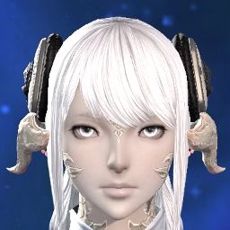
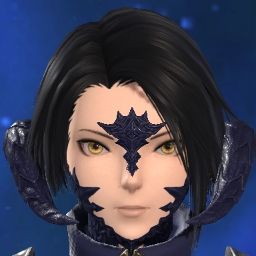
I stand corrected, the face and nose have been slimmed down. I guess I blinded myself too much with artefacts such as face scales still floating from the previous benchmark. The face is still wider compared to the current version, but honestly I'm pleasantly surprised and welcome the adjustments.
My criticism remains, however as long as the small oversights gets fixed, I'll be happy with my character. As much as I would love to have the old eyes and scales back as well, I'm starting to lose hope there.
On a different note, the shadow cast from the horns and clothes are pretty low res and jitters quite badly under harsh light. Hoping it's another oversight and gets looked into.

-
06-05-2024 03:14 PM #51(3)
Last edited by Tarath; 06-05-2024 at 03:23 PM.
-
06-05-2024 03:42 PM
Player
- Reason
- woops
-
06-05-2024 04:47 PM #52Player

- Join Date
- Apr 2024
- Posts
- 19
- Character
- Scribbles Atramento
- World
- Lamia
- Main Class
- Scholar Lv 100
I really do appreciate the developers taking the time and effort to address the player base's criticisms and release a (much needed) updated version of the benchmark; however, I feel that there are still several key concerns that I saw repeatedly brought up on both the English and Japanese forums that were not addressed. I have a lot to say, so I'm breaking my thoughts down into two posts, which will go over what I thought were major improvements and which areas I think still need to be touched up

Here are photos comparing how my character in the live game (6.58), the first benchmark (1), and the second benchmark (1.1) in two different environments:
[IMG] [/IMG]
[IMG] [/IMG]
The Improvements:
- The new shaders and textures look incredible, especially within the character creator itself! The new shaders gave my character's facial features (particularly around her eyes and nose) much more defined dimensions, which gets rid of much of the initial uncanny-valley feelings I had when I looked at my character within the first benchmark's character creator.
- The nose appears to have been slightly changed/remodeled, and it looks so much better than it did within the first character creator. In particular, it seems that the shape of the nostrils has been changed. It's a bit difficult to tell how much of this improvement is due to the nose actually being remodeled versus the new shaders adding dimension to the nose, but regardless it looks really good! The strange nose shape was one of my main concerns within the first benchmark, so I'm really glad that it has been updated.
- The limbal rings still look great! I didn't see much of a change in the limbal rings from the first benchmark to the second benchmark, which I'm really glad about because I think the first benchmark nailed their design. I love how they truly appear to be glowing now -- especially during the night!(1)Last edited by SabrinaScribb1es; 06-05-2024 at 04:57 PM. Reason: Grammar
-
06-05-2024 04:56 PM #53Player

- Join Date
- Apr 2024
- Posts
- 19
- Character
- Scribbles Atramento
- World
- Lamia
- Main Class
- Scholar Lv 100
Part 2 of my thoughts about the updated benchmark:
What Still Needs to Be Improved:
- While the lip shapes have definitely been improved upon, the updated benchmark’s new lips are still quite different from the original lip shape their characters had. For my character’s lips within benchmark, the 'descending' part of the top lip (where the top lip travels downward from the cupid's bow to meet the mouth opening) is concave instead of convex. This change in shape makes my character's lips look less plump and rounded, which takes away a lot of her original “soft” look.
- This complaint is specific to Female Au Ra Face 2 -- the dimple are way too subtle. While I am very happy that Face 2 got its dimples back in the updated benchmark, they are very difficult to see, and in some lighting, they are basically invisible. This difference in dimple visibility is probably because the dimples in the live game (6.58) are painted onto the face, whereas the dimples in the updated benchmark are modeled into the face so that they are affected by shadows and lighting. The dimples are an iconic feature of Face 2 and give the face a unique charm, so I am sad that the dimples are barely there. I think that this problem could easily be fixed by lightly shading in the dimple area so that it is still affected by lighting and shading but isn't nearly as subtle.
- Au Ra still have enlarged pupils. This was one of the most common complaints I saw within the forums (at least among Au Ra players), so I think it's very strange that the pupils were not changed back to their original, smaller size. My main problem with the larger pupils is that when they are combined with limbal rings, it really washes out your character's iris color. If you use limbal rings, then part of your character's eye color is already covered by the rings, so combining that with a much larger pupil prevents most of the original eye color from being seen. This is even worse on darker iris colors, as the pupils are relatively light in color and do not provide very much contrast against darker colors, causing the iris and the pupil to blend together into a dark gray-ish blob where it is difficult to distinguish one part from the other.
- ]The 'additional horns' that are part of certain Au Ra-exclusive hairstyles have still not had their textures updated, meaning they look very low-rez in comparison to all the new textures -- especially the updated facial horns and scales. From what I've seen, it looks like most of the hairstyles that have any type of hair accessory (additional horns, flowers, hair bands, barrettes, etc.) have not had their textures updated, which is strange since the hairstyles by themselves received updated textures. Aside from texture updates, I would also love to see the Au Ra hairstyles with additional horns get recolored versions in which the horns match the color of the Raen and Xaela facial horns and scale.(6)
-
06-05-2024 05:27 PM #54
A lot of people are complaining about the bigger pupils... but I actually like them. I hope they don't revert that part... the eyes look less freaky with them a little larger. If anything, make the iris portion slightly bigger to compensate.
(2)
-
06-05-2024 07:45 PM #55
Gotta split this into two posts so this is part 1.
While there were some improvements to the general lighting etc. other things however feel completely unaddressed.
I could understand that if the new lighting requires them to make changes to the facial sculpt in order to keep the same character feel. But that does not appear at all why they touched the sculpting.
I mainly used Au Ra face 4 so I will focus on this but some of the complaints come in general.
1. As many people pointed out, the scale textures are not uniform, all optional scale textures are far more crisp for whatever reason.
2. Face 4 still has quite massive dimples. They are so deep that they can throw their own shadow. This goes so far that depending on the lighting the face looks like a dented in plastic doll. I also think the stare looks a bit unfocused.
3. I am unsure if this is simply a bug due to some weird lighting but the Au Ra face 4 horns throw a shadow onto the face that makes no logical sense
In this first picture you can see that the light is coming from the right side of the picture. However there is a small strip of shadow near the scales that gets projected onto the face

Now if I slightly adjust the rotation (a few degrees) then this shadow gets pushed further into the face. However as you can still see by the nose shadow, there should be no shadow projected onto the face
 (3)
(3)Last edited by Sekhar; 06-05-2024 at 07:48 PM.
-
06-05-2024 07:47 PM #56
Here is part 2
4. Now weirdly enough it feels like they added Eye bags to most characters but since I am most familiar with face 4 I focus on this. I am not sure why those were added. Not only are they large enough to throw their own shadows depending on the lighting, this is quite the large change in the face sculpt in that these eye bags bulge outwards
Below you see a picture of the same character face from the same angle. Both the cheek and the eyebags are completely new and bulge outwards.
Left is current, right is DT.
5. (and most important) Now for the most striking change, as already hinted at before, they for whatever reason decided to change the face sculpt quite heavily. If this was to ensure that the characters give the same feel under new lighting conditions I could understand it, but this is absolutely not what they did.
The face is far pudgier, as already pointed out in the previous point. I tried to overlay the two pictures relative to the top part of the hair hair and the large center scales.
Link to short video as conversion to GIF did not want to work: https://imgur.com/k0q3iZu
Then I transition in the video from DT->Current->DT and as said before the face sculpt is completely different. I understand that there is some high definition food in the game now but I didn't know my character indulged in it that much.(6)
-
06-05-2024 09:22 PM #57Player

- Join Date
- Apr 2024
- Location
- Gridania
- Posts
- 43
- Character
- Asteri Wildsong
- World
- Diabolos
- Main Class
- Viper Lv 100
Spent a bit comparing again and noticed new things for FemRa Face 2 while comparing from the side!
Apologies for the use of most likely the improper terms to describe this, my vocabulary for facial terms is limited. :'D
- The natural eyeshadow is of a different shape in DT, more pointed, going past the eye and curving upwards. It used to be more rounded and stopped with the eyelid.
- The top lip was a soft curve from the corner of the lip to the middle. Now it starts thinner and has a sudden raise when close to the middle of the lip, it gives a sharper triangular effect.
- Bottom lip is the reverse, where before it started thin and became more plump and now it is generally more plump all around.
- The chin is very noticeably changed too, it used to be full and rounded outwards, now it is rounded inwards.
I understand changes needed to happen, but I chose Face 2 because of its more rounded face with Jaw 1, because of its thinner lips for Mouth 3, because of it's more "girl next door" appearance compared to the traditional "prettier" looks. I'm very worried as I don't recognize my character in the Benchmark v1.1 outside of a very few specific emotes that widen the lips such as Chuckle.
I hope there will be some changes to it before Dawntrail releases, it worries me and dampers my excitement for the expansion because I no longer see the character I absolutely fell in love with years ago now. I don't want to play MSQ with a stranger...
Slider for comparison: https://imgsli.com/MjcwMDU4
Current VS Benchmark
 (6)
(6)Last edited by Asteri; 06-05-2024 at 10:40 PM.
-
06-05-2024 10:16 PM #58Player
- Join Date
- Mar 2011
- Location
- Gridania
- Posts
- 88
- Character
- Kalandra Scathgealach
- World
- Excalibur
- Main Class
- Warrior Lv 100
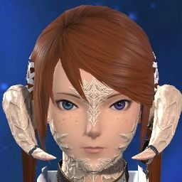
The biggest problem about the larger ones is that if you use the limbal rings, the actual color of the irises gets murky and I think increasing the iris portion isn't really an option in most cases. You can see with this eye type, the iris is already taking up most of the eye, not a lot more space available to play with.
(5)
-
06-05-2024 10:36 PM #59Player
- Join Date
- May 2024
- Location
- Gridania
- Posts
- 2
- Character
- Odgerel Kagon
- World
- Sephirot
- Main Class
- Ninja Lv 72
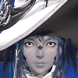
THIS! This is why I chose Face 2 as well. It's very confronting seeing my WoL in both 1.0 and 1.1 Benchmark with the changes they've made to it.Asteri: I chose Face 2 because of its more rounded face(5)Last edited by TheLiterateWolf; 06-05-2024 at 10:40 PM.
-
06-05-2024 11:06 PM #60Player
- Join Date
- Mar 2015
- Posts
- 797
- Character
- Arilaya Syldove
- World
- Brynhildr
- Main Class
- Black Mage Lv 100
I see this as an unfortunate realignment of how limbal rings are supposed to look. An actual dev art design choice.
Specifically, in HW, the limbal rings were implemented as a ring with an octagonal border on at least 1 side. Yes, it's not even a circle. There is a very hard edge between the limbal ring and the outer bounds of the iris, and the 2 share 0 colors with each other unless the player chooses to make them the same. DT's new design doesn't have a distinct region, instead opting to blend the 2 together. The limbal ring on the outside, the iris on the inside, a mix between the two.
To me, this is likely closer to what the devs initially envisioned but lacked the ability to make. This is also why limbal rings get a lot darker overall and why the 2 get muddy. Especially if you did a hyper-contrast like black iris with white limbal.
While I am personally not sad to see this changed, as I believe it looks more authentic to how this type of eye glow would exist in the game, I am also firmly on the side of adding the option for the player to have old-style and new-style rings. If you want a hyper-glow, you should be allowed to have it. If you want mixed glow, same. The problem is mostly that people are losing an option that already existed. Not that the devs wanted to retcon how limbal rings looked.(1)Last edited by Taranok; 06-05-2024 at 11:12 PM.




 Reply With Quote

