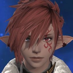
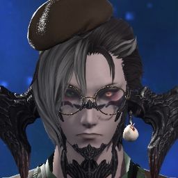
Looking at it, I'd say the eyes look more dead primarily because of the eyebrows. They're higher up, less fierce, more neutral. They're also darker but the face as a whole is also darker. And, unlike you, I can't fix my skin tone because it was already at the extreme of its category, so I have no hope to fix it. I just have yellower skin now. I'll need to grab a comparison later.
-
04-19-2024 10:30 AM #251Player
- Join Date
- Mar 2015
- Posts
- 797
- Character
- Arilaya Syldove
- World
- Brynhildr
- Main Class
- Black Mage Lv 100
(1)
-
04-19-2024 10:55 AM #252Player
- Join Date
- Apr 2021
- Location
- Gridania
- Posts
- 6
- Character
- Airi Daemonia
- World
- Brynhildr
- Main Class
- Dragoon Lv 100
The graphical update just makes her looks so different.
1st set of photos are side by sides of my character ported into the Benchmark via Save data. No changes made YET.
The top of the square is 7.0, bottom is what we have in game rn.
The face seems shorter, rounder? Outer eye corners lack original wing making eyes look massively bigger/rounded. Bottom inside corner used to have this little swoop & now the whole eye is just round? The black in the pupil is HUGE, this combined w/ new Limbal rings washes out over all color of the eye especially w/ this new starburst like pattern that is happening. The color is gone.
Nose looks upturned, assuming due to shadows?
Mouth shape is fundamentally different now making her look so much different. The outside corners mouth no longer look elongated, looks like her mouth just got cut off at the ends abruptly. Her cupids bow is gone. Color of the lipstick is also now this new matte?
I don't mind the matte but wish there was an option to have both a matte & glassy lipstick option because the new color combined w/ the new lip makes her look completely different.
The T zone where her cheeks are shaped & meet her nose have lost their angularness, again it's more rounded, it feels like her face got smooshed to me. Especially around the top part of the cheek face scales & where the eyes meet her bangs/hair line. She is round anime like, no defining bone structure or features.
When I look at her new form it just doesn't feel like home to me. Tbh I think I cried twice out of frustration during character creator trying to get her to look how she has always looked to me.
2nd set of photos are after making some changes in the character creator to try to achieve something that looks more like my character.
Had to change the color of both eyes. Left hand eye that is green w/ the limbal ring had to go over to the left 1 slot, same with the limbal ring. The gradient affect I have going originally just did not translate over. I also had to change her right hand blue eye 1 slot up as it had more greenish tone in it now rather than blue. I had to switch off of the lipstick as it was too dark for her in both the color & the matte.
Anytime I tried to change anything physical other than the coloring it feels like she gets more & more muddled & lost in translation so altering the colors & hoping this is not the final product is the best I can do.
The other 2 photos are just again side by sides of old vs new.
Some other things to mention:
Skin is too shiny. What will it look like with the wet filter on in gpose.
Scales have a strange cut out seem around them & for darker colors this translates even worse.
Raen scales look worse than the Xaela scales texture wise. The Raens scales are losing their golden bone like hue. They now look like a dried out sand dollar to me. They're more white?
Color swatches in general for eyes, lips, hair seem like they have been mixed around.
https://na.finalfantasyxiv.com/lodes.../blog/5378892/(9)Last edited by AiriDaemonia; 04-19-2024 at 11:04 AM.
-
04-19-2024 11:03 AM
Player
-
04-19-2024 11:18 AM
Player
-
04-19-2024 12:38 PM #253Player

- Join Date
- Mar 2015
- Posts
- 797
- Character
- Arilaya Syldove
- World
- Brynhildr
- Main Class
- Black Mage Lv 100
Here we are. Disregard the hair color and style in general. It's a hair I do use but I didn't load them saved so it might be the wrong exact color. Moving on.

Well, I guess the hair is also less shiny, YMMV if you don't like that. Note, no reshade is used here, this is vanilla in-game.
The right limbal ring was turned off to show there is a limbal ring. I can brighten it and achieve a similar effect to HW-era limbal ring, not a real problem. Eyebrows are different, a little bit higher, more 'bright-eyed.' Cheeks are 'puffier.' I guess more full would be a more accurate description. The lips are puckered but about the same width, but the jaw is softer and more rounded, and the chin through cheeks is a little bit wider. The skin color is noticeably a few shades yellower, there is no way to fix that.
The spikes on the cheek look different, and the butterfly, despite looking sharper, has a weird, rough edge at the bottom of it. Horns in general look vastly better, except complaints about not being sharp enough.

Here we have a front-side profile. The tip of the horn is roughly aligned to the corner of the lip and halfway down the chin. The limbal ring has been brightened up to show that, even at its brightest, it doesn't catch as strongly as the old one. The dimple of the pursed lip is extremely pronounced, and we can see the cheek-jaw-chin shape has changed significantly, as with the nose, by looking at the contour of the profile against the hair and background.
Horns are vastly, vastly improved. Night and day, 10/10, the forward horns are great.
Eye is an interesting one, since it's very similar, but the entire face is lit in what appears to be a darker overall lighting, which might account for the yellower-looking skin, it's just lit less and possibly with a yellowed light, though the ground behind looks very similar which betrays this line of thought as being the case. Maybe the cloud blocked the sun at a bad time, I tried to account for it.
The nose was reshaped, both wider at the base and less sharp an angle overall, but oddly looks sharper compared to the lower poly live face, this is mostly a trick. It looks slightly more natural but only just.
To put it mildly, these are not the same characters. The face is very different. The eyes are more green (probably why they look soulless for some people, it's literally not the same color,) spikes have been mucked with, lips are from another species from a society that forces women to pucker their lips to achieve maximum cuteness instead of the normal look.
Oddly, the eyes look the same aside from the color issues. Eyebrows are a bit wrong, pupils are more dilated but the iris and sclera are about the same size and shape. Eyelashes more defined, maybe a bit longer.
There's a lot that was done right in this HD update, but this isn't the same face. At all.(16)
-
04-19-2024 07:02 PM #254Player
- Join Date
- Nov 2011
- Posts
- 1,029
- Character
- Kaeya Alberich
- World
- Twintania
- Main Class
- Pictomancer Lv 100
Something else I noticed about the eye brows is that the crease/fold above your eyes is a lot more visible in the EW image and the shadow under your eye brows/in your eye socket is a lot darker, intensifying her gaze even more.
Eye lid folds can really change how an eye looks so the fact that it is less prominent in the DT picture adds quite a bit to the blank expression/stare for me personally.
I can see that the shadows in the EW picture are stronger in general, while they are a lot more mellow in the DT image, making your character's face look flatter.
But - without having checked - I am under the impression that the shadow under your eye brow/over the eye lid fold is darker relatively speaking than the corresponding shadow in the DT image.
That makes me wonder if they did in fact resculpt the eye socket, meaning that the eyes in EW are a bit more "sunken" (not in a bad way, I personally quite like it) while in DT they have been slightly flattened/ moved a bit further to the front.
I would have to actually boot up PS to compare the (relative) darkness of the shadows and perhaps looking at her in side view could also shed light on this because if the eye sockets are more sunken in EW then it should show up in side view.
Perhaps I'll find some time later because now I wanna know this about my character, too.
But even if this is just a case of pure lighting (which it could be) it's still a bit sad how the softer shadows lead to less definition and more wishy-washy features, when those stark shadowy edges and contrasts led to so much personality in this particular case.
If it's just the lighting though (in case of the eye sockets) I really hope it's just the CC.
Did you notice a similar lack of defining shadow between the eye brow and the crease of the eye lid while playing the benchmark or is the eye lid fold less prominent throughout the whole clip?(3)Last edited by Loggos; 04-19-2024 at 07:05 PM.
-
04-20-2024 12:14 AM #255Player
- Join Date
- Jun 2015
- Posts
- 28
- Character
- Cenauru Dotharl
- World
- Adamantoise
- Main Class
- Dark Knight Lv 100
Hopefully the benchmark update hammers out most issues we've seen. Still gotta see how my character will look, but pretty hopeful since a number of things shown in this thread are being addressed.
(3)
-
04-20-2024 02:51 AM #256Player
- Join Date
- Nov 2017
- Posts
- 14,165
- Character
- Aurelie Moonsong
- World
- Bismarck
- Main Class
- Red Mage Lv 100
Although we have had the official response today saying that they're working on an update, it seems to place all the blame on textures and environments and say nothing about actual remodelling of the faces, so I think it's important to still put that part of the feedback out.
I put together this comparison of my character's current appearance (PS4 screenshot) VS a mirrored version of the benchmark appearance. This is at the default camera angle upon opening the character creator, clicking "Face" to make it zoom in and then zooming closer as far as the camera would go.
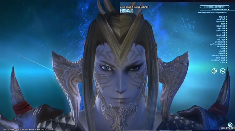
Relevant character settings:
Face 3
Jaw 4
Eyes 2
Iris L
No limbal rings
Brows 2
Nose 1
Mouth 1
"Other Features": cheek scales and thicker eyebrows turned on; extra eyeliner turned off.
Note that there's some inherent oddness as a result of the character's stance being non-symmetrical, so the body looks a bit warped here, but that's not the point of the image.
Also the lighting in the current appearance has somewhat washed out the part of the eyeliner extending outward to the side of the face, so that isn't as much of a change as the image makes it look.
The key issues are:
Eye shape looks different and has lost a lot of the "wide-eyed" look of the original.
Eyebrows - I think the actual shape hasn't changed that much, but the deepened shadows underneath cause it to blur down and look more furrowed and angry.
Exaggeration of the shadow under the eyebrow. There is some inbuilt shadow there in the original but it's much fainter.
Changed shape/position of the face paint - this isn't face-specific (I have seen some other people post about this on other characters and different races, and issues with other types of face paint) but it's still a change I would rather see fixed back to its original position. The part on the cheeks now collides with his scales.
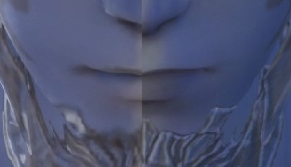
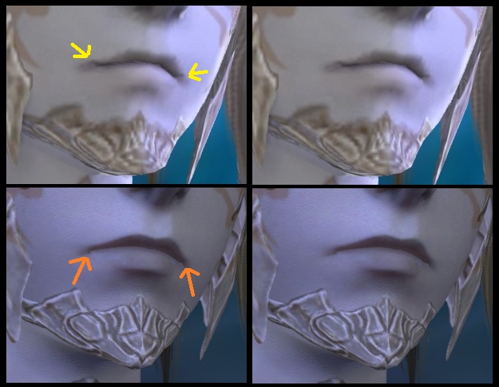
Mouth shape and expression has changed - this calls for a close-up. The original model has a slight upward curve at the edges of the mouth even though the shadow angles downwards from it. (Note that if you adjust the jaw shape in the character creator, it tugs on the shape of this shadow but leaves the actual mouth shape untouched.) In the changed model, the shadow has been reinterpreted as the actual shape of the mouth and an extra downturned line has been added to the edge of the mouth, turning a slight smile into a frown. This is an absolute loss - this was the only Au Ra face with a friendlier expression and it has been directly removed.
Meanwhile, at what I would normally consider a more flattering angle...
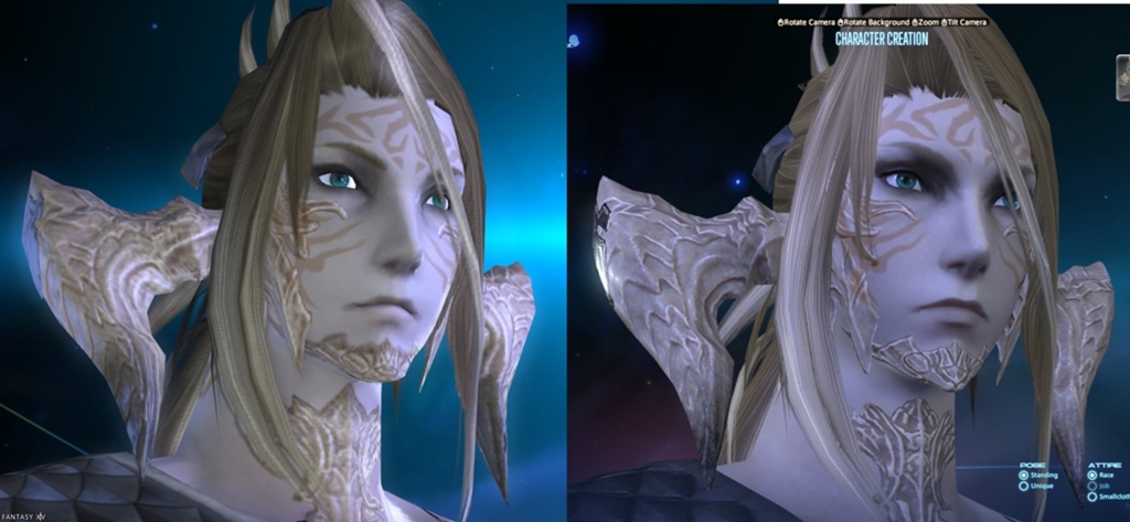
The eye shape itself seems unchanged from this angle, but other issues remain clear.
The heavy shadow vastly changes the apparent shape and mood of the eyes.
Additionally, the eyelid catches the light and changes the impression from "wearing heavy eyeliner" in the original model to "deep-set eyes" in the changed one.
Again the change to the mouth can be seen - it has been extended outwards into what was previously just a shadow, and been given clearly downturned ends that were not there before.
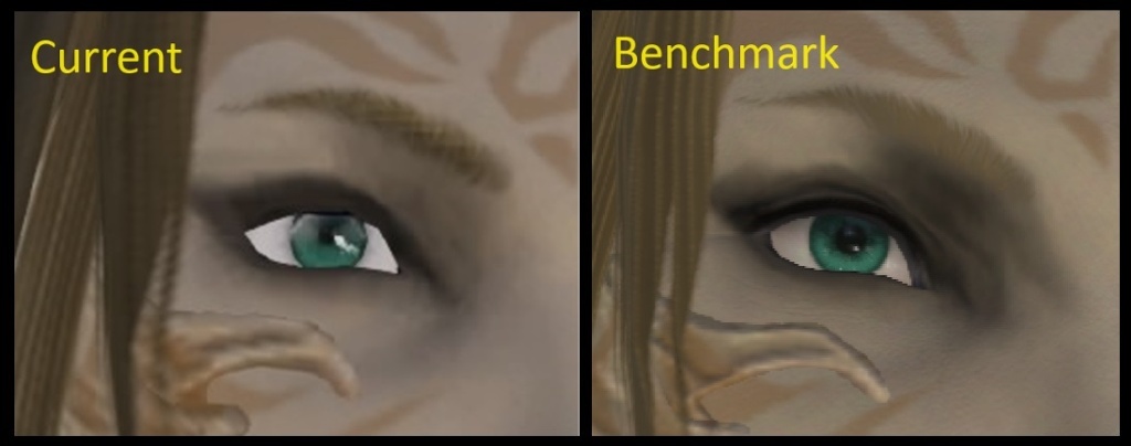
Looking closer at the eyes, the current shape of the eyelids seems quite flat or is flattened out by the black eyeliner. In contrast, the benchmark eyelid does not seem to have eyeliner, just the greyer eyeshadow that extends outwards, and an eyelid crease is visible where the previous appearance seems flat. Multiple layers of creases make the eyes seem unnaturally sunken.
I made an attempt at photoshopping the benchmark screenshot to address the main issues with it. It's still not quite right (I think I've under-done the shadows in the end) but it is certainly much closer to feeling like the right character and not a sour-faced imposter.
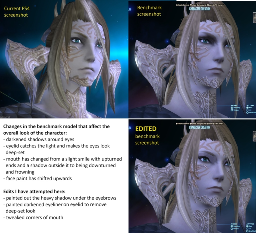
TL;DR:- Shadowed eyes completely alter the character, while the eyelids are ironically too lit and stand out from the eyeliner where they didn't previously.
- Mouth shape has been misinterpreted and has changed the character's mood.
I also continue to suspect that the entire benchmark is slightly stretched horizontally compared to the actual game.(17)Last edited by Iscah; 04-20-2024 at 09:05 AM. Reason: added eye comparison
-
04-20-2024 03:38 AM #257
This is a fantastic, detailed post that I would honestly recommend cross-posting to the JP thread if you ever feel like you have the time and energy. I feel that it would be well-received there. I also think male Au Ra get overlooked a lot in comparison to female Au Ra (although I do think female Au Ra very much do deserve the amount of attention they're getting in this case).
I also have a male Raen alt with the same face as yours and I disliked these changes too, lol, so I have some bias here.
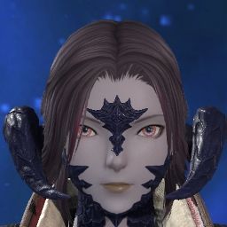
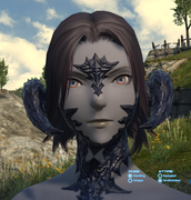
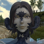
In vein of that, I also wanted to share that, due to the pupil size change in male Au Ra--and how much smaller their eyes are compared to female Au Ra--the balance of their eye colors change quite a lot when you have limbal rings, when compared to the live version of the game.
Live:

Benchmark:

(Sorry for the uneven cropping)
Of course, I like the general fidelity increase in the eyes, and I think the gradient impression is very nice. However, in the current game, the color balance between the orange and yellow is more equal, with the orange color's larger spacial coverage being evened out by the glow of the yellow limbal ring. Meanwhile, in the benchmark, the orange is much more dominated by the yellow on all fronts.
That's not to say the pupil increase doesn't change the impression even without limbal rings, though. I personally feel that it does.(10)
-
04-20-2024 03:55 AM #258Player

- Join Date
- Nov 2011
- Posts
- 1,029
- Character
- Kaeya Alberich
- World
- Twintania
- Main Class
- Pictomancer Lv 100
(5)Last edited by Loggos; 04-20-2024 at 03:57 AM. Reason: Phrasing
-
04-20-2024 04:46 AM #259
Thank you so much for this well constructed and illustrated breakdown! I also added my own to my starting post. You even noticed things that I didn't even realize to point out even if something felt "off" - such as the lack of the upturned mouth corners on the updated version (it does really affect the expression!).
I remain hopeful in light of the recent news, even if the concerns addressed are not really 1-to-1 the same I am personally concerned about with my own character. Hopefully our feedback reaches at least some relevant eyes and ears!(5)
-
04-20-2024 04:59 AM #260Player

- Join Date
- Nov 2017
- Posts
- 14,165
- Character
- Aurelie Moonsong
- World
- Bismarck
- Main Class
- Red Mage Lv 100
Thanks guys. Can I just drop my English post into Google translate or do I need to simplify it? I won't have any ability to check the translated version for accuracy. It's not going to translate "scales" like weighing scales or something bizarre like that?
Also, I updated the repainted version of the benchmark image (and I'm just about to update it another time) and I think I got it closer to the shape of the eyeliner on the original - and for the eye itself, it actually seems to be the exact same shape on the angled shot if I take the outline of the original and place it directly over the benchmark image, so I'm not sure why it looks like such a different angle in the straight-on mirrored shot.(3)



 Reply With Quote


