

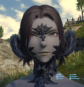
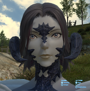
I posted additional screenshots in another thread a few days ago, I forgot to post them here too.
First comparison
Second comparison
The dimples, the puckered lips and changed lip shape, the really dilated eyes, the overall softer face, and so-on are all things that have massively changed my character's tone and expression.
As I picked a combination of features to really accentuate her stern and fierce looks, these changes are the complete and exact opposite of what I want for my character.
- Forum Top
- English Forums
- Community
- General Discussion
- Dawntrail Graphical Update - Au Ra Feedback
-
04-18-2024 02:50 PM #231Player

- Join Date
- Jun 2015
- Posts
- 28
- Character
- Cenauru Dotharl
- World
- Adamantoise
- Main Class
- Dark Knight Lv 100
(15)
-
04-18-2024 03:08 PM #232Player

- Join Date
- Oct 2021
- Location
- playing other games like yoshida intended
- Posts
- 2,492
- Character
- Alondite Ragnell
- World
- Midgardsormr
- Main Class
- Dark Knight Lv 100
I too am not very happy with how horribly the graphics have been downgraded in this upcoming expansion, my character looks like another character entirely and I've been up all night unable to sleep grieving the loss of my warrior of light. I can't believe Naoki Yoshida would force this onto us after all these years. Its like I'm losing apart of myself, the character I know and loved for the past 10 years is being taken away in some vain attempt to "modernize" the game with graphics the game never even really needed. The game was literally perfect in Endwalker, I cannot believe that they thought this was a good idea. I'm appalled at how much of the game's soul is being sucked out just by this benchmark alone. Previously I was so excited for Dawntrail, it looked like it was going to be the best expansion yet, but now I have no idea how I feel.
Like many others I'm sharing a draw over of everything wrong with my WoL that they changed in this benchmark, I'm hoping we can find justice in these trying times and hopefully the devs will hear us and delay the expansion, or at the very least revert the graphics update so we can remain faithful to the visions we all had for our characters.
 (5)
(5)
-
04-18-2024 03:39 PM #233Player

- Join Date
- Mar 2015
- Posts
- 797
- Character
- Arilaya Syldove
- World
- Brynhildr
- Main Class
- Black Mage Lv 100
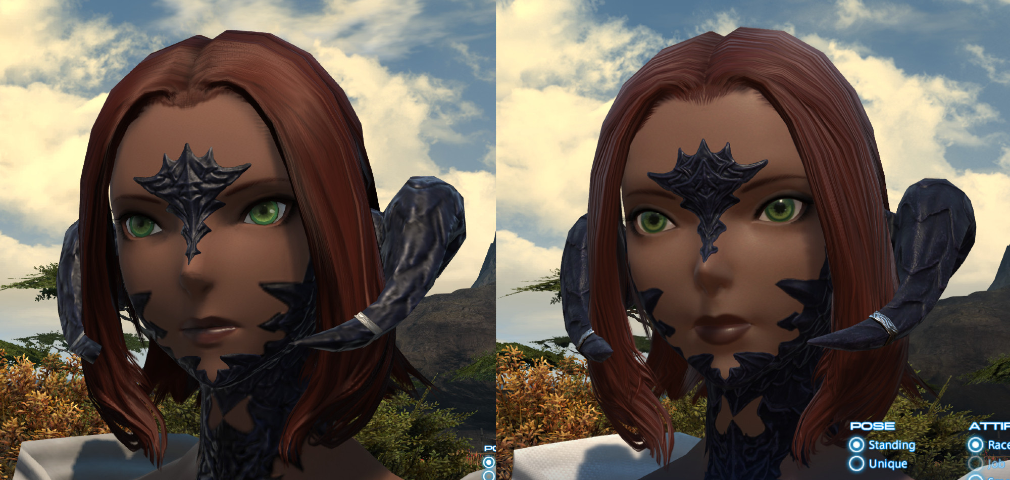
In my observations, they:
 Originally Posted by Aadrian1234
 I posted additional screenshots in another thread a few days ago, I forgot to post them here too.
First comparison


Second comparison


The dimples, the puckered lips and changed lip shape, the really dilated eyes, the overall softer face, and so-on are all things that have massively changed my character's tone and expression.
As I picked a combination of features to really accentuate her stern and fierce looks, these changes are the complete and exact opposite of what I want for my character.- Widened the face (making it rounder, less hawkish.)
- Reshaped the lips.
- The lips are now black voids of light and will cast harsh shadows around the corners (no subsurface scattering,)
- look like a goldfish.
- The eyes are greatly improved, have real depth and look like actual eyes (no regard on shape.)
- Changed skin tone (noticeably yellower for my character.)
- Ruined my character's entire aesthetic, for much the same reason.
The lips aren't actually wider or narrower than before, but widening the face causes them to look extremely small now, and the character's overall look is just ruined. I don't know who was in charge of this update but they really missed the mark on au ra.(10)
-
04-18-2024 03:48 PM #234Player

- Join Date
- Apr 2024
- Posts
- 9
- Character
- Thrawn Mitth
- World
- Behemoth
- Main Class
- Dark Knight Lv 90
First of all, there are some amazing character designs in this thread and it's been fun looking through them all (even the characters who the update has been unkind to). There's been a lot of great feedback regarding clear issues that need to be fixed, so hopefully that happens soon.

Overall I'm pretty happy with how my Raen turned out. I definitely agree that male face #3 has some pretty bad eye shadow, but I think my hairstyle slightly reduces it (it's really noticeable on some characters). The thing that stood out to me was how different the textures are on the horns vs the scales. It's pretty jarring in the above photo, so I hope they get touched up to look more consistent. It doesn't look quite as bad when zoomed out or in different lighting, but when compared to current pictures the discrepancy is still pretty noticeable.
Endwalker: perfectly matched scales across his horns and body

Benchmark: visually inconsistent

Hopefully things like this get addressed as they look through people's feedback.(2)
-
04-18-2024 05:05 PM #235Player

- Join Date
- May 2023
- Location
- Ul'dah
- Posts
- 30
- Character
- Khulan Qerel
- World
- Marilith
- Main Class
- Dancer Lv 90
Adding my lizard to the pile. Man, they really do look like they swallowed a bee, don't they? And after staring at this comparison for ten minutes, I realized that something I haven't seen mentioned a lot is how a lot of the sharp lines of the scales were smoothed and blunted. Like the top of the upper cheek "spike" tapers and curves a bit instead of coming to a sharp angle (this one really gets me, because I chose that jaw shape specifically for its strong, unbent spike), the tips of the lower nose scales are rounded off, and the three V shapes in the chin have been slightly filled in.
And I fully acknowledge that this last item is entirely self indulgent, but I miss how the horns came to a needle tip. "Sharp enough to stab somebody with" is a charm point in its own way.(21)
-
04-18-2024 10:46 PM #236Player

- Join Date
- Jun 2017
- Posts
- 133
- Character
- Cecilia Miller
- World
- Cerberus
- Main Class
- Summoner Lv 100
The only part I disagree with is that they greatly improved the eyes. The eyes look much worse in the benchmark here for me personally - they are less sharp and the pupils are massive and it looks more dead than before. I think for some, the blending of the umbral ring is more of a hit or miss - some love it, others hate it and prefer the harsher contrast/border. The red colour is more washed out so you have to select a brighter red to get the same effect. Currently in EW, you can have a deep, but also bright colour for the umbral rings, but now you either choose a watered down colour compared to current options or go for the brighter options which are not as deep as before. Not sure why they changed the colour options to the point that if you import your current character, you have to change the eye colour to get the same effect.
Originally Posted by Taranok
In my observations, they:- The eyes are greatly improved, have real depth and look like actual eyes (no regard on shape.)
The lips aren't actually wider or narrower than before, but widening the face causes them to look extremely small now, and the character's overall look is just ruined. I don't know who was in charge of this update but they really missed the mark on au ra.
Would be nice to have an option, but I think the massive pupils look significantly worse personally. I'm hoping they give us an option to customize the shape of the pupil.
Overall, I think the graphics direction also resulted in a style change where the au ra were made to look more "cutesy" resulting in changes such as much larger pupils which isn't a graphics update, but a style change and not really what people were expecting.(8)Last edited by CecMiller; 04-18-2024 at 10:50 PM.
: d
-
04-19-2024 12:20 AM #237Player

- Join Date
- Apr 2024
- Posts
- 1
- Character
- Eos Rhododaktulos
- World
- Spriggan
- Main Class
- White Mage Lv 90
Hi everyone, here to give feedback as well.
I need the devs to know that I love their work and that I also play a femroe with a darker skintone and she looks absolutely stunning in the benchmark. But my main is an au ra and here she is:
Left is her face now as of 6.58 / right is her face in the benchmark.
This is face 4 / Mouth 4. For some reason the benchmark makes her look lifeless. My main issue is with the lips, I don't know why they got bigger like that. As other people have noted face 4 got rounder and so the character looks less fierce and imo the shadows look... strange. I also take issue with her new skin/eye color but I found that I can achieve the original look by changing colors slightly.
In the benchmark cutscenes those issues were less visible so maybe it's also a question of lighting and facial expression. But I still wanted to report on that!(5)
-
04-19-2024 12:23 AM #238Player

- Join Date
- Sep 2019
- Posts
- 8
- Character
- Reyla Cherith
- World
- Cactuar
- Main Class
- Ninja Lv 90
Sorry if anyone else has pointed this out. But in the character creator, the pose Au Ra does when you swap between race clothes/small clothes is broken.
Screenshots:


 (5)
(5)
-
04-19-2024 12:29 AM #239Player

- Join Date
- Aug 2013
- Location
- Ul'dah
- Posts
- 2,261
- Character
- Roda Tirhaalo
- World
- Balmung
- Main Class
- Pictomancer Lv 100
Same as on live it seems
Originally Posted by Kimeraandrel
Sorry if anyone else has pointed this out. But in the character creator, the pose Au Ra does when you swap between race clothes/small clothes is broken.
Screenshots:

 (8)~sigh~
-
04-19-2024 12:32 AM #240Player
- Join Date
- Sep 2019
- Posts
- 8
- Character
- Reyla Cherith
- World
- Cactuar
- Main Class
- Ninja Lv 90
Weird, I just tried to create your character on 6.58 and it looks significantly different. I wonder why that is. It's especially odd that your hair is higher quality than what I'm seeing. Perhaps there's another explanation? It seems like that type of lighting you have in the 6.58 screenshot isn't replicatable either.
Originally Posted by Oizen
I too am not very happy with how horribly the graphics have been downgraded in this upcoming expansion, my character looks like another character entirely and I've been up all night unable to sleep grieving the loss of my warrior of light. I can't believe Naoki Yoshida would force this onto us after all these years. Its like I'm losing apart of myself, the character I know and loved for the past 10 years is being taken away in some vain attempt to "modernize" the game with graphics the game never even really needed. The game was literally perfect in Endwalker, I cannot believe that they thought this was a good idea. I'm appalled at how much of the game's soul is being sucked out just by this benchmark alone. Previously I was so excited for Dawntrail, it looked like it was going to be the best expansion yet, but now I have no idea how I feel.
Like many others I'm sharing a draw over of everything wrong with my WoL that they changed in this benchmark, I'm hoping we can find justice in these trying times and hopefully the devs will hear us and delay the expansion, or at the very least revert the graphics update so we can remain faithful to the visions we all had for our characters.
 (10)
(10)
 Reply With Quote


Quick Navigation
General Discussion
Top
- Forums
- Japanese Forums
- ニュース
- テクニカルサポート
- 不具合報告
- プロデューサーレター
- ゲームシステム
- クラス&ジョブ
- ウェブサイト/アプリフィードバック
- 雑談
- この装備を武具投影したい!!
- あのジョブのUIレイアウトが知りたい!
- みんなとストラテジーボードを共有したい!
- ジェネラルディスカッション
- ワールド(Group JP)
- ワールド(Group NA/EU/OC)
- Sargatanas(LEGACY)
- Balmung(LEGACY)
- Hyperion(LEGACY)
- Excalibur(LEGACY)
- Ragnarok(LEGACY/EU)
- Adamantoise
- Behemoth
- Cactuar
- Cerberus(EU)
- Coeurl
- Goblin
- Malboro
- Moogle(EU)
- Ultros
- Diabolos
- Gilgamesh
- Leviathan
- Midgardsormr
- Odin(EU)
- Shiva(EU)
- Exodus
- Faerie
- Lamia
- Phoenix(EU)
- Siren
- Famfrit
- Lich(EU)
- Mateus
- Brynhildr
- Zalera
- Jenova
- Zodiark
- Omega(EU)
- Louisoix(EU)
- Spriggan(EU)
- Twintania(EU)
- Phantom(EU)
- Sagittarius(EU)
- Alpha(EU)
- Raiden(EU)
- Bismarck(OC)
- Ravana(OC)
- Sephirot(OC)
- Sophia(OC)
- Zurvan(OC)
- Halicarnassus
- Maduin
- Marilith
- Seraph
- 初心者用
- コミュニティイベント
- 開催中
- 終了
- 第8回14時間生放送
- 第68回FFXIVプロデューサーレターLIVE
- 第65回FFXIVプロデューサーレターLIVE
- 第64回FFXIVプロデューサーレターLIVE
- 第60回FFXIVプロデューサーレターLIVE
- 第56回FFXIVプロデューサーレターLIVE
- 第53回FFXIVプロデューサーレターLIVE
- 出張!ひろしチャレンジ 応援プレゼント企画
- 第50回FFXIVプロデューサーレターLIVE
- 第49回FFXIVプロデューサーレターLIVE
- ハウジングコーディネートコンテスト
- 第44回FFXIVプロデューサーレターLIVE
- 第43回FFXIVプロデューサーレターLIVE
- 第42回FFXIVプロデューサーレターLIVE
- 第41回FFXIVプロデューサーレターLIVE
- 第40回FFXIVプロデューサーレターLIVE
- 第39回FFXIVプロデューサーレターLIVE
- 第38回FFXIVプロデューサーレターLIVE
- 第37回FFXIVプロデューサーレターLIVE
- 第35回FFXIVプロデューサーレターLIVE
- ハウジングデコレーションコンテスト
- 第34回FFXIVプロデューサーレターLIVE
- 第33回FFXIVプロデューサーレターLIVE
- 出張FFXIVプロデューサーレターLIVE in LAS VEGAS (2016)
- 髙井浩の○○チャレンジ!応援企画
- 第31回FFXIVプロデューサーレターLIVE
- 紅蓮祭スクリーンショットコンテスト 2016
- 第30回FFXIVプロデューサーレターLIVE
- 第28回FFXIVプロデューサーレターLIVE
- サントラ発売記念!奏天のイシュガルドコンテスト
- 第27回FFXIVプロデューサーレターLIVE
- 星芒祭 4コマスクリーンショットコンテスト
- 第26回FFXIVプロデューサーレターLIVE
- 第25回FFXIVプロデューサーレターLIVE
- パンプキンクッキーコンテスト
- 髪型デザインコンテスト
- 第24回FFXIVプロデューサーレターLIVE
- 第23回FFXIVプロデューサーレターLIVE
- 第22回FFXIVプロデューサーレターLIVE
- エオルゼア百景 in 装備コーディネートコンテスト
- 第21回FFXIVプロデューサーレターLIVE
- 思い出スクリーンショットコンテスト
- フリーカンパニーPRキャンペーン
- 第20回FFXIVプロデューサーレターLIVE
- FFXIVプロデューサーレターLIVE特別編
- ヴァレンティオンデーチョコレートコンテスト
- 闘会議2015 予想イベント
- 降神祭スクリーンショットコンテスト
- 星芒祭スクリーンショットコンテスト
- 第19回FFXIVプロデューサーレターLIVE
- 第18回FFXIVプロデューサーレターLIVE
- 出張FFXIVプロデューサーレターLIVE in LAS VEGAS
- 新生FFXIV キャプションコンテスト
- 紅蓮祭スクリーンショットコンテスト
- 第17回FFXIVプロデューサーレターLIVE
- 新生FFXIV 1周年記念PVコンテスト
- ミラプリ スクリーンショットコンテスト
- 第16回FFXIVプロデューサーレターLIVE
- 第15回FFXIVプロデューサーレターLIVE
- 第14回FFXIVプロデューサーレターLIVE
- エッグハントスクリーンショットコンテスト
- 出張プロデューサーレターLIVE
- 第13回FFXIVプロデューサーレターLIVE
- プリンセスデースクリーンショットコンテスト
- 第12回FFXIVプロデューサーレターLIVE
- 降神祭スクリーンショットコンテスト
- 星芒祭スクリーンショットコンテスト
- ヴァレンティオンデースクリーンショットコンテスト
- フリーカンパニー紹介PVコンテスト
- 第11回FFXIVプロデューサーレターLIVE
- 第10回FFXIVプロデューサーレターLIVE
- 守護天節スクリーンショットコンテスト
- 第9回FFXIVプロデューサーレターLIVE
- 出張プロデューサーレターLIVE in 幕張
- English Forums
- Information
- Technical Support
- Bug Reports
- Letters from the Producer
- Gameplay
- Classes & Jobs
- Feedback
- Community
- General Discussion
- Worlds(Group JP)
- Worlds(Group NA/EU/OC)
- Sargatanas(LEGACY)
- Balmung(LEGACY)
- Hyperion(LEGACY)
- Excalibur(LEGACY)
- Ragnarok(LEGACY/EU)
- Adamantoise
- Behemoth
- Cactuar
- Cerberus(EU)
- Coeurl
- Goblin
- Malboro
- Moogle(EU)
- Ultros
- Diabolos
- Gilgamesh
- Leviathan
- Midgardsormr
- Odin(EU)
- Shiva(EU)
- Exodus
- Faerie
- Lamia
- Phoenix(EU)
- Siren
- Famfrit
- Lich(EU)
- Mateus
- Brynhildr
- Zalera
- Jenova
- Zodiark
- Omega(EU)
- Louisoix(EU)
- Spriggan(EU)
- Twintania(EU)
- Phantom(EU)
- Sagittarius(EU)
- Alpha(EU)
- Raiden(EU)
- Bismarck(OC)
- Ravana(OC)
- Sephirot(OC)
- Sophia(OC)
- Zurvan(OC)
- Halicarnassus
- Maduin
- Marilith
- Seraph
- New Player Help
- Community Events
- Current Events
- Past Events
- Contests and Sweepstakes
- Fan Festival 2023 in London
- 10th Anniversary Mosaic Art Sweepstakes (NA/EU)
- Fan Festival 2023 in Las Vegas
- Ask Your Questions for the PAX East 2023 Q&A
- Crystalline Conflict Community Cup (North America)
- Letter from the Producer LIVE Part LXVIII
- Letter from the Producer LIVE Part LXV
- Letter from the Producer LIVE Part LXIV
- Letter from the Producer LIVE Part LX
- Everything’s on the Line! Screenshot Contest (NA)
- Ask Yusuke Mogi Your Questions for the PAX East 2020 Panel
- “A Star Light Party” Screenshot Contest (EU/PAL)
- Star Companion Screenshot Sweepstakes (NA)
- Letter from the Producer LIVE Part LVI
- “This is All Saints’ Wake” Screenshot Contest (EU/PAL)
- A Glamourous Guise Screenshot Contest (NA)
- Memoirs of Adventure Creative Writing Contest (NA)
- Ask Yoshi-P and Banri Oda Your Questions for the gamescom 2019 Q&A
- Letter from the Producer LIVE Part LIII
- Cosplay Contest at gamescom 2019 (EU)
- Become the Darkness Screenshot Sweepstakes! (NA)
- From Light to Darkness Screenshot Contest (EU/PAL)
- Frights and Delights Comic Contest (EU/PAL)
- Cosplay Contest at Japan Expo 2019 (EU)
- Ogre Pumpkin Carve Off Contest: The REDUX (NA)
- My new Viera and Hrothgar" Twitter Screenshot Contest (NA/EU)
- ”Sea Breeze Celebration” Screenshot Contest (NA)
- An Egg-Squisite Season Screenshot Contest (EU/PAL)
- The Eorzean Interior Design Contest (NA)
- Letter from the Producer LIVE Part XLIX
- Letter from the Producer LIVE Part L
- FLOWERS FOR ALL SCREENSHOT CONTEST
- The Eorzean Interior Design Contest (EU)
- Highlights of the Year Contest (EU)
- Fan Festival 2018 in Las Vegas (NA)
- Starlight Scenarios Comic Contest (NA)
- Fan Festival 2019 in Paris (EU)
- The "As Good As Gold" Screenshot Contest (NA)
- Glamour Extravaganza Contest (EU)
- Letter from the Producer LIVE: E3 2018 Edition
- Letter from the Producer LIVE Part XLIV
- Letter from the Producer LIVE Part XLIII
- The "Be My Valentione!" Creative Writing Contest (NA)
- Letter from the Producer LIVE Part XLII
- Letter from the Producer LIVE Part XLI
- Holiday Greetings Contest (EU)
- Starlight Starbright Screenshot Contest (NA)
- Letter from the Producer LIVE Part XL
- Ogre Pumpkin Carve Off Contest (NA)
- Letter from the Producer LIVE Part XXXIX
- Letter from the Producer LIVE Part XXXVIII
- PAX West 2017 (NA)
- Sightseeing Screenshot Contest! (EU)
- Letter from the Producer LIVE Part XXXVII
- And… Action! (NA)
- The Heavensdub Contest (NA)
- Letter from the Producer LIVE Part XXXV
- House Party Screenshot Contest (EU)
- Bright-Eyed Superstars Contest (NA)
- Letter from the Producer LIVE in Frankfurt (EU)
- Letter from the Producer LIVE Part XXXIV
- Starlight Celebration Haiku Contest (EU)
- Letter from the Producer LIVE Part XXXIII
- The “Eorzean Home Makeover (Extreme)” Contest (NA)
- Fan Festival 2017 (EU)
- Spooky Story Contest (EU)
- Letter from the Producer LIVE in Las Vegas (2016)
- The Rising Screenshot Contest (EU)
- Letter from the Producer LIVE Part XXXI
- "Do You Even /Pose?" Showdown! (NA)
- Fan Festival 2016 (NA)
- Dream Holiday Contest (EU)
- Letter from the Producer LIVE: E3 2016 Edition
- Heavensward Primal Haiku Contest (NA)
- Letter from the Producer LIVE Part XXX
- Letter from the Producer LIVE Part XXIX
- Letter from the Producer LIVE Part XXVIII
- Heavensward Music Contest (NA)
- Heavensward Music Contest (EU)
- Letter from the Producer LIVE Part XXVII
- Starlight Celebration Comic Strip Contest (NA)
- Starlight Celebration Comic Strip Contest (EU)
- Letter from the Producer LIVE Part XXVI
- Airship Components: Research and Development (NA)
- All Saints’ Wake Screenshot Contest (EU)
- Letter from the Producer LIVE Part XXV
- Retainer Ad-Venture Contest (EU)
- Cartographers and Seekers Contest (NA)
- Hairstyle Design Contest
- Letter from the Producer LIVE Part XXIV
- Letter from the Producer LIVE Part XXIII
- Letter from the Producer LIVE Part XXII
- Letter from the Producer LIVE Part XXI
- Memories of Eorzea Screenshot Contest (NA)
- Memories of Eorzea Screenshot Contest (EU)
- Heavensward Free Company Recruitment Contest (NA)
- Heavensward Free Company Recruitment Contest (EU)
- A Realm Redubbed Contest (NA)
- Letter from the Producer LIVE Part XX
- Letter from the Producer LIVE – Special Edition
- The Great Eorzean Cook-Off Contest (EU)
- Be My Valentione Contest (NA)
- Heavensturn Screenshot Contest (NA)
- Heavensturn Screenshot Contest (EU)
- Starlight Celebration Screenshot Contest (NA)
- Starlight Celebration Screenshot Contest (EU)
- Letter from the Producer LIVE Part XIX
- Letter from the Producer LIVE Part XVIII
- Letter from the Producer LIVE in Las Vegas
- Grant a Wish Contest (EU)
- Letter from the Producer LIVE Part XVII
- Moonfire Faire Screenshot Contest (NA)
- Moonfire Faire Screenshot Contest (EU)
- Fan Festival 2014 (NA)
- Fan Festival 2014 (EU)
- FFXIV: ARR One Year Anniversary Video Contest (NA)
- FFXIV: ARR One Year Anniversary Video Contest (EU)
- Letter from the Producer LIVE Part XVI
- Eorzea IRL Contest (NA)
- Letter from the Producer LIVE: E3 Edition
- Letter from the Producer LIVE Part XV
- Letter from the Producer LIVE Part XIV
- Hatching-tide Screenshot Contest (NA)
- Hatching-tide Screenshot Contest (EU)
- Letter from the Producer LIVE Part XIII
- Little Ladies' Day Screenshot Contest (NA)
- Little Ladies' Day Screenshot Contest (EU)
- Valentione's Day Screenshot Contest (NA)
- Valentione's Day Screenshot Contest (EU)
- Letter from the Producer LIVE Part XII
- Heavensturn Screenshot Contest (NA)
- Heavensturn Screenshot Contest (EU)
- Starlight Celebration Screenshot Contest (NA)
- Starlight Celebration Screenshot Contest (EU)
- FFXIV: ARR Free Company Recruitment Contest (NA)
- FFXIV: ARR Free Company Recruitment Contest (EU)
- Letter from the Producer LIVE Part XI
- XIII Days – Your Fate is Sealed Contest (NA)
- Letter from the Producer LIVE Part X
- Doppelganger Screenshot Contest (NA)
- All Saints’ Wake Haiku Contest (EU)
- Letter from the Producer LIVE Part IX
- Ask Your Questions for the Mini Letter from the Producer LIVE at TGS!
- Sightseeing Screenshot Sweepstakes (NA/EU)
- Forums français
- Informations
- Assistance technique
- Rapports de problèmes
- La lettre du producteur
- Système de jeu
- Classes & Jobs
- Avis et retours sur les sites et l’appli
- Discussion
- Discussion générale
- Mondes (Japon)
- Mondes (Amérique du N./Europe/Océanie)
- Sargatanas(LEGACY)
- Balmung(LEGACY)
- Hyperion(LEGACY)
- Excalibur(LEGACY)
- Ragnarok(LEGACY/EU)
- Adamantoise
- Behemoth
- Cactuar
- Cerberus(EU)
- Coeurl
- Goblin
- Malboro
- Moogle(EU)
- Ultros
- Diabolos
- Gilgamesh
- Leviathan
- Midgardsormr
- Odin(EU)
- Shiva(EU)
- Exodus
- Faerie
- Lamia
- Phoenix(EU)
- Siren
- Famfrit
- Lich(EU)
- Mateus
- Brynhildr
- Zalera
- Jenova
- Zodiark
- Omega(EU)
- Louisoix(EU)
- Spriggan(EU)
- Twintania(EU)
- Phantom(EU)
- Sagittarius(EU)
- Alpha(EU)
- Raiden(EU)
- Bismarck(OC)
- Ravana(OC)
- Sephirot(OC)
- Sophia(OC)
- Zurvan(OC)
- Halicarnassus
- Maduin
- Marilith
- Seraph
- Aide aux nouveaux joueurs
- Événements communautaires
- Evénements en cours
- Evénements passés
- Concours et tirages au sort
- Fan Festival 2023 de Londres
- Concours pour la mosaïque du 10e anniversaire
- « La lettre du producteur LIVE » : 68e émission
- « La lettre du producteur LIVE » : 65e émission
- « La lettre du producteur LIVE » : 64e émission
- Concours de captures d’écran d'exploration - Édition 2020
- « La lettre du producteur LIVE » : 60e émission
- Concours de captures d’écran - Une petite fête des étoiles entre amis
- « La lettre du producteur LIVE » : 56e émission
- Concours de captures d’écran – C’est ça la Veillée des Saints
- Mes questions à Yoshi-P et Banri Oda pour le Q&R de gamescom 2019 !
- « La lettre du producteur LIVE » : 53e émission
- Concours de cosplay à la gamescom 2019
- Concours de captures d’écran : De la Lumière aux Ténèbres
- Concours Pistolame à Japan Expo 2019 !
- Concours de Cosplay à Japan Expo 2019
- « Ma Viéra & mon Hrothgar » - Concours Twitter de capture d'écran
- Fabulœuf concours de captures d’écran
- « La lettre du producteur LIVE » : 50e émission
- « La lettre du producteur LIVE » : 49e émission
- Concours des meilleurs moments de l'année 2018
- Concours de BD’pouvante
- Concours de décoration d’intérieur
- Fan Festival 2019 à Paris
- Concours “Les dieux de la mode”
- « La lettre du producteur LIVE » : 44e émission
- « La lettre du producteur LIVE » : 43e émission
- « La lettre du producteur LIVE » : 42e émission
- « La lettre du producteur LIVE » : 41e émission
- Concours de cartes de vœux
- « La lettre du producteur LIVE » : 40e émission
- « La lettre du producteur LIVE » : 39e émission
- « La lettre du producteur LIVE » : 38e émission
- Concours de captures d’écran d’exploration
- « La lettre du producteur LIVE » : 37e émission
- « La lettre du producteur LIVE » : 35e émission
- Concours de captures d’écran spécial « House Party »
- Lettre du producteur LIVE à Francfort
- « La lettre du producteur LIVE » : 34e émission
- Concours de haïkus pour la fête des étoiles
- « La lettre du producteur LIVE » : 33e émission
- Concours d’histoires effrayantes
- Posez vos questions pour la lettre Live à Las Vegas (2016)
- Concours de captures d’écran pour la fête de la Commémoration
- « La lettre du producteur LIVE » : 31e émission
- Concours office de tourisme d’Éorzéa
- « La lettre du producteur LIVE » : 30e émission
- « La lettre du producteur LIVE » : 29e émission
- « La lettre du producteur LIVE » : 28e émission
- Concours de musique d’Heavensward
- « La lettre du producteur LIVE » : 27e émission
- Concours de comic strip pour la fête des étoiles
- « La lettre du producteur LIVE » : 26e émission
- Concours de captures d’écran pour la Veillée des saints
- « La lettre du producteur LIVE » : 25e émission
- Concours « Les aventures de mon servant »
- Concours de création de coupe de cheveux
- « La lettre du producteur LIVE » : 24e émission
- « La lettre du producteur LIVE » : 22e émission
- « La lettre du producteur LIVE » : 23e émission
- Concours de captures d’écran – Souvenirs d’Éorzéa
- Les compagnies libres recrutent pour Heavensward
- « La lettre du producteur LIVE » : 20e émission
- La lettre du producteur LIVE : émission spéciale
- Le grand concours culinaire d’Éorzéa
- Concours de captures d’écran pour la fête de la transition
- Concours de captures d’écran pour la fête des étoiles
- « La lettre du producteur LIVE » : dix-huitième émission
- Posez vos questions pour la lettre Live à Las Vegas
- Concours « Le jeu des souhaits »
- « La lettre du producteur LIVE » : 19e émission
- Fan Festival 2014
- Concours de captures d’écran pour les feux de la mort
- « La lettre du producteur LIVE » : dix-septième émission
- Concours vidéo pour le premier anniversaire
- « La lettre du producteur LIVE » : seizième émission
- « La lettre du producteur LIVE » : quinzième émission
- « La lettre du producteur LIVE » : quatorzième émission
- Concours de captures d’écran pour la chasse aux Prœufs
- « La lettre du producteur LIVE » : treizième émission
- Concours de captures d’écran pour la fête des demoiselles
- « La lettre du producteur LIVE » : douzième émission
- Concours de captures d’écran pour la fête de la transition
- Concours de captures d’écran pour la fête des étoiles
- Concours de captures d’écran pour la Valention
- Les compagnies libres recrutent
- « La lettre du producteur LIVE » : onzième émission
- « La lettre du producteur LIVE » : dixième émission
- Concours Haiku d'Éorzéa - la Veillée des saints
- « La lettre du producteur LIVE » : neuvième émission
- Posez vos questions pour la lettre Live à Makuhari
- Deutsches Forum
- Ankündigungen
- Technischer Support
- Fehler melden
- Briefe des Produzenten
- Spielsystem
- Charakterklassen & Jobs
- Feedback
- Diskussionen
- Allgemeine Diskussionen
- Welten(Group JP)
- Welten(Group NA/EU/OC)
- Sargatanas(LEGACY)
- Balmung(LEGACY)
- Hyperion(LEGACY)
- Excalibur(LEGACY)
- Ragnarok(LEGACY/EU)
- Adamantoise
- Behemoth
- Cactuar
- Cerberus(EU)
- Coeurl
- Goblin
- Malboro
- Moogle(EU)
- Ultros
- Diabolos
- Gilgamesh
- Leviathan
- Midgardsormr
- Odin(EU)
- Shiva(EU)
- Exodus
- Faerie
- Lamia
- Phoenix(EU)
- Siren
- Famfrit
- Lich(EU)
- Mateus
- Brynhildr
- Zalera
- Jenova
- Zodiark
- Omega(EU)
- Louisoix(EU)
- Spriggan(EU)
- Twintania(EU)
- Phantom(EU)
- Sagittarius(EU)
- Alpha(EU)
- Raiden(EU)
- Bismarck(OC)
- Ravana(OC)
- Sephirot(OC)
- Sophia(OC)
- Zurvan(OC)
- Halicarnassus
- Maduin
- Marilith
- Seraph
- Für Einsteiger
- Community-Veranstaltungen
- Aktuelle Veranstaltungen
- Vergangene Veranstaltungen
- Wettbewerbe und Gewinnspiele
- Mosaik-Gewinnspiel zum 10. Jubiläum
- Fan Festival 2023 in London
- Der 68 Teil des „FINAL FANTASY XIV Produzentenbriefs LIVE”
- Der 65 Teil des „FINAL FANTASY XIV Produzentenbriefs LIVE”
- Der 64 Teil des „FINAL FANTASY XIV Produzentenbriefs LIVE”
- Reisetagebuch-Screenshot-Gewinnspiel
- Der 60. Teil des „FINAL FANTASY XIV Produzentenbriefs LIVE”
- Sternenlichtertrupp-Screenshot-Wettbewerb
- Der 56. Teil des „FINAL FANTASY XIV Produzentenbriefs LIVE”
- Allerschutzheiligen Schauer-Spektakel-Screenshot-Wettbewerbs
- Eure Fragen an Naoki Yoshida und Banri Oda für die Q&A-Session auf der gamescom 2019
- Der 53. Teil des „FINAL FANTASY XIV Produzentenbriefs LIVE”
- Cosplay-Wettbewerb auf der gamescom 2019
- Vom Licht in die Dunkelheit Screenshot-Wettbewerb
- Cosplay-Wettbewerb auf der Japan Expo 2019
- „Viera & Hrothgar Makeover“ Twitter-Screenshot-Wettbewerb
- Wundereiersuche Screenshot-Wettbewerb
- Der 50. Teil des „FINAL FANTASY XIV Produzentenbriefs LIVE”
- Der 49. Teil des „FINAL FANTASY XIV Produzentenbriefs LIVE”
- Highlights des Jahres Wettbewerb
- Spuk und Schabernack Comic-Wettbewerb
- Inneneinrichtungs-Wettbewerb
- Fan Festival 2019 in Paris
- Extravaganza-Wettbewerb
- Der 44. Teil des „FINAL FANTASY XIV Produzentenbriefs LIVE”
- Der 43. Teil des „FINAL FANTASY XIV Produzentenbriefs LIVE”
- Der 42. Teil des „FINAL FANTASY XIV Produzentenbriefs LIVE”
- Der 41. Teil des „FINAL FANTASY XIV Produzentenbriefs LIVE”
- Wintergrüße-Wettbewerb
- Der 40. Teil des „FINAL FANTASY XIV Produzentenbriefs LIVE”
- Der 39. Teil des „FINAL FANTASY XIV Produzentenbriefs LIVE”
- Der 38. Teil des „FINAL FANTASY XIV Produzentenbriefs LIVE”
- Sightseeing-Screenshot-Wettbewerb
- Der 37. Teil des „FINAL FANTASY XIV Produzentenbriefs LIVE”
- Der 35. Teil des „FINAL FANTASY XIV Produzentenbriefs LIVE”
- House Party! Screenshot-Wettbewerb
- Brief des Produzenten LIVE in Frankfurt
- Der 34. Teil des „FINAL FANTASY XIV Produzentenbriefs LIVE”
- Sternenlichtfest Haiku-Wettbewerb
- Der 33. Teil des „FINAL FANTASY XIV Produzentenbriefs LIVE”
- Gruselgeschichten-Wettbewerb
- Stellt eure Fragen für den Brief des Produzenten – Live in Las Vegas (2016)
- Fest der Wiedergeburt Screenshot-Wettbewerb
- Der 31. Teil des „FINAL FANTASY XIV Produzentenbriefs LIVE”
- Traumurlaub-Wettbewerb
- Der 30. Teil des „FINAL FANTASY XIV Produzentenbriefs LIVE”
- Der 29. Teil des „FINAL FANTASY XIV Produzentenbriefs LIVE”
- Der 28. Teil des „FINAL FANTASY XIV Produzentenbriefs LIVE
- Heavensward Musik-Wettbewerb
- Der 27. Teil des „FINAL FANTASY XIV Produzentenbriefs LIVE
- Sternenlichtfest Comicstrip-Wettbwerb
- Der 26. Teil des „FINAL FANTASY XIV Produzentenbriefs LIVE
- Allerschutzheiligen-Fest Screenshot-Wettbewerb
- Der 25. Teil des „FINAL FANTASY XIV Produzentenbriefs LIVE
- Die Abenteuer des Tapferen Gehilfen–Wettbewerb
- Frisuren-Design-Wettbewerb
- Der 24. Teil des „FINAL FANTASY XIV Produzentenbriefs LIVE
- Der 22. Teil des „FINAL FANTASY XIV Produzentenbriefs LIVE
- Der 23. Teil des „FINAL FANTASY XIV Produzentenbriefs LIVE
- Erinnerungen an Eorzea Screenshot-Wettbewerb
- Heavensward-Rekrutierungswettbewerb der freien Gesellschaften
- Der 20. Teil des „FINAL FANTASY XIV Produzentenbriefs LIVE
- Brief des Produzenten – LIVE-Sondersendung!
- Großer, eorzäischer Kochwettbewerb
- Himmelswende Screenshot Wettbewerb
- Sternenlichtfest Screenshot-Wettbewerb
- Der 18. Teil des „FINAL FANTASY XIV Produzentenbriefs LIVE
- Stellt eure Fragen für den Brief des Produzenten – Live in Las Vegas
- Wünsche werden wahr- Wettbewerb
- Der 19. Teil des „FINAL FANTASY XIV Produzentenbriefs LIVE
- Fan Festival 2014
- Feuermond-Reigen Screenshot-Wettbewerb
- Der 17. Teil des „FINAL FANTASY XIV Produzentenbriefs LIVE
- Video-Wettbewerb zum einjährigen Jubiläum
- Der 16. Teil des „FINAL FANTASY XIV Produzentenbriefs LIVE
- Der 15. Teil des „FINAL FANTASY XIV Produzentenbriefs LIVE
- Der 14. Teil des „FINAL FANTASY XIV Produzentenbriefs LIVE
- Wundereiersuche Screenshot-Wettbewerb
- Der 13. Teil des „FINAL FANTASY XIV Produzentenbriefs LIVE
- Prinzessinnenfest Screenshot-Wettbewerb
- Valentiontag Screenshot Wettbewerb
- Der 12. Teil des „FINAL FANTASY XIV Produzentenbriefs LIVE
- Himmelswende Screenshot Wettbewerb
- Sternenlichtfest Screenshot Wettbewerb
- Rekrutierungsvideo-Wettbewerb der Freien Gesellschaften
- Der 11. Teil des „FINAL FANTASY XIV Produzentenbriefs LIVE
- Der 10. Teil des „FINAL FANTASY XIV Produzentenbriefs LIVE
- Allerschutzheiligen-Haiku-Wettbewerb
- Der 9. Teil des „FINAL FANTASY XIV Produzentenbriefs LIVE
- Stellt eure Fragen für den Brief des Produzenten – Live in Makuhari!
- Version 1.0 Forum Archive
- Japanese Forums
- インフォメーション
- サポート
- アップデート
- ゲームシステム
- クラス&ジョブ
- ウェブサイトフィードバック
- 雑談
- 初心者用
- 写真館
- コミュニティイベント
- 開催中
- 終了
- ファイナルファンタジーXIV: 新生エオルゼア キャッチフレーズコンテスト
- 第8回FFXIVプロデューサーレターLIVE
- 出張FFXIVプロデューサーレターLIVE in LA
- 第7回FFXIVプロデューサーレターLIVE
- 第6回FFXIVプロデューサーレターLIVE
- 創作タマゴコンテスト
- 第5回FFXIVプロデューサーレターLIVE
- マイ ベスト チョコボ
- ダラガブを探せ!
- エオルゼア メモリーズ
- 第4回FFXIVプロデューサーレターLIVE
- エオルゼア de 五・七・五
- 第3回FFXIVプロデューサーレターLIVE
- 残暑見舞いコンテスト
- Hidden Artifacts ~新生コンセプトアートクイズ~
- ガルーダトライアル
- 宿屋deつぶやき!イベント (JP)
- LSリクルートポスターコンテスト (JP)
- English Forums
- Information
- Support
- Updates
- Gameplay
- Classes & Jobs
- Feedback
- Community
- New Player Help
- In-Game Media
- Community Events
- Current Events
- Past Events
- Letter from the Producer LIVE Part VIII
- Letter from the Producer LIVE Part VII
- Letter from the Producer LIVE Part VI
- Eorzean Egg Decoration Contest
- Letter from the Producer LIVE Part V
- Eorzea Haiku Contest (EU)
- “Chocobos Rule the World” Contest!
- Memories of Eorzea Contest
- Letter from the Producer LIVE Part IV
- What if Dalamud Contest (EU)
- Tales from Eorzea (NA)
- Culinary Creation Contest (EU)
- Letter from the Producer LIVE Part III
- We Dub to Make it Ours (NA)
- These Grand Company Colors Don't Run!
- Hidden Artifacts
- Grant A Wish Contest (EU)
- Garuda—She's Like the Wind
- Culinary Creation Contest (NA)
- Valentione’s Dialogue Contest (EU)
- Valentione’s Day Love Letter Contest (NA)
- Forums français
- Informations
- Assistance sur le jeu
- Développement
- Système de jeu
- Classes & Jobs
- Avis et retours
- Discussion
- Aide aux nouveaux joueurs
- Galerie multimédia & articles
- Evénements organisés par l'équipe communautaire
- Evénements en cours
- Evénements passés
- « La lettre du producteur LIVE » : huitième émission
- « La lettre du producteur LIVE » : septième émission
- « La lettre du producteur LIVE » : sixième émission
- Concours : « Décoration d’Œufs Éorzéens »
- « La lettre du producteur LIVE » : cinquième émission
- Concours « Haïkus d’Eorzéa »
- Concours « Les Chocobos à la Conquête du Monde » !
- Concours « Souvenirs d’Eorzéa »
- « La lettre du producteur LIVE » : quatrième émission
- Concours : « Et si Dalamud était... »
- Concours de création culinaire
- « La lettre du producteur LIVE » : troisième émission
- Soutenons les grandes compagnies !
- Questions pour un Eorzéen
- Concours du jeu des souhaits
- L’épreuve de Garuda
- Concours de dialogue de la Valention
- Deutsches Forum
- Ankündigungen
- Support
- Update
- Spielsystem
- Charakterklassen & Jobs
- Feedback
- Diskussionen
- Für Einsteiger
- Medien
- Community-Veranstaltungen
- Aktuelle Veranstaltungen
- Vergangene Veranstaltungen
- Der 8. Teil des „FINAL FANTASY XIV Produzentenbriefs LIVE
- Der 7. Teil des „FINAL FANTASY XIV Produzentenbriefs LIVE
- Der 6. Teil des „FINAL FANTASY XIV Produzentenbriefs LIVE
- Eorzäischer Ei-Dekorations-Wettbewerb
- Der 5. Teil des „FINAL FANTASY XIV Produzentenbriefs LIVE“
- Eorzea-Haiku-Wettbewerb
- Chocobos, die Herrscher der Welt
- Erinnerungen an Eorzea
- Der 4. Teil des „FINAL FANTASY XIV Produzentenbriefs LIVE“
- Was, wenn Dalamud … wäre?
- Kulinarische Kreationen
- Der 3. Teil des „FINAL FANTASY XIV Produzentenbriefs LIVE“
- Farben, die nicht die Segel streichen!
- Verborgene ARTefakte
- Wünsche werden wahr-Wettbewerb
- Garuda – Grausame Herrin der Stürme
- Valentione Dialog-Wettbewerb
- Japanese Forums
«
Previous Thread
|
Next Thread
»


