

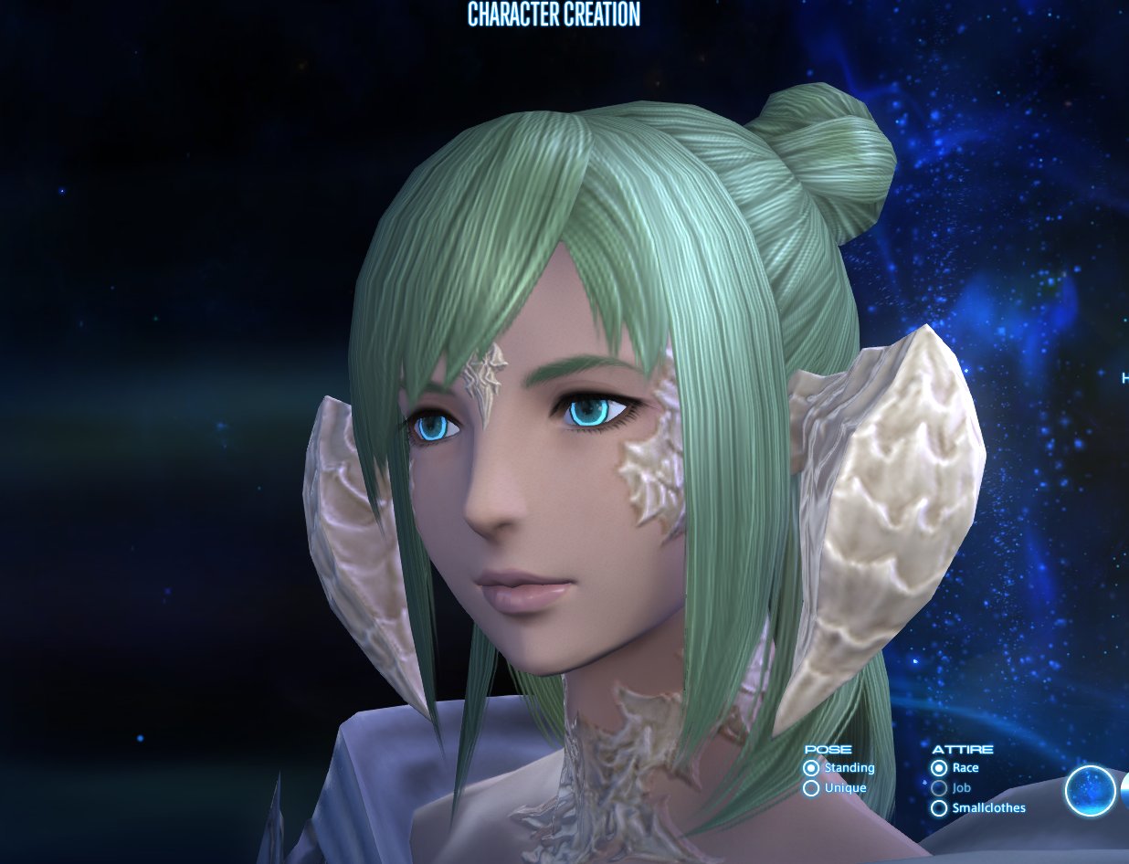
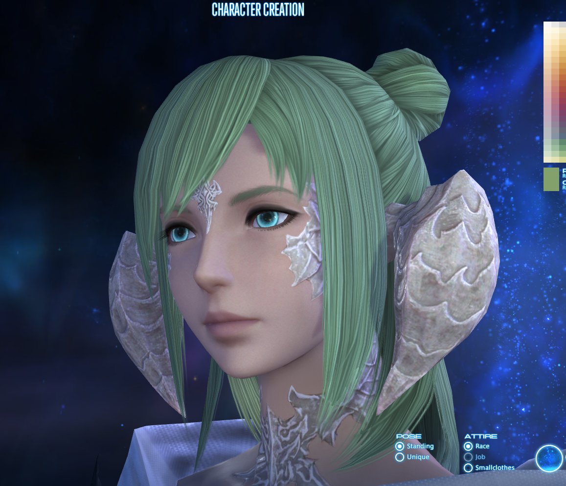
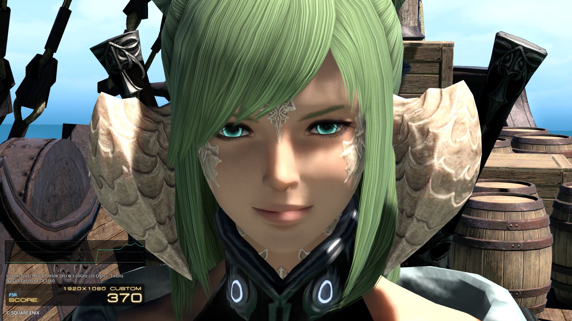
Agreed. Raen scales look terrible on females; less like scales and more like painted or stuck on plates.
- Forum Top
- English Forums
- Community
- General Discussion
- Dawntrail Graphical Update - Au Ra Feedback
-
04-15-2024 11:59 AM #111Player

- Join Date
- Apr 2024
- Posts
- 3
- Character
- Kiku Sazanami
- World
- Famfrit
- Main Class
- Scholar Lv 90
(10)
-
04-15-2024 12:11 PM
Player
-
04-15-2024 12:21 PM #112Player

- Join Date
- Sep 2013
- Location
- Girdania
- Posts
- 159
- Character
- Jayde Ravynwing
- World
- Sargatanas
- Main Class
- Bard Lv 90
I'm going to chime in to say that I also would like my old lip textures back please.
This is her currently:
Notice the shine on her lips and how her upper lip appears to be slightly thinner than her bottom lip. There is also a small dip and some nice "lip" type textures there.
This is her in the benchmark:
Her lips are really flat and no longer shiny. Her hair also looks pretty flat, which is kind of out of place given the shine on her skin in certain lighting. I don't like these two things, but I'm not going to cry over it because she still looks really good!
I did also have to adjust her limbal ring by scooting it to the left a few squares on the color selector so that it showed up again the way I wanted it to. But, that's not a big deal.
I do feel like the concerns expressed in this thread are valid concerns, and I see where people are coming from with regards to the scales. SE has never really explained to us what the scales are made out of, so perhaps they had some idea behind these changes that they haven't explained very well and that's why they look the way that they do. I hope SE takes this feedback into consideration and makes adjustments in the future (like, within the next year. Not the next 10 years please lol).(2)Last edited by JaydeDancer; 04-15-2024 at 12:30 PM. Reason: Removed an extra line. Added additional thoughts.
-
04-15-2024 12:47 PM #113Player

- Join Date
- Jan 2023
- Posts
- 7
- Character
- Ren Shimizu
- World
- Sargatanas
- Main Class
- Dancer Lv 90
This! The scale really looks weird as if they had never been washed since they were born.
 Originally Posted by Kiku_Sazanami


Agreed. Raen scales look terrible on females; less like scales and more like painted or stuck on plates.(8)
-
04-15-2024 01:20 PM #114Player

- Join Date
- Feb 2022
- Posts
- 26
- Character
- Red R'okamura
- World
- Lamia
- Main Class
- Reaper Lv 90
With everyone upset, I was worried I got the short end of the stick as well...
I seem to have gotten the opposite problem with people: She looks more alive and happy than her 6.58 look! (This is GOOD for me, btw.)
6.58
7.0
Granted, I DID have to make some small changes (swapped the eyes and lips cause the ones she currently had looked weird, but that doesn't seem like a big problem for me considering we're getting a free fantasia.
To the people here who are genuinely upset, I advise you try editing your blorbo a bit and see if that fixes some of your issues.(1)
-
04-15-2024 01:44 PM #115Player

- Join Date
- Jul 2021
- Posts
- 203
- Character
- Luna Puella
- World
- Midgardsormr
- Main Class
- Red Mage Lv 100
I really prefer the original lip appearance, the setting is the same yet the difference looks so strong. Also tried out Mouth 3 instead of 1 today to see if it would thin the lips a bit more and it just didn't give the same feel (not pictured here)

Took a side view picture to compare the shape of the mouth/nose. The lips look more puckered up in the new version.

Another note: I've been looking at my character a lot and I've noticed that the eyes look really off? I considered myself a part of that "dead stare" Au Ra fanbase, but it feels like the version of that stare I liked has been replaced with a truly unappealing soulless eye look.
EDIT: Horns not connected to the scales? Oh that's very strange...

More of a personal addendum but also got lots of anxiety regarding the new mouth rig, I am attached to the weirdness of the /fakegrin emote on this race.(5)Last edited by lunartears; 04-15-2024 at 02:22 PM.
-
04-15-2024 01:56 PM #116Player

- Join Date
- Jun 2023
- Location
- Ul'dah
- Posts
- 2
- Character
- Khet Islwyn
- World
- Zalera
- Main Class
- Samurai Lv 90
Hello 14 devs, thank you for your work in all of this!
Add me to the list of people who are finding the change in my character's lip shape (not color, I know that can be adjusted very easily) to be really off from the original. Others in this thread have already pointed out the whys, so I'll just attach a screenshot and add my name to the pile.
 (8)---
You call them 'vuln stacks,' I call them 'uptime stickers'
-
04-15-2024 02:11 PM #117Player

- Join Date
- Apr 2019
- Posts
- 1,917
- Character
- Khloe Entialpoh
- World
- Sargatanas
- Main Class
- Conjurer Lv 100
She is pretty! Originally Posted by Shyllen
snip
Originally Posted by Shyllen
snip
I also like the nose shapes better- they look less bird or skeletal like
But they really need to clean up the scales & adjust the lips(0)
-
04-15-2024 02:19 PM #118Player

- Join Date
- May 2021
- Posts
- 3
- Character
- Sel'via Thornbridge
- World
- Zodiark
- Main Class
- Bard Lv 90
Coloring of neck scales for Raen
So as an Au Ra haver, I really do enjoy graphics update. The increased poly count looks great and I enjoy it a lot and really love how nice he looks in the benchmark. Also messing with the Gamma filter helped to restore how I usually see my Au Ra and it’s been lovely for myself.
My only true issue that I would like to see be addressed is the coloring of the neck scales on male Raen. (I’m sorry, I don’t really know how to insert images from mobile phone here.)
The way the neck scales look now looks as though the contrast between the lighter tone of the scale surface compared with the darker color used to define them feels very drastic and most noticeable on the neck. It’s something I wound up noticing far more and feels more distracting to me. It felt as though it was a sticker placed on top of the neck rather than something that feels like “natural scales” that are part of my character as I usually see it in the current version of him.
A way that I think could help to balance and address that is by decreasing the saturation of the darker color to help it blend more seamlessly with the lighter scale color, if that makes sense? Again, I apologize that I’m not able to add in images at this time to help visualize my point better but I hope it’s understood what I’m trying to say.
I do also want to say that I appreciate the updated look and I am pleased with everything else. I genuinely was happy and excited seeing him in the benchmark trailer and found the lighting in trailer to be a better representation of how I would see him in game than what is represented in the character creator. (I know that others may not feel that way and I understand as well.) But I do appreciate the time the team has taken to make these changes for the game going forward and I hope you’ll also be willing to take my feedback into consideration for future fixes. Thank you!(9)
-
04-15-2024 02:39 PM
Player
-
04-15-2024 02:49 PM #119Player

- Join Date
- Apr 2024
- Posts
- 4
- Character
- Kayato Harya
- World
- Titan
- Main Class
- Sage Lv 90

Aside from the lips and eyes, which everyone points out, I'm referring specifically to the scales and horns, which are what got me playing Aura.
1) The scales are noticeably thinner than before (both in shape and thickness) and seem to stick to the skin. At first glance, they may look more detailed than before, but they just look flat, like a tattoo or sticker of scales, especially the nose and neck scales.
2. As the resolution increases, the texture of the horns becomes flattened.
All the curves and contours of the horns are reduced, and the reflections are reduced, giving it an unpleasant resin figure texture, or a sanded look. This is even more pronounced when you look at the back of the horns.
The roughness of the horns was the reason I played Aura in the first place, so it would be disappointing to see this texture representation significantly downgraded.
3. Different scales have different resolutions for different face types. Especially for the male Au Ra's, the difference between the scales on face 3 and face 1 is noticeable.
Could it be that the data for Face 1 has been processed more for promotional images? This also happens with the male Viera race.
Overall, the horns and scales look downgraded because the textures have been sharpened, but they are too thin. Could you maybe increase the thickness a bit more like before or add some reflections to the horns like before?(7)
-
04-15-2024 03:01 PM
-
04-15-2024 03:04 PM #120Player

- Join Date
- Feb 2022
- Location
- brooding, somewhere
- Posts
- 129
- Character
- Ancalagon Blacktalon
- World
- Adamantoise
- Main Class
- Dragoon Lv 90
This is funny to me because one of the big complaints when they initially showed Au Ra with these changes was that the limbal ring was too subtle.
but personally its intended effect looks virtually the same to me, at least with my character. compare,


The eye texture itself is better but I think the ratio of iris-to-glow is nearly the same, just with the transition made fuzzier so it actually blends in.(1)
 Reply With Quote


Quick Navigation
General Discussion
Top
- Forums
- Japanese Forums
- ニュース
- テクニカルサポート
- 不具合報告
- プロデューサーレター
- ゲームシステム
- クラス&ジョブ
- ウェブサイト/アプリフィードバック
- 雑談
- この装備を武具投影したい!!
- あのジョブのUIレイアウトが知りたい!
- みんなとストラテジーボードを共有したい!
- ジェネラルディスカッション
- ワールド(Group JP)
- ワールド(Group NA/EU/OC)
- Sargatanas(LEGACY)
- Balmung(LEGACY)
- Hyperion(LEGACY)
- Excalibur(LEGACY)
- Ragnarok(LEGACY/EU)
- Adamantoise
- Behemoth
- Cactuar
- Cerberus(EU)
- Coeurl
- Goblin
- Malboro
- Moogle(EU)
- Ultros
- Diabolos
- Gilgamesh
- Leviathan
- Midgardsormr
- Odin(EU)
- Shiva(EU)
- Exodus
- Faerie
- Lamia
- Phoenix(EU)
- Siren
- Famfrit
- Lich(EU)
- Mateus
- Brynhildr
- Zalera
- Jenova
- Zodiark
- Omega(EU)
- Louisoix(EU)
- Spriggan(EU)
- Twintania(EU)
- Phantom(EU)
- Sagittarius(EU)
- Alpha(EU)
- Raiden(EU)
- Bismarck(OC)
- Ravana(OC)
- Sephirot(OC)
- Sophia(OC)
- Zurvan(OC)
- Halicarnassus
- Maduin
- Marilith
- Seraph
- 初心者用
- コミュニティイベント
- 開催中
- 終了
- 第8回14時間生放送
- 第68回FFXIVプロデューサーレターLIVE
- 第65回FFXIVプロデューサーレターLIVE
- 第64回FFXIVプロデューサーレターLIVE
- 第60回FFXIVプロデューサーレターLIVE
- 第56回FFXIVプロデューサーレターLIVE
- 第53回FFXIVプロデューサーレターLIVE
- 出張!ひろしチャレンジ 応援プレゼント企画
- 第50回FFXIVプロデューサーレターLIVE
- 第49回FFXIVプロデューサーレターLIVE
- ハウジングコーディネートコンテスト
- 第44回FFXIVプロデューサーレターLIVE
- 第43回FFXIVプロデューサーレターLIVE
- 第42回FFXIVプロデューサーレターLIVE
- 第41回FFXIVプロデューサーレターLIVE
- 第40回FFXIVプロデューサーレターLIVE
- 第39回FFXIVプロデューサーレターLIVE
- 第38回FFXIVプロデューサーレターLIVE
- 第37回FFXIVプロデューサーレターLIVE
- 第35回FFXIVプロデューサーレターLIVE
- ハウジングデコレーションコンテスト
- 第34回FFXIVプロデューサーレターLIVE
- 第33回FFXIVプロデューサーレターLIVE
- 出張FFXIVプロデューサーレターLIVE in LAS VEGAS (2016)
- 髙井浩の○○チャレンジ!応援企画
- 第31回FFXIVプロデューサーレターLIVE
- 紅蓮祭スクリーンショットコンテスト 2016
- 第30回FFXIVプロデューサーレターLIVE
- 第28回FFXIVプロデューサーレターLIVE
- サントラ発売記念!奏天のイシュガルドコンテスト
- 第27回FFXIVプロデューサーレターLIVE
- 星芒祭 4コマスクリーンショットコンテスト
- 第26回FFXIVプロデューサーレターLIVE
- 第25回FFXIVプロデューサーレターLIVE
- パンプキンクッキーコンテスト
- 髪型デザインコンテスト
- 第24回FFXIVプロデューサーレターLIVE
- 第23回FFXIVプロデューサーレターLIVE
- 第22回FFXIVプロデューサーレターLIVE
- エオルゼア百景 in 装備コーディネートコンテスト
- 第21回FFXIVプロデューサーレターLIVE
- 思い出スクリーンショットコンテスト
- フリーカンパニーPRキャンペーン
- 第20回FFXIVプロデューサーレターLIVE
- FFXIVプロデューサーレターLIVE特別編
- ヴァレンティオンデーチョコレートコンテスト
- 闘会議2015 予想イベント
- 降神祭スクリーンショットコンテスト
- 星芒祭スクリーンショットコンテスト
- 第19回FFXIVプロデューサーレターLIVE
- 第18回FFXIVプロデューサーレターLIVE
- 出張FFXIVプロデューサーレターLIVE in LAS VEGAS
- 新生FFXIV キャプションコンテスト
- 紅蓮祭スクリーンショットコンテスト
- 第17回FFXIVプロデューサーレターLIVE
- 新生FFXIV 1周年記念PVコンテスト
- ミラプリ スクリーンショットコンテスト
- 第16回FFXIVプロデューサーレターLIVE
- 第15回FFXIVプロデューサーレターLIVE
- 第14回FFXIVプロデューサーレターLIVE
- エッグハントスクリーンショットコンテスト
- 出張プロデューサーレターLIVE
- 第13回FFXIVプロデューサーレターLIVE
- プリンセスデースクリーンショットコンテスト
- 第12回FFXIVプロデューサーレターLIVE
- 降神祭スクリーンショットコンテスト
- 星芒祭スクリーンショットコンテスト
- ヴァレンティオンデースクリーンショットコンテスト
- フリーカンパニー紹介PVコンテスト
- 第11回FFXIVプロデューサーレターLIVE
- 第10回FFXIVプロデューサーレターLIVE
- 守護天節スクリーンショットコンテスト
- 第9回FFXIVプロデューサーレターLIVE
- 出張プロデューサーレターLIVE in 幕張
- English Forums
- Information
- Technical Support
- Bug Reports
- Letters from the Producer
- Gameplay
- Classes & Jobs
- Feedback
- Community
- General Discussion
- Worlds(Group JP)
- Worlds(Group NA/EU/OC)
- Sargatanas(LEGACY)
- Balmung(LEGACY)
- Hyperion(LEGACY)
- Excalibur(LEGACY)
- Ragnarok(LEGACY/EU)
- Adamantoise
- Behemoth
- Cactuar
- Cerberus(EU)
- Coeurl
- Goblin
- Malboro
- Moogle(EU)
- Ultros
- Diabolos
- Gilgamesh
- Leviathan
- Midgardsormr
- Odin(EU)
- Shiva(EU)
- Exodus
- Faerie
- Lamia
- Phoenix(EU)
- Siren
- Famfrit
- Lich(EU)
- Mateus
- Brynhildr
- Zalera
- Jenova
- Zodiark
- Omega(EU)
- Louisoix(EU)
- Spriggan(EU)
- Twintania(EU)
- Phantom(EU)
- Sagittarius(EU)
- Alpha(EU)
- Raiden(EU)
- Bismarck(OC)
- Ravana(OC)
- Sephirot(OC)
- Sophia(OC)
- Zurvan(OC)
- Halicarnassus
- Maduin
- Marilith
- Seraph
- New Player Help
- Community Events
- Current Events
- Past Events
- Contests and Sweepstakes
- Fan Festival 2023 in London
- 10th Anniversary Mosaic Art Sweepstakes (NA/EU)
- Fan Festival 2023 in Las Vegas
- Ask Your Questions for the PAX East 2023 Q&A
- Crystalline Conflict Community Cup (North America)
- Letter from the Producer LIVE Part LXVIII
- Letter from the Producer LIVE Part LXV
- Letter from the Producer LIVE Part LXIV
- Letter from the Producer LIVE Part LX
- Everything’s on the Line! Screenshot Contest (NA)
- Ask Yusuke Mogi Your Questions for the PAX East 2020 Panel
- “A Star Light Party” Screenshot Contest (EU/PAL)
- Star Companion Screenshot Sweepstakes (NA)
- Letter from the Producer LIVE Part LVI
- “This is All Saints’ Wake” Screenshot Contest (EU/PAL)
- A Glamourous Guise Screenshot Contest (NA)
- Memoirs of Adventure Creative Writing Contest (NA)
- Ask Yoshi-P and Banri Oda Your Questions for the gamescom 2019 Q&A
- Letter from the Producer LIVE Part LIII
- Cosplay Contest at gamescom 2019 (EU)
- Become the Darkness Screenshot Sweepstakes! (NA)
- From Light to Darkness Screenshot Contest (EU/PAL)
- Frights and Delights Comic Contest (EU/PAL)
- Cosplay Contest at Japan Expo 2019 (EU)
- Ogre Pumpkin Carve Off Contest: The REDUX (NA)
- My new Viera and Hrothgar" Twitter Screenshot Contest (NA/EU)
- ”Sea Breeze Celebration” Screenshot Contest (NA)
- An Egg-Squisite Season Screenshot Contest (EU/PAL)
- The Eorzean Interior Design Contest (NA)
- Letter from the Producer LIVE Part XLIX
- Letter from the Producer LIVE Part L
- FLOWERS FOR ALL SCREENSHOT CONTEST
- The Eorzean Interior Design Contest (EU)
- Highlights of the Year Contest (EU)
- Fan Festival 2018 in Las Vegas (NA)
- Starlight Scenarios Comic Contest (NA)
- Fan Festival 2019 in Paris (EU)
- The "As Good As Gold" Screenshot Contest (NA)
- Glamour Extravaganza Contest (EU)
- Letter from the Producer LIVE: E3 2018 Edition
- Letter from the Producer LIVE Part XLIV
- Letter from the Producer LIVE Part XLIII
- The "Be My Valentione!" Creative Writing Contest (NA)
- Letter from the Producer LIVE Part XLII
- Letter from the Producer LIVE Part XLI
- Holiday Greetings Contest (EU)
- Starlight Starbright Screenshot Contest (NA)
- Letter from the Producer LIVE Part XL
- Ogre Pumpkin Carve Off Contest (NA)
- Letter from the Producer LIVE Part XXXIX
- Letter from the Producer LIVE Part XXXVIII
- PAX West 2017 (NA)
- Sightseeing Screenshot Contest! (EU)
- Letter from the Producer LIVE Part XXXVII
- And… Action! (NA)
- The Heavensdub Contest (NA)
- Letter from the Producer LIVE Part XXXV
- House Party Screenshot Contest (EU)
- Bright-Eyed Superstars Contest (NA)
- Letter from the Producer LIVE in Frankfurt (EU)
- Letter from the Producer LIVE Part XXXIV
- Starlight Celebration Haiku Contest (EU)
- Letter from the Producer LIVE Part XXXIII
- The “Eorzean Home Makeover (Extreme)” Contest (NA)
- Fan Festival 2017 (EU)
- Spooky Story Contest (EU)
- Letter from the Producer LIVE in Las Vegas (2016)
- The Rising Screenshot Contest (EU)
- Letter from the Producer LIVE Part XXXI
- "Do You Even /Pose?" Showdown! (NA)
- Fan Festival 2016 (NA)
- Dream Holiday Contest (EU)
- Letter from the Producer LIVE: E3 2016 Edition
- Heavensward Primal Haiku Contest (NA)
- Letter from the Producer LIVE Part XXX
- Letter from the Producer LIVE Part XXIX
- Letter from the Producer LIVE Part XXVIII
- Heavensward Music Contest (NA)
- Heavensward Music Contest (EU)
- Letter from the Producer LIVE Part XXVII
- Starlight Celebration Comic Strip Contest (NA)
- Starlight Celebration Comic Strip Contest (EU)
- Letter from the Producer LIVE Part XXVI
- Airship Components: Research and Development (NA)
- All Saints’ Wake Screenshot Contest (EU)
- Letter from the Producer LIVE Part XXV
- Retainer Ad-Venture Contest (EU)
- Cartographers and Seekers Contest (NA)
- Hairstyle Design Contest
- Letter from the Producer LIVE Part XXIV
- Letter from the Producer LIVE Part XXIII
- Letter from the Producer LIVE Part XXII
- Letter from the Producer LIVE Part XXI
- Memories of Eorzea Screenshot Contest (NA)
- Memories of Eorzea Screenshot Contest (EU)
- Heavensward Free Company Recruitment Contest (NA)
- Heavensward Free Company Recruitment Contest (EU)
- A Realm Redubbed Contest (NA)
- Letter from the Producer LIVE Part XX
- Letter from the Producer LIVE – Special Edition
- The Great Eorzean Cook-Off Contest (EU)
- Be My Valentione Contest (NA)
- Heavensturn Screenshot Contest (NA)
- Heavensturn Screenshot Contest (EU)
- Starlight Celebration Screenshot Contest (NA)
- Starlight Celebration Screenshot Contest (EU)
- Letter from the Producer LIVE Part XIX
- Letter from the Producer LIVE Part XVIII
- Letter from the Producer LIVE in Las Vegas
- Grant a Wish Contest (EU)
- Letter from the Producer LIVE Part XVII
- Moonfire Faire Screenshot Contest (NA)
- Moonfire Faire Screenshot Contest (EU)
- Fan Festival 2014 (NA)
- Fan Festival 2014 (EU)
- FFXIV: ARR One Year Anniversary Video Contest (NA)
- FFXIV: ARR One Year Anniversary Video Contest (EU)
- Letter from the Producer LIVE Part XVI
- Eorzea IRL Contest (NA)
- Letter from the Producer LIVE: E3 Edition
- Letter from the Producer LIVE Part XV
- Letter from the Producer LIVE Part XIV
- Hatching-tide Screenshot Contest (NA)
- Hatching-tide Screenshot Contest (EU)
- Letter from the Producer LIVE Part XIII
- Little Ladies' Day Screenshot Contest (NA)
- Little Ladies' Day Screenshot Contest (EU)
- Valentione's Day Screenshot Contest (NA)
- Valentione's Day Screenshot Contest (EU)
- Letter from the Producer LIVE Part XII
- Heavensturn Screenshot Contest (NA)
- Heavensturn Screenshot Contest (EU)
- Starlight Celebration Screenshot Contest (NA)
- Starlight Celebration Screenshot Contest (EU)
- FFXIV: ARR Free Company Recruitment Contest (NA)
- FFXIV: ARR Free Company Recruitment Contest (EU)
- Letter from the Producer LIVE Part XI
- XIII Days – Your Fate is Sealed Contest (NA)
- Letter from the Producer LIVE Part X
- Doppelganger Screenshot Contest (NA)
- All Saints’ Wake Haiku Contest (EU)
- Letter from the Producer LIVE Part IX
- Ask Your Questions for the Mini Letter from the Producer LIVE at TGS!
- Sightseeing Screenshot Sweepstakes (NA/EU)
- Forums français
- Informations
- Assistance technique
- Rapports de problèmes
- La lettre du producteur
- Système de jeu
- Classes & Jobs
- Avis et retours sur les sites et l’appli
- Discussion
- Discussion générale
- Mondes (Japon)
- Mondes (Amérique du N./Europe/Océanie)
- Sargatanas(LEGACY)
- Balmung(LEGACY)
- Hyperion(LEGACY)
- Excalibur(LEGACY)
- Ragnarok(LEGACY/EU)
- Adamantoise
- Behemoth
- Cactuar
- Cerberus(EU)
- Coeurl
- Goblin
- Malboro
- Moogle(EU)
- Ultros
- Diabolos
- Gilgamesh
- Leviathan
- Midgardsormr
- Odin(EU)
- Shiva(EU)
- Exodus
- Faerie
- Lamia
- Phoenix(EU)
- Siren
- Famfrit
- Lich(EU)
- Mateus
- Brynhildr
- Zalera
- Jenova
- Zodiark
- Omega(EU)
- Louisoix(EU)
- Spriggan(EU)
- Twintania(EU)
- Phantom(EU)
- Sagittarius(EU)
- Alpha(EU)
- Raiden(EU)
- Bismarck(OC)
- Ravana(OC)
- Sephirot(OC)
- Sophia(OC)
- Zurvan(OC)
- Halicarnassus
- Maduin
- Marilith
- Seraph
- Aide aux nouveaux joueurs
- Événements communautaires
- Evénements en cours
- Evénements passés
- Concours et tirages au sort
- Fan Festival 2023 de Londres
- Concours pour la mosaïque du 10e anniversaire
- « La lettre du producteur LIVE » : 68e émission
- « La lettre du producteur LIVE » : 65e émission
- « La lettre du producteur LIVE » : 64e émission
- Concours de captures d’écran d'exploration - Édition 2020
- « La lettre du producteur LIVE » : 60e émission
- Concours de captures d’écran - Une petite fête des étoiles entre amis
- « La lettre du producteur LIVE » : 56e émission
- Concours de captures d’écran – C’est ça la Veillée des Saints
- Mes questions à Yoshi-P et Banri Oda pour le Q&R de gamescom 2019 !
- « La lettre du producteur LIVE » : 53e émission
- Concours de cosplay à la gamescom 2019
- Concours de captures d’écran : De la Lumière aux Ténèbres
- Concours Pistolame à Japan Expo 2019 !
- Concours de Cosplay à Japan Expo 2019
- « Ma Viéra & mon Hrothgar » - Concours Twitter de capture d'écran
- Fabulœuf concours de captures d’écran
- « La lettre du producteur LIVE » : 50e émission
- « La lettre du producteur LIVE » : 49e émission
- Concours des meilleurs moments de l'année 2018
- Concours de BD’pouvante
- Concours de décoration d’intérieur
- Fan Festival 2019 à Paris
- Concours “Les dieux de la mode”
- « La lettre du producteur LIVE » : 44e émission
- « La lettre du producteur LIVE » : 43e émission
- « La lettre du producteur LIVE » : 42e émission
- « La lettre du producteur LIVE » : 41e émission
- Concours de cartes de vœux
- « La lettre du producteur LIVE » : 40e émission
- « La lettre du producteur LIVE » : 39e émission
- « La lettre du producteur LIVE » : 38e émission
- Concours de captures d’écran d’exploration
- « La lettre du producteur LIVE » : 37e émission
- « La lettre du producteur LIVE » : 35e émission
- Concours de captures d’écran spécial « House Party »
- Lettre du producteur LIVE à Francfort
- « La lettre du producteur LIVE » : 34e émission
- Concours de haïkus pour la fête des étoiles
- « La lettre du producteur LIVE » : 33e émission
- Concours d’histoires effrayantes
- Posez vos questions pour la lettre Live à Las Vegas (2016)
- Concours de captures d’écran pour la fête de la Commémoration
- « La lettre du producteur LIVE » : 31e émission
- Concours office de tourisme d’Éorzéa
- « La lettre du producteur LIVE » : 30e émission
- « La lettre du producteur LIVE » : 29e émission
- « La lettre du producteur LIVE » : 28e émission
- Concours de musique d’Heavensward
- « La lettre du producteur LIVE » : 27e émission
- Concours de comic strip pour la fête des étoiles
- « La lettre du producteur LIVE » : 26e émission
- Concours de captures d’écran pour la Veillée des saints
- « La lettre du producteur LIVE » : 25e émission
- Concours « Les aventures de mon servant »
- Concours de création de coupe de cheveux
- « La lettre du producteur LIVE » : 24e émission
- « La lettre du producteur LIVE » : 22e émission
- « La lettre du producteur LIVE » : 23e émission
- Concours de captures d’écran – Souvenirs d’Éorzéa
- Les compagnies libres recrutent pour Heavensward
- « La lettre du producteur LIVE » : 20e émission
- La lettre du producteur LIVE : émission spéciale
- Le grand concours culinaire d’Éorzéa
- Concours de captures d’écran pour la fête de la transition
- Concours de captures d’écran pour la fête des étoiles
- « La lettre du producteur LIVE » : dix-huitième émission
- Posez vos questions pour la lettre Live à Las Vegas
- Concours « Le jeu des souhaits »
- « La lettre du producteur LIVE » : 19e émission
- Fan Festival 2014
- Concours de captures d’écran pour les feux de la mort
- « La lettre du producteur LIVE » : dix-septième émission
- Concours vidéo pour le premier anniversaire
- « La lettre du producteur LIVE » : seizième émission
- « La lettre du producteur LIVE » : quinzième émission
- « La lettre du producteur LIVE » : quatorzième émission
- Concours de captures d’écran pour la chasse aux Prœufs
- « La lettre du producteur LIVE » : treizième émission
- Concours de captures d’écran pour la fête des demoiselles
- « La lettre du producteur LIVE » : douzième émission
- Concours de captures d’écran pour la fête de la transition
- Concours de captures d’écran pour la fête des étoiles
- Concours de captures d’écran pour la Valention
- Les compagnies libres recrutent
- « La lettre du producteur LIVE » : onzième émission
- « La lettre du producteur LIVE » : dixième émission
- Concours Haiku d'Éorzéa - la Veillée des saints
- « La lettre du producteur LIVE » : neuvième émission
- Posez vos questions pour la lettre Live à Makuhari
- Deutsches Forum
- Ankündigungen
- Technischer Support
- Fehler melden
- Briefe des Produzenten
- Spielsystem
- Charakterklassen & Jobs
- Feedback
- Diskussionen
- Allgemeine Diskussionen
- Welten(Group JP)
- Welten(Group NA/EU/OC)
- Sargatanas(LEGACY)
- Balmung(LEGACY)
- Hyperion(LEGACY)
- Excalibur(LEGACY)
- Ragnarok(LEGACY/EU)
- Adamantoise
- Behemoth
- Cactuar
- Cerberus(EU)
- Coeurl
- Goblin
- Malboro
- Moogle(EU)
- Ultros
- Diabolos
- Gilgamesh
- Leviathan
- Midgardsormr
- Odin(EU)
- Shiva(EU)
- Exodus
- Faerie
- Lamia
- Phoenix(EU)
- Siren
- Famfrit
- Lich(EU)
- Mateus
- Brynhildr
- Zalera
- Jenova
- Zodiark
- Omega(EU)
- Louisoix(EU)
- Spriggan(EU)
- Twintania(EU)
- Phantom(EU)
- Sagittarius(EU)
- Alpha(EU)
- Raiden(EU)
- Bismarck(OC)
- Ravana(OC)
- Sephirot(OC)
- Sophia(OC)
- Zurvan(OC)
- Halicarnassus
- Maduin
- Marilith
- Seraph
- Für Einsteiger
- Community-Veranstaltungen
- Aktuelle Veranstaltungen
- Vergangene Veranstaltungen
- Wettbewerbe und Gewinnspiele
- Mosaik-Gewinnspiel zum 10. Jubiläum
- Fan Festival 2023 in London
- Der 68 Teil des „FINAL FANTASY XIV Produzentenbriefs LIVE”
- Der 65 Teil des „FINAL FANTASY XIV Produzentenbriefs LIVE”
- Der 64 Teil des „FINAL FANTASY XIV Produzentenbriefs LIVE”
- Reisetagebuch-Screenshot-Gewinnspiel
- Der 60. Teil des „FINAL FANTASY XIV Produzentenbriefs LIVE”
- Sternenlichtertrupp-Screenshot-Wettbewerb
- Der 56. Teil des „FINAL FANTASY XIV Produzentenbriefs LIVE”
- Allerschutzheiligen Schauer-Spektakel-Screenshot-Wettbewerbs
- Eure Fragen an Naoki Yoshida und Banri Oda für die Q&A-Session auf der gamescom 2019
- Der 53. Teil des „FINAL FANTASY XIV Produzentenbriefs LIVE”
- Cosplay-Wettbewerb auf der gamescom 2019
- Vom Licht in die Dunkelheit Screenshot-Wettbewerb
- Cosplay-Wettbewerb auf der Japan Expo 2019
- „Viera & Hrothgar Makeover“ Twitter-Screenshot-Wettbewerb
- Wundereiersuche Screenshot-Wettbewerb
- Der 50. Teil des „FINAL FANTASY XIV Produzentenbriefs LIVE”
- Der 49. Teil des „FINAL FANTASY XIV Produzentenbriefs LIVE”
- Highlights des Jahres Wettbewerb
- Spuk und Schabernack Comic-Wettbewerb
- Inneneinrichtungs-Wettbewerb
- Fan Festival 2019 in Paris
- Extravaganza-Wettbewerb
- Der 44. Teil des „FINAL FANTASY XIV Produzentenbriefs LIVE”
- Der 43. Teil des „FINAL FANTASY XIV Produzentenbriefs LIVE”
- Der 42. Teil des „FINAL FANTASY XIV Produzentenbriefs LIVE”
- Der 41. Teil des „FINAL FANTASY XIV Produzentenbriefs LIVE”
- Wintergrüße-Wettbewerb
- Der 40. Teil des „FINAL FANTASY XIV Produzentenbriefs LIVE”
- Der 39. Teil des „FINAL FANTASY XIV Produzentenbriefs LIVE”
- Der 38. Teil des „FINAL FANTASY XIV Produzentenbriefs LIVE”
- Sightseeing-Screenshot-Wettbewerb
- Der 37. Teil des „FINAL FANTASY XIV Produzentenbriefs LIVE”
- Der 35. Teil des „FINAL FANTASY XIV Produzentenbriefs LIVE”
- House Party! Screenshot-Wettbewerb
- Brief des Produzenten LIVE in Frankfurt
- Der 34. Teil des „FINAL FANTASY XIV Produzentenbriefs LIVE”
- Sternenlichtfest Haiku-Wettbewerb
- Der 33. Teil des „FINAL FANTASY XIV Produzentenbriefs LIVE”
- Gruselgeschichten-Wettbewerb
- Stellt eure Fragen für den Brief des Produzenten – Live in Las Vegas (2016)
- Fest der Wiedergeburt Screenshot-Wettbewerb
- Der 31. Teil des „FINAL FANTASY XIV Produzentenbriefs LIVE”
- Traumurlaub-Wettbewerb
- Der 30. Teil des „FINAL FANTASY XIV Produzentenbriefs LIVE”
- Der 29. Teil des „FINAL FANTASY XIV Produzentenbriefs LIVE”
- Der 28. Teil des „FINAL FANTASY XIV Produzentenbriefs LIVE
- Heavensward Musik-Wettbewerb
- Der 27. Teil des „FINAL FANTASY XIV Produzentenbriefs LIVE
- Sternenlichtfest Comicstrip-Wettbwerb
- Der 26. Teil des „FINAL FANTASY XIV Produzentenbriefs LIVE
- Allerschutzheiligen-Fest Screenshot-Wettbewerb
- Der 25. Teil des „FINAL FANTASY XIV Produzentenbriefs LIVE
- Die Abenteuer des Tapferen Gehilfen–Wettbewerb
- Frisuren-Design-Wettbewerb
- Der 24. Teil des „FINAL FANTASY XIV Produzentenbriefs LIVE
- Der 22. Teil des „FINAL FANTASY XIV Produzentenbriefs LIVE
- Der 23. Teil des „FINAL FANTASY XIV Produzentenbriefs LIVE
- Erinnerungen an Eorzea Screenshot-Wettbewerb
- Heavensward-Rekrutierungswettbewerb der freien Gesellschaften
- Der 20. Teil des „FINAL FANTASY XIV Produzentenbriefs LIVE
- Brief des Produzenten – LIVE-Sondersendung!
- Großer, eorzäischer Kochwettbewerb
- Himmelswende Screenshot Wettbewerb
- Sternenlichtfest Screenshot-Wettbewerb
- Der 18. Teil des „FINAL FANTASY XIV Produzentenbriefs LIVE
- Stellt eure Fragen für den Brief des Produzenten – Live in Las Vegas
- Wünsche werden wahr- Wettbewerb
- Der 19. Teil des „FINAL FANTASY XIV Produzentenbriefs LIVE
- Fan Festival 2014
- Feuermond-Reigen Screenshot-Wettbewerb
- Der 17. Teil des „FINAL FANTASY XIV Produzentenbriefs LIVE
- Video-Wettbewerb zum einjährigen Jubiläum
- Der 16. Teil des „FINAL FANTASY XIV Produzentenbriefs LIVE
- Der 15. Teil des „FINAL FANTASY XIV Produzentenbriefs LIVE
- Der 14. Teil des „FINAL FANTASY XIV Produzentenbriefs LIVE
- Wundereiersuche Screenshot-Wettbewerb
- Der 13. Teil des „FINAL FANTASY XIV Produzentenbriefs LIVE
- Prinzessinnenfest Screenshot-Wettbewerb
- Valentiontag Screenshot Wettbewerb
- Der 12. Teil des „FINAL FANTASY XIV Produzentenbriefs LIVE
- Himmelswende Screenshot Wettbewerb
- Sternenlichtfest Screenshot Wettbewerb
- Rekrutierungsvideo-Wettbewerb der Freien Gesellschaften
- Der 11. Teil des „FINAL FANTASY XIV Produzentenbriefs LIVE
- Der 10. Teil des „FINAL FANTASY XIV Produzentenbriefs LIVE
- Allerschutzheiligen-Haiku-Wettbewerb
- Der 9. Teil des „FINAL FANTASY XIV Produzentenbriefs LIVE
- Stellt eure Fragen für den Brief des Produzenten – Live in Makuhari!
- Version 1.0 Forum Archive
- Japanese Forums
- インフォメーション
- サポート
- アップデート
- ゲームシステム
- クラス&ジョブ
- ウェブサイトフィードバック
- 雑談
- 初心者用
- 写真館
- コミュニティイベント
- 開催中
- 終了
- ファイナルファンタジーXIV: 新生エオルゼア キャッチフレーズコンテスト
- 第8回FFXIVプロデューサーレターLIVE
- 出張FFXIVプロデューサーレターLIVE in LA
- 第7回FFXIVプロデューサーレターLIVE
- 第6回FFXIVプロデューサーレターLIVE
- 創作タマゴコンテスト
- 第5回FFXIVプロデューサーレターLIVE
- マイ ベスト チョコボ
- ダラガブを探せ!
- エオルゼア メモリーズ
- 第4回FFXIVプロデューサーレターLIVE
- エオルゼア de 五・七・五
- 第3回FFXIVプロデューサーレターLIVE
- 残暑見舞いコンテスト
- Hidden Artifacts ~新生コンセプトアートクイズ~
- ガルーダトライアル
- 宿屋deつぶやき!イベント (JP)
- LSリクルートポスターコンテスト (JP)
- English Forums
- Information
- Support
- Updates
- Gameplay
- Classes & Jobs
- Feedback
- Community
- New Player Help
- In-Game Media
- Community Events
- Current Events
- Past Events
- Letter from the Producer LIVE Part VIII
- Letter from the Producer LIVE Part VII
- Letter from the Producer LIVE Part VI
- Eorzean Egg Decoration Contest
- Letter from the Producer LIVE Part V
- Eorzea Haiku Contest (EU)
- “Chocobos Rule the World” Contest!
- Memories of Eorzea Contest
- Letter from the Producer LIVE Part IV
- What if Dalamud Contest (EU)
- Tales from Eorzea (NA)
- Culinary Creation Contest (EU)
- Letter from the Producer LIVE Part III
- We Dub to Make it Ours (NA)
- These Grand Company Colors Don't Run!
- Hidden Artifacts
- Grant A Wish Contest (EU)
- Garuda—She's Like the Wind
- Culinary Creation Contest (NA)
- Valentione’s Dialogue Contest (EU)
- Valentione’s Day Love Letter Contest (NA)
- Forums français
- Informations
- Assistance sur le jeu
- Développement
- Système de jeu
- Classes & Jobs
- Avis et retours
- Discussion
- Aide aux nouveaux joueurs
- Galerie multimédia & articles
- Evénements organisés par l'équipe communautaire
- Evénements en cours
- Evénements passés
- « La lettre du producteur LIVE » : huitième émission
- « La lettre du producteur LIVE » : septième émission
- « La lettre du producteur LIVE » : sixième émission
- Concours : « Décoration d’Œufs Éorzéens »
- « La lettre du producteur LIVE » : cinquième émission
- Concours « Haïkus d’Eorzéa »
- Concours « Les Chocobos à la Conquête du Monde » !
- Concours « Souvenirs d’Eorzéa »
- « La lettre du producteur LIVE » : quatrième émission
- Concours : « Et si Dalamud était... »
- Concours de création culinaire
- « La lettre du producteur LIVE » : troisième émission
- Soutenons les grandes compagnies !
- Questions pour un Eorzéen
- Concours du jeu des souhaits
- L’épreuve de Garuda
- Concours de dialogue de la Valention
- Deutsches Forum
- Ankündigungen
- Support
- Update
- Spielsystem
- Charakterklassen & Jobs
- Feedback
- Diskussionen
- Für Einsteiger
- Medien
- Community-Veranstaltungen
- Aktuelle Veranstaltungen
- Vergangene Veranstaltungen
- Der 8. Teil des „FINAL FANTASY XIV Produzentenbriefs LIVE
- Der 7. Teil des „FINAL FANTASY XIV Produzentenbriefs LIVE
- Der 6. Teil des „FINAL FANTASY XIV Produzentenbriefs LIVE
- Eorzäischer Ei-Dekorations-Wettbewerb
- Der 5. Teil des „FINAL FANTASY XIV Produzentenbriefs LIVE“
- Eorzea-Haiku-Wettbewerb
- Chocobos, die Herrscher der Welt
- Erinnerungen an Eorzea
- Der 4. Teil des „FINAL FANTASY XIV Produzentenbriefs LIVE“
- Was, wenn Dalamud … wäre?
- Kulinarische Kreationen
- Der 3. Teil des „FINAL FANTASY XIV Produzentenbriefs LIVE“
- Farben, die nicht die Segel streichen!
- Verborgene ARTefakte
- Wünsche werden wahr-Wettbewerb
- Garuda – Grausame Herrin der Stürme
- Valentione Dialog-Wettbewerb
- Japanese Forums
«
Previous Thread
|
Next Thread
»


