

Definitely feels like this, for sure
Originally Posted by SquidzureDragoon

- Forum Top
- English Forums
- Community
- General Discussion
- Updated benchmark
Thread: Updated benchmark
-
06-04-2024 03:30 AM #221Player

- Join Date
- Jun 2019
- Posts
- 8
- Character
- Zuzubee Korinek
- World
- Midgardsormr
- Main Class
- Bard Lv 90
(4)
-
06-04-2024 03:32 AM #222Player

- Join Date
- Oct 2015
- Posts
- 15
- Character
- Mont Blanc
- World
- Louisoix
- Main Class
- Alchemist Lv 97
Posted before, after the first benchmark.
Like a lot of people with femra face 4, I was not happy with the weird mouth changes and the pinched area at the corners.
Updated screens (left - first benchmark, middle - endwalker, right - new benchmark):


Lighting did make things look better (for me), the mouth pinch (?) looks not so apparent now, and I feel like I can live with it due to it being a middle ground between the first two (especially on the bottom pic). However! Lips are still wildly different and I wouldn't say no to the depth/shape being added back;
Scales are better but the one on the nose is still different (I don't feel too strongly about it admittedly though).
I don't use limbal rings so I'll leave the discussion about their changes to those who do.
So in the end I feel happier about it than before and, regardless, you'd have to pry my lizard from my cold dead hands even with the changes, but still would loooove to have the old mouth back in HD xD it's my favourite detail.
And will also support fellow face 4 players in their comments(10)
-
06-04-2024 03:33 AM #223Player

- Join Date
- Mar 2023
- Posts
- 26
- Character
- Beo Cat
- World
- Lich
- Main Class
- Paladin Lv 100
Oh i wasn't accusing you of anything, it was targeted towards specific feedback that changed shadows from 1.0 to 1.1. Originally Posted by FrechDax
excuse me? that has nothing to do with my case. there is no extra software used! stop having a false assumption instead!(0)
Originally Posted by FrechDax
excuse me? that has nothing to do with my case. there is no extra software used! stop having a false assumption instead!(0)
-
06-04-2024 03:35 AM #224Player

- Join Date
- Jul 2012
- Posts
- 105
- Character
- Kanemano Manomano
- World
- Sargatanas
- Main Class
- Lancer Lv 90
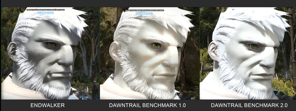
The updated benchmark is harsh on Roegadyn. Above is Endwalker > Benchmark 1.0 > Benchmark 2.0
1.0 is impressively lifelike with softer shadows and what almost could be mistaken as sub-surface scattering and fleshy tones in the cheeks and nose cast shadows (looks like warm bounce light).
Benchmark 2.0's lighting is harsher with a stronger main light and no (or less pronounced) bounce light, resulting in harsher shadows and more angular features. Benchmark 2.0 is almost a step back toward Endwalker vs 1.0.
Beard texture is quite pixelated.
Some pretty bad clipping where the hair meets the beard. If following Endwalker, the beard should be over the hairline where they meet.(7)Last edited by Kanemano; 06-04-2024 at 03:41 AM.
-
06-04-2024 03:38 AM #225Player

- Join Date
- Apr 2024
- Location
- New Gridania
- Posts
- 79
- Character
- Llymlaen Greene
- World
- Cerberus
- Main Class
- Goldsmith Lv 93
I am very glad that the developers took into account the feedback and made corrections. But I only want to speak out for my hyur 1 and I wish I was really happy with this change, but... I got the impression that they have their own artists for each race, and some races do look very similar to the original, and some, in this case I'm talking about hyur 1 and hyur in general, look completely different. It's like they're being created by a new artist, and *I'm not trying to offend developers and artists* he sees these changes and the character differently than the creator of the original race. And he changes the little details that end up changing our characters. I hope they will continue to make changes based on feedback and make us happy :3
(4)Last edited by LlymlaenGreene; 06-04-2024 at 03:42 AM.
-
06-04-2024 03:39 AM #226Player

- Join Date
- May 2012
- Posts
- 57
- Character
- Clouse Sydonis
- World
- Mateus
- Main Class
- Dragoon Lv 91
Thanks for the image feedback on how to post it. As usual, 14 is lacking in information.
I did in other threads but missed it here.
Though honestly a 6 year old could point out the issue of ugly horn shadows messing with the face. I mean really, we shouldn't have to do their job for them.(2)
-
06-04-2024 03:48 AM #227Player

- Join Date
- Dec 2021
- Posts
- 1,474
- Character
- Cid Heiral
- World
- Hyperion
- Main Class
- Dragoon Lv 100
Oh good it's not just me! Originally Posted by Geda
I liked the stronger eyeliner in the outer corner of the eye in the old benchmark, but I understand the changes on the new one are going for a more realistic look, so I suppose I'll get used to it.
Originally Posted by Geda
I liked the stronger eyeliner in the outer corner of the eye in the old benchmark, but I understand the changes on the new one are going for a more realistic look, so I suppose I'll get used to it.
I preferred the old version as well. I added some feedback on this in the JP thread if you'd like to throw your hat in the ring too.(2)
-
06-04-2024 03:57 AM #228Player

- Join Date
- Apr 2024
- Posts
- 44
- Character
- Yasunori Katou
- World
- Phoenix
- Main Class
- Thaumaturge Lv 70
Very satisfied with the lighting and my other characters are looking fabulous, but my mooncat here...

So that's current, old benchmark, new benchmark. I must say it's pretty amazing how such subtle differences can change the look of a character so much. He went from neutral but alert to looking like he traded some brain cells for a leer. I remember many other people giving feedback about losing the only small mouth option for face 1, so I was really hoping for them to leave mouth 4 small. It looks better from some angles and when the cutscene is having the character make a different expression and/or move his mouth, but in the current version I like the neutral expression from all angles, and losing that doesn't feel like an upgrade.(7)
-
06-04-2024 04:00 AM #229Player

- Join Date
- Jul 2015
- Location
- Gridania
- Posts
- 2,680
- Character
- Kacho Nacho
- World
- Coeurl
- Main Class
- White Mage Lv 98
Ah, it wasn't just on the lalafell hair. Everyone's goes from slightly oversharpened to a smudged blob with little change in zoom. Originally Posted by Ath192
Im going to post this here too, more centralized on the general topic.
Originally Posted by Ath192
Im going to post this here too, more centralized on the general topic.
The transition in this hair is WAY too big, as you zoom in things become more defined, I understand that for saving resources, however, with this hair the difference is TOO big, I would make the zoomed out hair a bit more defined than this because I actually do enjoy this style a lot and it won't look as good like this.
Barely zoomed out:

Barely zoomed in:

Maybe an issue with the resolution chosen for the texture map?
Didn't your dad teach you about the birds and the bees? When it's our "special time", we dig deep in the dirt to make a burrow and fall into a deep hibernation. Originally Posted by KonCarne
Is it just me or do lalafell have a weird line around their neck like their head is detachable?
Originally Posted by KonCarne
Is it just me or do lalafell have a weird line around their neck like their head is detachable?
When the time is right, our heads pop off, and over a period of a few months, the discarded head sprouts several new clones, while our body grows a new head. When the process is completed, we all spring up from the earth as a new generation of lalafell with all the knowledge of the original mother brain in ours.(8)Last edited by Kacho_Nacho; 06-04-2024 at 04:39 AM.

-
06-04-2024 04:01 AM #230Player

- Join Date
- Sep 2013
- Posts
- 5
- Character
- Mizuki Mizu
- World
- Shiva
- Main Class
- Black Mage Lv 90
With new lightning, Lalafell got a very visable neckseem, too.
 Please fix it.

 (14)
(14)
 Reply With Quote


Quick Navigation
General Discussion
Top
- Forums
- Japanese Forums
- ニュース
- テクニカルサポート
- 不具合報告
- プロデューサーレター
- ゲームシステム
- クラス&ジョブ
- ウェブサイト/アプリフィードバック
- 雑談
- この装備を武具投影したい!!
- あのジョブのUIレイアウトが知りたい!
- ジェネラルディスカッション
- ワールド(Group JP)
- ワールド(Group NA/EU/OC)
- Sargatanas(LEGACY)
- Balmung(LEGACY)
- Hyperion(LEGACY)
- Excalibur(LEGACY)
- Ragnarok(LEGACY/EU)
- Adamantoise
- Behemoth
- Cactuar
- Cerberus(EU)
- Coeurl
- Goblin
- Malboro
- Moogle(EU)
- Ultros
- Diabolos
- Gilgamesh
- Leviathan
- Midgardsormr
- Odin(EU)
- Shiva(EU)
- Exodus
- Faerie
- Lamia
- Phoenix(EU)
- Siren
- Famfrit
- Lich(EU)
- Mateus
- Brynhildr
- Zalera
- Jenova
- Zodiark
- Omega(EU)
- Louisoix(EU)
- Spriggan(EU)
- Twintania(EU)
- Phantom(EU)
- Sagittarius(EU)
- Alpha(EU)
- Raiden(EU)
- Bismarck(OC)
- Ravana(OC)
- Sephirot(OC)
- Sophia(OC)
- Zurvan(OC)
- Halicarnassus
- Maduin
- Marilith
- Seraph
- 初心者用
- コミュニティイベント
- 開催中
- 終了
- 第8回14時間生放送
- 第68回FFXIVプロデューサーレターLIVE
- 第65回FFXIVプロデューサーレターLIVE
- 第64回FFXIVプロデューサーレターLIVE
- 第60回FFXIVプロデューサーレターLIVE
- 第56回FFXIVプロデューサーレターLIVE
- 第53回FFXIVプロデューサーレターLIVE
- 出張!ひろしチャレンジ 応援プレゼント企画
- 第50回FFXIVプロデューサーレターLIVE
- 第49回FFXIVプロデューサーレターLIVE
- ハウジングコーディネートコンテスト
- 第44回FFXIVプロデューサーレターLIVE
- 第43回FFXIVプロデューサーレターLIVE
- 第42回FFXIVプロデューサーレターLIVE
- 第41回FFXIVプロデューサーレターLIVE
- 第40回FFXIVプロデューサーレターLIVE
- 第39回FFXIVプロデューサーレターLIVE
- 第38回FFXIVプロデューサーレターLIVE
- 第37回FFXIVプロデューサーレターLIVE
- 第35回FFXIVプロデューサーレターLIVE
- ハウジングデコレーションコンテスト
- 第34回FFXIVプロデューサーレターLIVE
- 第33回FFXIVプロデューサーレターLIVE
- 出張FFXIVプロデューサーレターLIVE in LAS VEGAS (2016)
- 髙井浩の○○チャレンジ!応援企画
- 第31回FFXIVプロデューサーレターLIVE
- 紅蓮祭スクリーンショットコンテスト 2016
- 第30回FFXIVプロデューサーレターLIVE
- 第28回FFXIVプロデューサーレターLIVE
- サントラ発売記念!奏天のイシュガルドコンテスト
- 第27回FFXIVプロデューサーレターLIVE
- 星芒祭 4コマスクリーンショットコンテスト
- 第26回FFXIVプロデューサーレターLIVE
- 第25回FFXIVプロデューサーレターLIVE
- パンプキンクッキーコンテスト
- 髪型デザインコンテスト
- 第24回FFXIVプロデューサーレターLIVE
- 第23回FFXIVプロデューサーレターLIVE
- 第22回FFXIVプロデューサーレターLIVE
- エオルゼア百景 in 装備コーディネートコンテスト
- 第21回FFXIVプロデューサーレターLIVE
- 思い出スクリーンショットコンテスト
- フリーカンパニーPRキャンペーン
- 第20回FFXIVプロデューサーレターLIVE
- FFXIVプロデューサーレターLIVE特別編
- ヴァレンティオンデーチョコレートコンテスト
- 闘会議2015 予想イベント
- 降神祭スクリーンショットコンテスト
- 星芒祭スクリーンショットコンテスト
- 第19回FFXIVプロデューサーレターLIVE
- 第18回FFXIVプロデューサーレターLIVE
- 出張FFXIVプロデューサーレターLIVE in LAS VEGAS
- 新生FFXIV キャプションコンテスト
- 紅蓮祭スクリーンショットコンテスト
- 第17回FFXIVプロデューサーレターLIVE
- 新生FFXIV 1周年記念PVコンテスト
- ミラプリ スクリーンショットコンテスト
- 第16回FFXIVプロデューサーレターLIVE
- 第15回FFXIVプロデューサーレターLIVE
- 第14回FFXIVプロデューサーレターLIVE
- エッグハントスクリーンショットコンテスト
- 出張プロデューサーレターLIVE
- 第13回FFXIVプロデューサーレターLIVE
- プリンセスデースクリーンショットコンテスト
- 第12回FFXIVプロデューサーレターLIVE
- 降神祭スクリーンショットコンテスト
- 星芒祭スクリーンショットコンテスト
- ヴァレンティオンデースクリーンショットコンテスト
- フリーカンパニー紹介PVコンテスト
- 第11回FFXIVプロデューサーレターLIVE
- 第10回FFXIVプロデューサーレターLIVE
- 守護天節スクリーンショットコンテスト
- 第9回FFXIVプロデューサーレターLIVE
- 出張プロデューサーレターLIVE in 幕張
- English Forums
- Information
- Technical Support
- Bug Reports
- Letters from the Producer
- Gameplay
- Classes & Jobs
- Feedback
- Community
- General Discussion
- Worlds(Group JP)
- Worlds(Group NA/EU/OC)
- Sargatanas(LEGACY)
- Balmung(LEGACY)
- Hyperion(LEGACY)
- Excalibur(LEGACY)
- Ragnarok(LEGACY/EU)
- Adamantoise
- Behemoth
- Cactuar
- Cerberus(EU)
- Coeurl
- Goblin
- Malboro
- Moogle(EU)
- Ultros
- Diabolos
- Gilgamesh
- Leviathan
- Midgardsormr
- Odin(EU)
- Shiva(EU)
- Exodus
- Faerie
- Lamia
- Phoenix(EU)
- Siren
- Famfrit
- Lich(EU)
- Mateus
- Brynhildr
- Zalera
- Jenova
- Zodiark
- Omega(EU)
- Louisoix(EU)
- Spriggan(EU)
- Twintania(EU)
- Phantom(EU)
- Sagittarius(EU)
- Alpha(EU)
- Raiden(EU)
- Bismarck(OC)
- Ravana(OC)
- Sephirot(OC)
- Sophia(OC)
- Zurvan(OC)
- Halicarnassus
- Maduin
- Marilith
- Seraph
- New Player Help
- Community Events
- Current Events
- Past Events
- Contests and Sweepstakes
- Fan Festival 2023 in London
- 10th Anniversary Mosaic Art Sweepstakes (NA/EU)
- Fan Festival 2023 in Las Vegas
- Ask Your Questions for the PAX East 2023 Q&A
- Crystalline Conflict Community Cup (North America)
- Letter from the Producer LIVE Part LXVIII
- Letter from the Producer LIVE Part LXV
- Letter from the Producer LIVE Part LXIV
- Letter from the Producer LIVE Part LX
- Everything’s on the Line! Screenshot Contest (NA)
- Ask Yusuke Mogi Your Questions for the PAX East 2020 Panel
- “A Star Light Party” Screenshot Contest (EU/PAL)
- Star Companion Screenshot Sweepstakes (NA)
- Letter from the Producer LIVE Part LVI
- “This is All Saints’ Wake” Screenshot Contest (EU/PAL)
- A Glamourous Guise Screenshot Contest (NA)
- Memoirs of Adventure Creative Writing Contest (NA)
- Ask Yoshi-P and Banri Oda Your Questions for the gamescom 2019 Q&A
- Letter from the Producer LIVE Part LIII
- Cosplay Contest at gamescom 2019 (EU)
- Become the Darkness Screenshot Sweepstakes! (NA)
- From Light to Darkness Screenshot Contest (EU/PAL)
- Frights and Delights Comic Contest (EU/PAL)
- Cosplay Contest at Japan Expo 2019 (EU)
- Ogre Pumpkin Carve Off Contest: The REDUX (NA)
- My new Viera and Hrothgar" Twitter Screenshot Contest (NA/EU)
- ”Sea Breeze Celebration” Screenshot Contest (NA)
- An Egg-Squisite Season Screenshot Contest (EU/PAL)
- The Eorzean Interior Design Contest (NA)
- Letter from the Producer LIVE Part XLIX
- Letter from the Producer LIVE Part L
- FLOWERS FOR ALL SCREENSHOT CONTEST
- The Eorzean Interior Design Contest (EU)
- Highlights of the Year Contest (EU)
- Fan Festival 2018 in Las Vegas (NA)
- Starlight Scenarios Comic Contest (NA)
- Fan Festival 2019 in Paris (EU)
- The "As Good As Gold" Screenshot Contest (NA)
- Glamour Extravaganza Contest (EU)
- Letter from the Producer LIVE: E3 2018 Edition
- Letter from the Producer LIVE Part XLIV
- Letter from the Producer LIVE Part XLIII
- The "Be My Valentione!" Creative Writing Contest (NA)
- Letter from the Producer LIVE Part XLII
- Letter from the Producer LIVE Part XLI
- Holiday Greetings Contest (EU)
- Starlight Starbright Screenshot Contest (NA)
- Letter from the Producer LIVE Part XL
- Ogre Pumpkin Carve Off Contest (NA)
- Letter from the Producer LIVE Part XXXIX
- Letter from the Producer LIVE Part XXXVIII
- PAX West 2017 (NA)
- Sightseeing Screenshot Contest! (EU)
- Letter from the Producer LIVE Part XXXVII
- And… Action! (NA)
- The Heavensdub Contest (NA)
- Letter from the Producer LIVE Part XXXV
- House Party Screenshot Contest (EU)
- Bright-Eyed Superstars Contest (NA)
- Letter from the Producer LIVE in Frankfurt (EU)
- Letter from the Producer LIVE Part XXXIV
- Starlight Celebration Haiku Contest (EU)
- Letter from the Producer LIVE Part XXXIII
- The “Eorzean Home Makeover (Extreme)” Contest (NA)
- Fan Festival 2017 (EU)
- Spooky Story Contest (EU)
- Letter from the Producer LIVE in Las Vegas (2016)
- The Rising Screenshot Contest (EU)
- Letter from the Producer LIVE Part XXXI
- "Do You Even /Pose?" Showdown! (NA)
- Fan Festival 2016 (NA)
- Dream Holiday Contest (EU)
- Letter from the Producer LIVE: E3 2016 Edition
- Heavensward Primal Haiku Contest (NA)
- Letter from the Producer LIVE Part XXX
- Letter from the Producer LIVE Part XXIX
- Letter from the Producer LIVE Part XXVIII
- Heavensward Music Contest (NA)
- Heavensward Music Contest (EU)
- Letter from the Producer LIVE Part XXVII
- Starlight Celebration Comic Strip Contest (NA)
- Starlight Celebration Comic Strip Contest (EU)
- Letter from the Producer LIVE Part XXVI
- Airship Components: Research and Development (NA)
- All Saints’ Wake Screenshot Contest (EU)
- Letter from the Producer LIVE Part XXV
- Retainer Ad-Venture Contest (EU)
- Cartographers and Seekers Contest (NA)
- Hairstyle Design Contest
- Letter from the Producer LIVE Part XXIV
- Letter from the Producer LIVE Part XXIII
- Letter from the Producer LIVE Part XXII
- Letter from the Producer LIVE Part XXI
- Memories of Eorzea Screenshot Contest (NA)
- Memories of Eorzea Screenshot Contest (EU)
- Heavensward Free Company Recruitment Contest (NA)
- Heavensward Free Company Recruitment Contest (EU)
- A Realm Redubbed Contest (NA)
- Letter from the Producer LIVE Part XX
- Letter from the Producer LIVE – Special Edition
- The Great Eorzean Cook-Off Contest (EU)
- Be My Valentione Contest (NA)
- Heavensturn Screenshot Contest (NA)
- Heavensturn Screenshot Contest (EU)
- Starlight Celebration Screenshot Contest (NA)
- Starlight Celebration Screenshot Contest (EU)
- Letter from the Producer LIVE Part XIX
- Letter from the Producer LIVE Part XVIII
- Letter from the Producer LIVE in Las Vegas
- Grant a Wish Contest (EU)
- Letter from the Producer LIVE Part XVII
- Moonfire Faire Screenshot Contest (NA)
- Moonfire Faire Screenshot Contest (EU)
- Fan Festival 2014 (NA)
- Fan Festival 2014 (EU)
- FFXIV: ARR One Year Anniversary Video Contest (NA)
- FFXIV: ARR One Year Anniversary Video Contest (EU)
- Letter from the Producer LIVE Part XVI
- Eorzea IRL Contest (NA)
- Letter from the Producer LIVE: E3 Edition
- Letter from the Producer LIVE Part XV
- Letter from the Producer LIVE Part XIV
- Hatching-tide Screenshot Contest (NA)
- Hatching-tide Screenshot Contest (EU)
- Letter from the Producer LIVE Part XIII
- Little Ladies' Day Screenshot Contest (NA)
- Little Ladies' Day Screenshot Contest (EU)
- Valentione's Day Screenshot Contest (NA)
- Valentione's Day Screenshot Contest (EU)
- Letter from the Producer LIVE Part XII
- Heavensturn Screenshot Contest (NA)
- Heavensturn Screenshot Contest (EU)
- Starlight Celebration Screenshot Contest (NA)
- Starlight Celebration Screenshot Contest (EU)
- FFXIV: ARR Free Company Recruitment Contest (NA)
- FFXIV: ARR Free Company Recruitment Contest (EU)
- Letter from the Producer LIVE Part XI
- XIII Days – Your Fate is Sealed Contest (NA)
- Letter from the Producer LIVE Part X
- Doppelganger Screenshot Contest (NA)
- All Saints’ Wake Haiku Contest (EU)
- Letter from the Producer LIVE Part IX
- Ask Your Questions for the Mini Letter from the Producer LIVE at TGS!
- Sightseeing Screenshot Sweepstakes (NA/EU)
- Forums français
- Informations
- Assistance technique
- Rapports de problèmes
- La lettre du producteur
- Système de jeu
- Classes & Jobs
- Avis et retours sur les sites et l’appli
- Discussion
- Discussion générale
- Mondes (Japon)
- Mondes (Amérique du N./Europe/Océanie)
- Sargatanas(LEGACY)
- Balmung(LEGACY)
- Hyperion(LEGACY)
- Excalibur(LEGACY)
- Ragnarok(LEGACY/EU)
- Adamantoise
- Behemoth
- Cactuar
- Cerberus(EU)
- Coeurl
- Goblin
- Malboro
- Moogle(EU)
- Ultros
- Diabolos
- Gilgamesh
- Leviathan
- Midgardsormr
- Odin(EU)
- Shiva(EU)
- Exodus
- Faerie
- Lamia
- Phoenix(EU)
- Siren
- Famfrit
- Lich(EU)
- Mateus
- Brynhildr
- Zalera
- Jenova
- Zodiark
- Omega(EU)
- Louisoix(EU)
- Spriggan(EU)
- Twintania(EU)
- Phantom(EU)
- Sagittarius(EU)
- Alpha(EU)
- Raiden(EU)
- Bismarck(OC)
- Ravana(OC)
- Sephirot(OC)
- Sophia(OC)
- Zurvan(OC)
- Halicarnassus
- Maduin
- Marilith
- Seraph
- Aide aux nouveaux joueurs
- Événements communautaires
- Evénements en cours
- Evénements passés
- Concours et tirages au sort
- Fan Festival 2023 de Londres
- Concours pour la mosaïque du 10e anniversaire
- « La lettre du producteur LIVE » : 68e émission
- « La lettre du producteur LIVE » : 65e émission
- « La lettre du producteur LIVE » : 64e émission
- Concours de captures d’écran d'exploration - Édition 2020
- « La lettre du producteur LIVE » : 60e émission
- Concours de captures d’écran - Une petite fête des étoiles entre amis
- « La lettre du producteur LIVE » : 56e émission
- Concours de captures d’écran – C’est ça la Veillée des Saints
- Mes questions à Yoshi-P et Banri Oda pour le Q&R de gamescom 2019 !
- « La lettre du producteur LIVE » : 53e émission
- Concours de cosplay à la gamescom 2019
- Concours de captures d’écran : De la Lumière aux Ténèbres
- Concours Pistolame à Japan Expo 2019 !
- Concours de Cosplay à Japan Expo 2019
- « Ma Viéra & mon Hrothgar » - Concours Twitter de capture d'écran
- Fabulœuf concours de captures d’écran
- « La lettre du producteur LIVE » : 50e émission
- « La lettre du producteur LIVE » : 49e émission
- Concours des meilleurs moments de l'année 2018
- Concours de BD’pouvante
- Concours de décoration d’intérieur
- Fan Festival 2019 à Paris
- Concours “Les dieux de la mode”
- « La lettre du producteur LIVE » : 44e émission
- « La lettre du producteur LIVE » : 43e émission
- « La lettre du producteur LIVE » : 42e émission
- « La lettre du producteur LIVE » : 41e émission
- Concours de cartes de vœux
- « La lettre du producteur LIVE » : 40e émission
- « La lettre du producteur LIVE » : 39e émission
- « La lettre du producteur LIVE » : 38e émission
- Concours de captures d’écran d’exploration
- « La lettre du producteur LIVE » : 37e émission
- « La lettre du producteur LIVE » : 35e émission
- Concours de captures d’écran spécial « House Party »
- Lettre du producteur LIVE à Francfort
- « La lettre du producteur LIVE » : 34e émission
- Concours de haïkus pour la fête des étoiles
- « La lettre du producteur LIVE » : 33e émission
- Concours d’histoires effrayantes
- Posez vos questions pour la lettre Live à Las Vegas (2016)
- Concours de captures d’écran pour la fête de la Commémoration
- « La lettre du producteur LIVE » : 31e émission
- Concours office de tourisme d’Éorzéa
- « La lettre du producteur LIVE » : 30e émission
- « La lettre du producteur LIVE » : 29e émission
- « La lettre du producteur LIVE » : 28e émission
- Concours de musique d’Heavensward
- « La lettre du producteur LIVE » : 27e émission
- Concours de comic strip pour la fête des étoiles
- « La lettre du producteur LIVE » : 26e émission
- Concours de captures d’écran pour la Veillée des saints
- « La lettre du producteur LIVE » : 25e émission
- Concours « Les aventures de mon servant »
- Concours de création de coupe de cheveux
- « La lettre du producteur LIVE » : 24e émission
- « La lettre du producteur LIVE » : 22e émission
- « La lettre du producteur LIVE » : 23e émission
- Concours de captures d’écran – Souvenirs d’Éorzéa
- Les compagnies libres recrutent pour Heavensward
- « La lettre du producteur LIVE » : 20e émission
- La lettre du producteur LIVE : émission spéciale
- Le grand concours culinaire d’Éorzéa
- Concours de captures d’écran pour la fête de la transition
- Concours de captures d’écran pour la fête des étoiles
- « La lettre du producteur LIVE » : dix-huitième émission
- Posez vos questions pour la lettre Live à Las Vegas
- Concours « Le jeu des souhaits »
- « La lettre du producteur LIVE » : 19e émission
- Fan Festival 2014
- Concours de captures d’écran pour les feux de la mort
- « La lettre du producteur LIVE » : dix-septième émission
- Concours vidéo pour le premier anniversaire
- « La lettre du producteur LIVE » : seizième émission
- « La lettre du producteur LIVE » : quinzième émission
- « La lettre du producteur LIVE » : quatorzième émission
- Concours de captures d’écran pour la chasse aux Prœufs
- « La lettre du producteur LIVE » : treizième émission
- Concours de captures d’écran pour la fête des demoiselles
- « La lettre du producteur LIVE » : douzième émission
- Concours de captures d’écran pour la fête de la transition
- Concours de captures d’écran pour la fête des étoiles
- Concours de captures d’écran pour la Valention
- Les compagnies libres recrutent
- « La lettre du producteur LIVE » : onzième émission
- « La lettre du producteur LIVE » : dixième émission
- Concours Haiku d'Éorzéa - la Veillée des saints
- « La lettre du producteur LIVE » : neuvième émission
- Posez vos questions pour la lettre Live à Makuhari
- Deutsches Forum
- Ankündigungen
- Technischer Support
- Fehler melden
- Briefe des Produzenten
- Spielsystem
- Charakterklassen & Jobs
- Feedback
- Diskussionen
- Allgemeine Diskussionen
- Welten(Group JP)
- Welten(Group NA/EU/OC)
- Sargatanas(LEGACY)
- Balmung(LEGACY)
- Hyperion(LEGACY)
- Excalibur(LEGACY)
- Ragnarok(LEGACY/EU)
- Adamantoise
- Behemoth
- Cactuar
- Cerberus(EU)
- Coeurl
- Goblin
- Malboro
- Moogle(EU)
- Ultros
- Diabolos
- Gilgamesh
- Leviathan
- Midgardsormr
- Odin(EU)
- Shiva(EU)
- Exodus
- Faerie
- Lamia
- Phoenix(EU)
- Siren
- Famfrit
- Lich(EU)
- Mateus
- Brynhildr
- Zalera
- Jenova
- Zodiark
- Omega(EU)
- Louisoix(EU)
- Spriggan(EU)
- Twintania(EU)
- Phantom(EU)
- Sagittarius(EU)
- Alpha(EU)
- Raiden(EU)
- Bismarck(OC)
- Ravana(OC)
- Sephirot(OC)
- Sophia(OC)
- Zurvan(OC)
- Halicarnassus
- Maduin
- Marilith
- Seraph
- Für Einsteiger
- Community-Veranstaltungen
- Aktuelle Veranstaltungen
- Vergangene Veranstaltungen
- Wettbewerbe und Gewinnspiele
- Mosaik-Gewinnspiel zum 10. Jubiläum
- Fan Festival 2023 in London
- Der 68 Teil des „FINAL FANTASY XIV Produzentenbriefs LIVE”
- Der 65 Teil des „FINAL FANTASY XIV Produzentenbriefs LIVE”
- Der 64 Teil des „FINAL FANTASY XIV Produzentenbriefs LIVE”
- Reisetagebuch-Screenshot-Gewinnspiel
- Der 60. Teil des „FINAL FANTASY XIV Produzentenbriefs LIVE”
- Sternenlichtertrupp-Screenshot-Wettbewerb
- Der 56. Teil des „FINAL FANTASY XIV Produzentenbriefs LIVE”
- Allerschutzheiligen Schauer-Spektakel-Screenshot-Wettbewerbs
- Eure Fragen an Naoki Yoshida und Banri Oda für die Q&A-Session auf der gamescom 2019
- Der 53. Teil des „FINAL FANTASY XIV Produzentenbriefs LIVE”
- Cosplay-Wettbewerb auf der gamescom 2019
- Vom Licht in die Dunkelheit Screenshot-Wettbewerb
- Cosplay-Wettbewerb auf der Japan Expo 2019
- „Viera & Hrothgar Makeover“ Twitter-Screenshot-Wettbewerb
- Wundereiersuche Screenshot-Wettbewerb
- Der 50. Teil des „FINAL FANTASY XIV Produzentenbriefs LIVE”
- Der 49. Teil des „FINAL FANTASY XIV Produzentenbriefs LIVE”
- Highlights des Jahres Wettbewerb
- Spuk und Schabernack Comic-Wettbewerb
- Inneneinrichtungs-Wettbewerb
- Fan Festival 2019 in Paris
- Extravaganza-Wettbewerb
- Der 44. Teil des „FINAL FANTASY XIV Produzentenbriefs LIVE”
- Der 43. Teil des „FINAL FANTASY XIV Produzentenbriefs LIVE”
- Der 42. Teil des „FINAL FANTASY XIV Produzentenbriefs LIVE”
- Der 41. Teil des „FINAL FANTASY XIV Produzentenbriefs LIVE”
- Wintergrüße-Wettbewerb
- Der 40. Teil des „FINAL FANTASY XIV Produzentenbriefs LIVE”
- Der 39. Teil des „FINAL FANTASY XIV Produzentenbriefs LIVE”
- Der 38. Teil des „FINAL FANTASY XIV Produzentenbriefs LIVE”
- Sightseeing-Screenshot-Wettbewerb
- Der 37. Teil des „FINAL FANTASY XIV Produzentenbriefs LIVE”
- Der 35. Teil des „FINAL FANTASY XIV Produzentenbriefs LIVE”
- House Party! Screenshot-Wettbewerb
- Brief des Produzenten LIVE in Frankfurt
- Der 34. Teil des „FINAL FANTASY XIV Produzentenbriefs LIVE”
- Sternenlichtfest Haiku-Wettbewerb
- Der 33. Teil des „FINAL FANTASY XIV Produzentenbriefs LIVE”
- Gruselgeschichten-Wettbewerb
- Stellt eure Fragen für den Brief des Produzenten – Live in Las Vegas (2016)
- Fest der Wiedergeburt Screenshot-Wettbewerb
- Der 31. Teil des „FINAL FANTASY XIV Produzentenbriefs LIVE”
- Traumurlaub-Wettbewerb
- Der 30. Teil des „FINAL FANTASY XIV Produzentenbriefs LIVE”
- Der 29. Teil des „FINAL FANTASY XIV Produzentenbriefs LIVE”
- Der 28. Teil des „FINAL FANTASY XIV Produzentenbriefs LIVE
- Heavensward Musik-Wettbewerb
- Der 27. Teil des „FINAL FANTASY XIV Produzentenbriefs LIVE
- Sternenlichtfest Comicstrip-Wettbwerb
- Der 26. Teil des „FINAL FANTASY XIV Produzentenbriefs LIVE
- Allerschutzheiligen-Fest Screenshot-Wettbewerb
- Der 25. Teil des „FINAL FANTASY XIV Produzentenbriefs LIVE
- Die Abenteuer des Tapferen Gehilfen–Wettbewerb
- Frisuren-Design-Wettbewerb
- Der 24. Teil des „FINAL FANTASY XIV Produzentenbriefs LIVE
- Der 22. Teil des „FINAL FANTASY XIV Produzentenbriefs LIVE
- Der 23. Teil des „FINAL FANTASY XIV Produzentenbriefs LIVE
- Erinnerungen an Eorzea Screenshot-Wettbewerb
- Heavensward-Rekrutierungswettbewerb der freien Gesellschaften
- Der 20. Teil des „FINAL FANTASY XIV Produzentenbriefs LIVE
- Brief des Produzenten – LIVE-Sondersendung!
- Großer, eorzäischer Kochwettbewerb
- Himmelswende Screenshot Wettbewerb
- Sternenlichtfest Screenshot-Wettbewerb
- Der 18. Teil des „FINAL FANTASY XIV Produzentenbriefs LIVE
- Stellt eure Fragen für den Brief des Produzenten – Live in Las Vegas
- Wünsche werden wahr- Wettbewerb
- Der 19. Teil des „FINAL FANTASY XIV Produzentenbriefs LIVE
- Fan Festival 2014
- Feuermond-Reigen Screenshot-Wettbewerb
- Der 17. Teil des „FINAL FANTASY XIV Produzentenbriefs LIVE
- Video-Wettbewerb zum einjährigen Jubiläum
- Der 16. Teil des „FINAL FANTASY XIV Produzentenbriefs LIVE
- Der 15. Teil des „FINAL FANTASY XIV Produzentenbriefs LIVE
- Der 14. Teil des „FINAL FANTASY XIV Produzentenbriefs LIVE
- Wundereiersuche Screenshot-Wettbewerb
- Der 13. Teil des „FINAL FANTASY XIV Produzentenbriefs LIVE
- Prinzessinnenfest Screenshot-Wettbewerb
- Valentiontag Screenshot Wettbewerb
- Der 12. Teil des „FINAL FANTASY XIV Produzentenbriefs LIVE
- Himmelswende Screenshot Wettbewerb
- Sternenlichtfest Screenshot Wettbewerb
- Rekrutierungsvideo-Wettbewerb der Freien Gesellschaften
- Der 11. Teil des „FINAL FANTASY XIV Produzentenbriefs LIVE
- Der 10. Teil des „FINAL FANTASY XIV Produzentenbriefs LIVE
- Allerschutzheiligen-Haiku-Wettbewerb
- Der 9. Teil des „FINAL FANTASY XIV Produzentenbriefs LIVE
- Stellt eure Fragen für den Brief des Produzenten – Live in Makuhari!
- Version 1.0 Forum Archive
- Japanese Forums
- インフォメーション
- サポート
- アップデート
- ゲームシステム
- クラス&ジョブ
- ウェブサイトフィードバック
- 雑談
- 初心者用
- 写真館
- コミュニティイベント
- 開催中
- 終了
- ファイナルファンタジーXIV: 新生エオルゼア キャッチフレーズコンテスト
- 第8回FFXIVプロデューサーレターLIVE
- 出張FFXIVプロデューサーレターLIVE in LA
- 第7回FFXIVプロデューサーレターLIVE
- 第6回FFXIVプロデューサーレターLIVE
- 創作タマゴコンテスト
- 第5回FFXIVプロデューサーレターLIVE
- マイ ベスト チョコボ
- ダラガブを探せ!
- エオルゼア メモリーズ
- 第4回FFXIVプロデューサーレターLIVE
- エオルゼア de 五・七・五
- 第3回FFXIVプロデューサーレターLIVE
- 残暑見舞いコンテスト
- Hidden Artifacts ~新生コンセプトアートクイズ~
- ガルーダトライアル
- 宿屋deつぶやき!イベント (JP)
- LSリクルートポスターコンテスト (JP)
- English Forums
- Information
- Support
- Updates
- Gameplay
- Classes & Jobs
- Feedback
- Community
- New Player Help
- In-Game Media
- Community Events
- Current Events
- Past Events
- Letter from the Producer LIVE Part VIII
- Letter from the Producer LIVE Part VII
- Letter from the Producer LIVE Part VI
- Eorzean Egg Decoration Contest
- Letter from the Producer LIVE Part V
- Eorzea Haiku Contest (EU)
- “Chocobos Rule the World” Contest!
- Memories of Eorzea Contest
- Letter from the Producer LIVE Part IV
- What if Dalamud Contest (EU)
- Tales from Eorzea (NA)
- Culinary Creation Contest (EU)
- Letter from the Producer LIVE Part III
- We Dub to Make it Ours (NA)
- These Grand Company Colors Don't Run!
- Hidden Artifacts
- Grant A Wish Contest (EU)
- Garuda—She's Like the Wind
- Culinary Creation Contest (NA)
- Valentione’s Dialogue Contest (EU)
- Valentione’s Day Love Letter Contest (NA)
- Forums français
- Informations
- Assistance sur le jeu
- Développement
- Système de jeu
- Classes & Jobs
- Avis et retours
- Discussion
- Aide aux nouveaux joueurs
- Galerie multimédia & articles
- Evénements organisés par l'équipe communautaire
- Evénements en cours
- Evénements passés
- « La lettre du producteur LIVE » : huitième émission
- « La lettre du producteur LIVE » : septième émission
- « La lettre du producteur LIVE » : sixième émission
- Concours : « Décoration d’Œufs Éorzéens »
- « La lettre du producteur LIVE » : cinquième émission
- Concours « Haïkus d’Eorzéa »
- Concours « Les Chocobos à la Conquête du Monde » !
- Concours « Souvenirs d’Eorzéa »
- « La lettre du producteur LIVE » : quatrième émission
- Concours : « Et si Dalamud était... »
- Concours de création culinaire
- « La lettre du producteur LIVE » : troisième émission
- Soutenons les grandes compagnies !
- Questions pour un Eorzéen
- Concours du jeu des souhaits
- L’épreuve de Garuda
- Concours de dialogue de la Valention
- Deutsches Forum
- Ankündigungen
- Support
- Update
- Spielsystem
- Charakterklassen & Jobs
- Feedback
- Diskussionen
- Für Einsteiger
- Medien
- Community-Veranstaltungen
- Aktuelle Veranstaltungen
- Vergangene Veranstaltungen
- Der 8. Teil des „FINAL FANTASY XIV Produzentenbriefs LIVE
- Der 7. Teil des „FINAL FANTASY XIV Produzentenbriefs LIVE
- Der 6. Teil des „FINAL FANTASY XIV Produzentenbriefs LIVE
- Eorzäischer Ei-Dekorations-Wettbewerb
- Der 5. Teil des „FINAL FANTASY XIV Produzentenbriefs LIVE“
- Eorzea-Haiku-Wettbewerb
- Chocobos, die Herrscher der Welt
- Erinnerungen an Eorzea
- Der 4. Teil des „FINAL FANTASY XIV Produzentenbriefs LIVE“
- Was, wenn Dalamud … wäre?
- Kulinarische Kreationen
- Der 3. Teil des „FINAL FANTASY XIV Produzentenbriefs LIVE“
- Farben, die nicht die Segel streichen!
- Verborgene ARTefakte
- Wünsche werden wahr-Wettbewerb
- Garuda – Grausame Herrin der Stürme
- Valentione Dialog-Wettbewerb
- Japanese Forums
«
Previous Thread
|
Next Thread
»


