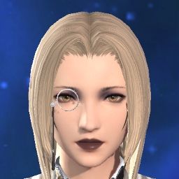
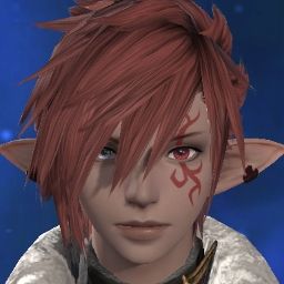
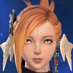
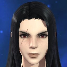
I'm still working on my cumulative feedback post, but this is something I took note of as well. Some of the most drastic changes to F midlander face 1, such as the smaller and more rounded jaw, doubly-long lashes, smaller philtrum, and much more triangular nose, all seem like attempts to make the face appear more traditionally feminine and "pretty". What we were promised was that the aim of the update would be to preserve the looks we know, but that simply isn't what happened, and it's clear that the intention was to make sweeping aesthetic changes to suit the artists' individual preferences, such as "beautifying" female characters. And I'm sorry, but that just should not have happened. I don't want my character to be given facial reconstruction surgery to look more feminine, I loved her exactly how she was, as did many people who used the same face.
Dev. Posts
Hybrid View
-
07-17-2024 01:24 AM #1Player
- Join Date
- Oct 2022
- Posts
- 223
- Character
- Mara Sagegrove
- World
- Faerie
- Main Class
- Dark Knight Lv 100
(19)
-
07-17-2024 05:50 AM #2
I really look forward to your feedback post!
You took the words right out of my mouth; it really does seem like the artists used the update as an opportunity to tweak the faces to fit a specific preference instead of faithfully recreating the tried-and-true originals.
And in the case of face 1, I actually think they made it less beautiful in a mature sense and more neotenous, as if to suit modern asian beauty trends. My character looks like she's from a korean MMO now; which is not to say it's a look without an appeal in its own right, but is to say that it's not what I chose the face for, and it should have been added separately as a new face #6 or something. I feel like a broken record given how much people have asked for options instead of replacements, but it really can't be said enough.
Yes. We could go on forever about all the ways the altered features changed the nature of the faces, and we're all going to get slightly different impressions from them, but what remains constant is that they are just too different from the originals. We were lead to believe something opposite to what the devs delivered.
I would love if they'd restore the original characteristics to the existing face features, and then add the altered ones as new options, because some of them do look nice...just not appropriate as replacements.(27)
-
07-18-2024 12:48 AM #3Player
- Join Date
- Mar 2019
- Location
- Limsa Lominsa
- Posts
- 61
- Character
- Eura Waska
- World
- Phoenix
- Main Class
- Black Mage Lv 93
Something else in regards to this update I particularly can't wrap my head around is which races got the subsurface scattering on their ears and which did not. To my current knowledge, only elezen and raen au ra* (your guess why is as good as mine) have it enabled. Other races that should have the effect, namely lalafell, miqo'te, viera, do not.
*My female raen au ra has it and so does every female raen face, but I can't tell if all the other au ra combinations do not have it or if it's more subtle.
Another thing that bothers me a lot which I would like to add in regards to this particular topic is that they've basically bleached the female raen scales and horns in an attempt to further "beautify" them (read: butcher). I was under the impression the horns were basically bone, which are naturally more yellow. Male au ra did not get this treatment.
I desperately hope they are reading feedback and taking notes. Too many inconsistencies and errors despite what was promised. The update is a mess and the shiny new lighting will not cover that up to those who bother to look closer.(12)
-
07-18-2024 01:23 AM #4Player
- Join Date
- Jul 2015
- Posts
- 3,378
- Character
- Endris Caemwynn
- World
- Coeurl
- Main Class
- Gunbreaker Lv 100
I think viera ears had it in the first benchmark, but it was very buggy with some ears in some lighting and caused the interiors to glow white. I assume it was removed as a stopgap, but who knows whether or not it'll get fixed and added again.
Do you have a comparison? I noticed that they added the pink accents that Yugiri's horns have(but not the ones her scales have), but the color seems consistent to me otherwise.
 (6)
(6)
-
07-16-2024 04:16 PM #5Player
- Join Date
- Sep 2013
- Posts
- 145
- Character
- Argantaelle Frilaix
- World
- Aegis
- Main Class
- White Mage Lv 50
Please bear with me one more time
 FFXIV has been such a huge part of my life. I've been playing the game (in and out) for more than 10 years, and since 2016 I almost never cancelled my sub (even during the last year, when I couldn't play due to real-time issues and stopped raiding completely).
The main problem is that I literally have no options. I created my main character (a male Au Ra) with the intention of creating a friendly, curious, and compassionate character. It wasn't an easy task, haha. Unfortunately, after the update, all the features that created this gentle and friendly facial expression are gone. All three younger faces (1-3) are affected; they all look the same now, as if the character is even more dead inside, arrogant, and disgusted than a usual male Au Ra. Even if the eye shape remained the same, they changed the size of the pupils, darkened the whites in the eyes, changed eyebrows (they are all frowning now), and changed the shape of the mouth.
If I could find a good option across all 3 faces, I'd correct the appearance of my character with the help of free fantasia and be more or less content. But there is literally nothing for me to choose from.
Sorry, it seems like there are too many of my rants in this thread.(25)
-
07-16-2024 04:30 PM #6Player
- Join Date
- Jul 2018
- Location
- Gridania
- Posts
- 67
- Character
- Ypatia Omega
- World
- Tonberry
- Main Class
- Scholar Lv 100
They ruined my right miqo'te eye

Now it has an attitude problem. I̶'l̶l̶ u̶p̶d̶a̶t̶e̶ w̶i̶t̶h̶ w̶h̶i̶c̶h̶ e̶y̶e̶ w̶h̶e̶n̶ t̶h̶e̶ s̶e̶r̶v̶e̶r̶s̶ a̶r̶e̶ l̶i̶v̶e̶ a̶g̶a̶i̶n̶. Keeper of the moon, eye shape type 4.(8)Last edited by Lethros; 07-16-2024 at 09:23 PM. Reason: had to check which eye shape
-
07-16-2024 06:40 PM #7Player
- Join Date
- Nov 2017
- Posts
- 14,253
- Character
- Aurelie Moonsong
- World
- Bismarck
- Main Class
- Red Mage Lv 100
The thing is, these are clearly not as close as possible, and in ways that are hard to comprehend how it could go so wrong if they were doing their best to be accurate.
Another thing that instantly stands out to me is nose shapes. They're both more triangular and the side segments are bulbous instead of relatively flat-sided.
I've said before, but I've had the exact same issue. My Au Ra was a sweetheart with a gorgeous smile; he looks so harsh now and has a downturned mouth that not even the smile emotes will fix – the line of the mouth curls up at the edges in an unconvincing way and the downward creases at the corners of the mouth remain downward outside of the smile.(22)
-
07-16-2024 07:21 PM #8Player
- Join Date
- Oct 2022
- Location
- Radz-at-Han
- Posts
- 433
- Character
- R'vhen Tia
- World
- Excalibur
- Main Class
- Dancer Lv 100
First of all, I agree with the entirety of your original post! So well said. But this bit right here really can't be emphasized enough, in my opinion. Every face, every facial feature, deserves due attention and reevaluation. Please do not ignore these in favor of the complaints of the vocal/visible majority. Not all of us have the skill with words or the technical know-how to make detailed posts and diagrams, but it would be as simple as comparing each customization option, before and now, to see where and how each update strayed.
I understand that this is easier said than done; it's tedious work, and of course the devs should prioritize common criticisms first -- and of course it's easier to address those criticisms given in detail. But again, I believe many of these issues are self-evident when given their due diligence. Many posters here have proven it's often as simple as providing side-by-side comparisons or GIFs.(31)
-
07-17-2024 06:38 AM #9
So I finally got my hands on the Endwalker Benchmark which allowed me to take some more detailed before/after pictures in the character creator instead of having to reenact random screenshots.
This gif is what came of it, highlighting the changes to Au Ra Face 2 (Shape 2, Eyes 3, Nose 3, Mouth 1). The most obvoius ones are, as others have already pointed out in this thread, the change to eye shape, making it narrower on the vertical axis and wider on the horizontal, and the change to mouth shape, making especially the lower lip more narrow and mostly getting rid of the "dimples" at the corner of the mouth.
The change to eyes 3 can be kind of mitigated by switching to eyes 1, which are way closer to how eyes 3 used to be in EW, the mouth changes however, cannot.
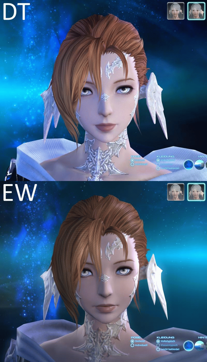
Disregard the change in skin tone here, as it seems to be an issue with the EW Benchmark. Ingame the skin tone has not changed between EW and DT.(21)
-
07-17-2024 08:51 AM #10
I have to wade back into this thread to leave some character feedback.
As I've posted before, I'm largely content with the update and I think Face 1 turned out great except for this weird issue with the lips which I've been leaving feedback on since the first benchmark. I finally got to see the raw textures themselves and I am astounded at how the artist could have arrived at this result when referencing the original.
For reference, here is the root issue. Right click and open in a new tab for the full view.

The old model's lips looked like a normal pair of lips.
The new model has the following issues:
1. The lower lip has been separated into two sections, one very dark and one light. The divider between them is very solid and harsh. I have never seen a lip that looks like this in my life. It looks like someone took their thumb and somehow wiped off the lower half of her bottom lip.
2. The lower lip has a horizontal white line going through it which I assume was an attempt at a highlight but it just looks drawn on with a white pencil. That whole section looks very muddy and reads poorly.
3. The top lip has a weird inverted white triangle which I think was an attempt to highlight the shape there, but again it just looks like it was drawn on with a white pencil. It does not exist on the original lips.
This all combines to make a very bizarre looking end result. Sometimes it looks okay when the light hits it in a way that blends that all together, but that's just the light covering for poor texture work.
Here is the actual texture for that face.

As you can see, it's a total mess of light chunks, dark chunks, and mottled lines running through it. It looks like the artist did their rough outline of the texture and just left it at that.
Compare that to the other female highlander faces:


The lip borders are clearly defined, the lip shading is blended into the rest of the lip, and the highlights are subtle, there are no random mottled lines.
I know every artist is going to have their own interpretation of something but I'm struggling to imagine how the artist could look at the original and come to this conclusion, especially when the rest of the face looks pretty great and no other face shares this problem. It looks absolutely ridiculous in cutscenes, it's all I can look at.
What I would like to see changed:
1. Blend out the bottom lip so it matches the original!!
2. Improve the white highlights so they look less drawn on, especially the weird white triangle on the upper lip which should be removed entirely or made extremely subtle. Again it does not exist on the original lips so I don't know why it's there.
PS: If anyone has the raw texture for face 1 highlander from the original models I'd love to see it for comparison.(15)Last edited by CidHeiral; 07-17-2024 at 10:09 AM.


 Reply With Quote
