First of all, a very big thank you to the entire development team for all the hard work and effort they are putting into this! I appreciate the dedication and attention to detail.
Regarding the specific feedback on Female Miqo'te, Face #3, Eye #3, Mouth #4, I've tried to make my comments as clear and constructive as possible in the hopes that they will be useful.
Overall impression on the new benchmark
I think the new benchmark is a big improvement, the lighting is much better, the colors are more vibrant, and the facial details are much more defined. I think a few small tweaks to some details and some adjustments to the shadows would improve it even more.
https://imgur.com/a/slAljby
Female Miqo'te Face #3 + Eye #3
https://imgur.com/a/jKTCOfJ
Eye Shape: The shape of the eye in the new version appears more rounded above, giving the impression that the character is keeping their eyes wide open. In the original graphic, the eye had a more relaxed and focused expression.
Lash Length Variation: In the original graphic, the upper lashes were shorter near the inner corner of the eye and became longer near the outer corner. In the new version, the upper lashes are more even, with the lashes being slightly longer near the inner corner and shorter toward the outer corner. I think that this change in lash length variation contributes to the strange expression in the new version.
Upper lashes meet the skin: In the original graphic, the black line where the upper lashes meet the skin is thicker, creating a smooth gradient effect. In contrast, the new version shows a sharp transition between the upper lashes and the upper lid, resulting in a distinct thin black line. IMPORTANT: This issue is not present in the first benchmark (1.0), where the upper lashes correctly meet the skin, achieving the intended effect perfectly in my opinion.
Eyelid Shape: The inner part of the eyelids (skin that forms the eye socket) appears significantly thicker in the new version. This increased thickness sometimes fails to follow the natural shape of the eye (maybe the eyeball model was positioned slightly more inward than before?) As a result, the eye appears slightly smaller in the new version. Additionally, this altered shape creates a strange effect when viewed from certain angles.
Overall Expression: The cumulative changes to the eyelid thickness, lash color, and lash length variation give the impression that the character in the new version is keeping their eyes wide open. In contrast, she has a more relaxed and focused expression in the original graphics.
-
06-05-2024 03:46 AM #1Player
- Join Date
- Oct 2017
- Location
- Gridania
- Posts
- 14
- Character
- Erika Diantha
- World
- Lich
- Main Class
- White Mage Lv 100
Benchmark 1.1 for 7.0: Feedback on Female Miqo'te Face #3, Eye #3, Mouth #4
(18)Last edited by Erika23; 06-05-2024 at 03:57 AM.
-
06-05-2024 03:47 AM #2Player

- Join Date
- Oct 2017
- Location
- Gridania
- Posts
- 14
- Character
- Erika Diantha
- World
- Lich
- Main Class
- White Mage Lv 100
Part 2
Female Miqo'te Face #3 + Mouth #4

https://imgur.com/a/7oPua9n
Mouth Shape: The mouth shape in the new version is generally good and similar to the original, with only a few minor adjustments needed. From the side, it is already perfect in my opinion. From the front, the median tubercle should be more pointed downward, resembling a V shape.
Mouth Seam: The seam of the mouth in the original version appeared darker and more pronounced due to the color of the texture. This added depth and definition to the mouth.
Mouth Corners: The corners of the mouth in the new version are slightly too prominent. This is noticeable both in well-lit conditions and in full shadow. While I don't think the corners should be completely removed, as they add depth to the character, I believe they should be less pronounced. I edited one picture to reduce the prominence of the corners and made the seam darker.
Mouth Shadows: Overall, I appreciate the improved appearance of the shadows around the new mouth compared to the original version. However, I think the dark area around the mouth corners requires adjustment to achieve a more balanced look.
When comparing the new version to the first benchmark (1.0), the colors were overall duller, I like the colors way more in the new benchmark (1.1), but the shadows around the mouth looked slightly softer.
Thank you so much for your hard work! <3(17)Last edited by Erika23; 06-05-2024 at 03:57 AM.
-
06-06-2024 12:33 AM #3Player

- Join Date
- Aug 2019
- Location
- Gridania
- Posts
- 4
- Character
- Himari Kaname
- World
- Shiva
- Main Class
- White Mage Lv 90
Thank you for posting this

The new benchmark update looks amazing but I'm not so happy with the mouth corners and shadows right now. I'm also using mouth #4.
Hope they'll see this (6)
(6)Last edited by Yumiru; 06-06-2024 at 09:25 PM.
-
06-06-2024 07:06 AM #4Player
- Join Date
- Jun 2024
- Location
- Gridania
- Posts
- 1
- Character
- K'lyha Yorha
- World
- Raiden
- Main Class
- Bard Lv 89
Face #3 and Mouth #4 here also,
Your analysis is really good, the edited version of the mouth corners would be a blessing!
I liked the way the skin was rendered in the first benchmark though, it looks like they were using some sort of subsurface scattering that was softening these shading effects, and mouth corners were less (but slightly) visible:

(current game, benchmark #1.0, benchmark #1.1)
The overall look was more organic and I think it looked better during the benchmark cinematics, like here https://imgur.com/GS7C3l8 or here https://imgur.com/CxUmd1R (benchmark #1.0 on the left, #1.1 on the right).
But the "hard" rendering of the new benchmark accuentuates too much those dimples, as you said, and shadows in general (light exposure and sun position might not help). I don't know why they rolled back and removed all SSS effects or if it was a consequence of the wrong normals we have heard about, but an intermediate value should be possible to get a soft and more natural shading.
Geometry was changed to something higher res, but the mouth corners were already that deep before. The new improved shaders are just highlighting something that was probably not computed until now:

I would love this part to be reworked a little to soften the renderering !
For the eyes (eyes #6 here), you pointed out the exact thing I was not able to describe : they seem to be forced to keep their eyes open! Combined with this weird mouth, my Miqo'te seems to have taken some really good catnip...
Hope that with some additional work, it would be nearly perrrfect !
[Edit with Dawntrail Release:]
Well, the mouth is quite good now!

Eyes are not as bad as before but they might not have been changed, so I assume the mouth was really the big part that made the face so strange.(7)Last edited by KlyhaYorha; 06-29-2024 at 01:53 AM. Reason: dawntrail release!
-
06-06-2024 07:27 AM #5
Yes, please fix the huge dimple shadows. It's too much
 (11)
(11)
-
06-07-2024 08:42 PM #6
Thank you so much for going in depth, I love Eye 3 and am so sad to see it be completely rounded out like this
(4)
-
06-28-2024 01:28 AM #7Player
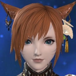
- Join Date
- Jan 2015
- Location
- Ul'dah
- Posts
- 10
- Character
- Emiko Kitska
- World
- Phoenix
- Main Class
- Arcanist Lv 90
Female Moon Miqo'te - Face #3, Eye #4, Mouth # 4
Hello! This is my first proper post in a really long time so here's hoping I can get the hang of the formatting!
I just want to give acknowledgement to OP for their hard work as it inspired me to create my own similar feedback images. Whilst I use different eyes and I am a Moon Miqo'te, I do use the same face and lips so I felt this was the most appropriate place to post my feedback.
I also wish to give my thanks to the development team for their hard work, I know that this must have been a momentous undertaking. My feedback comes from a place of love for my character and the game. I've been looking at her face since 1.0, so I feel I'm sensitive to even the most minor of changes! Thank you for listening to our feedback so far and for all the changes you have implemented!(1)
-
06-28-2024 01:29 AM #8Player

- Join Date
- Jan 2015
- Location
- Ul'dah
- Posts
- 10
- Character
- Emiko Kitska
- World
- Phoenix
- Main Class
- Arcanist Lv 90
Face #3 + Eye #4

https://imgur.com/a/ADi0Szt
Eye Shape
Section 1
Whilst not as pronounced as Eye #3, I also feel that the eye shape has changed for Eye # 4 and I have to agree that there is a roundness to the shape that wasn't present before. I can recognise that this might be due to the updated graphics, but I personally prefer the shape of the EW eyes (more angular, sharper etc.)
Eyelid Shape
Sections 1, 3, 4
Similar to OP, I also noticed that the eyelid skin is significantly thicker and a change I do not personally prefer. I also agree to the possibility that the eyeball must have been positioned differently, as you can notice that the inner corner white area of the eyeball is similar in both Benchmarks, but I recognise this might be due to the defining of the inner corner area
Noted by the small arrow in Section 4, the inner corner skin is also notable triangular and is angled down
Lashes
Section 2
You can see in 6.0 vs BM 1+2 we are missing lower lashes compared to EW
Section 3
There also appears to be a loss of lashes compared to EW but I can recognise that might be due to graphics and/or the angle
Section 4
The general length of the lashes look a lot more fuller and keep uniform shape - I am undecided which I prefer but I know the Benchmark lashes give me the feeling of really thick false eyelashes (this might be just a personal preference/issue though)
Upper Lashes
Sections 2 and 4
Similar to what OP said, I noticed that they way the lashes are connected to the upper eyelid looked a lot better in BM 1, compared to BM 2; it looks more natural but at the same time gives me the too thick false lashes effect. I think a compromise between these two would be preferable - a reduction of the thick band of flesh, with the lashes being brought closer to the lash line or the eyeball being brought forward in the socket
Eye Gloss
Whilst BM2 is a huge improvement in regards to the "dead eyes" look, as noted by other posts, there seems to be an odd gloss on Moon eyes that gives off the impression of cateracts
(see the images attached in the various city state locations with the CC with Ponytail hair)
Perhaps this is the result of fixing the "dead eyes" and unfortunately is much more noticeable with how large the pupils are for Moon eyes(8)
-
06-28-2024 01:38 AM #9Player

- Join Date
- Jan 2015
- Location
- Ul'dah
- Posts
- 10
- Character
- Emiko Kitska
- World
- Phoenix
- Main Class
- Arcanist Lv 90
Face #3 + Mouth #4

https://imgur.com/a/nJpcmQV
Mouth Shape
Arrows on Sections 3 & 4
My biggest issue with the new lip shape is that I feel the upper lip doesn't connect to the outer edges as nicely as the older model. I believe this is due to how the older models lips were more "blurred", compared to the much more defined new models.
Section 1 & 2
I agree with OP's post in that the upper lip is heavily missing the V shape/Tubercle and believe this is due to a change in shading, leading me to also agree with OPs comments regarding the mouth seams lacking the older models depth and definition
Mouth Corners
Section 3 & 4, circled
I also agree that there is something weird happening with the inner corners of the mouth and I believe this is an opinion that many other individuals share. It gives off the impression that there are large dimples and I really do not like the look of it, I agree with OPs comments that the BM1 seemed to be a good compromise between the two and I like the edit that OP made.
Gloss
This might be a personal preference, but I much prefer the older matte style of the lips; it reminds me of a lip product that was described as "soft-focus" and "plush". Now with the new lips, regardless if I pick "None", "Light" or "Dark", there is a gloss on the lips. I would appreciate it if we could have a setting to have gloss or not, or returning to the "None" option removing gloss altogether.
- A minor issue I didn't include was that I feel some definition has also been lost from noses due to the smoothing of everything. I checked them against one another and there is no shape change, but if you compare my above images I feel there is a noticeable difference between the way the noses are presented.(6)
-
06-28-2024 02:20 AM #10Player

- Join Date
- Jan 2015
- Location
- Ul'dah
- Posts
- 10
- Character
- Emiko Kitska
- World
- Phoenix
- Main Class
- Arcanist Lv 90
Here is the image I mentioned earlier with the Ponytail hairstyle, to show off the "Cataracts" in the CC:
Edit: Please note, this should read Benchmark 2 not 1

https://imgur.com/a/HojW80C
Additional Feedback
If you could please look at the white lips at the very bottom of the image, please note the large difference in the shape of the lips; I feel this lip colour helps to highlight my previous posts issues even further. I initially took these images to showcase that I felt that there is a "lip liner" situation going on in BM1, as if a purposeful line is being left between where the colour ends and the lips end. It is not as noticeable on more natural colours for the lips, but some players like to have bold lip colours as shown.(3)Last edited by EmikoKitska; 06-28-2024 at 05:46 PM.


 Reply With Quote


