

Face 3 user here! It also bothers me so hopefully they fix it. Bottom lips are not okay on face 3. You can easily notice it on lips 2 and 4, but it affects all lips. It is sad that last benchmark had the same issue and it wasn't fixed, and if people don't talk about it then it won't be fixed for official release.
Originally Posted by HildyElaHita

- Forum Top
- English Forums
- Community
- General Discussion
- Benchmark 1.1 Feedback - Viera
Thread: Benchmark 1.1 Feedback - Viera
-
06-05-2024 08:50 AM #41Player

- Join Date
- Jul 2022
- Posts
- 37
- Character
- Erine Carmin
- World
- Lamia
- Main Class
- Summoner Lv 100
(3)
-
06-05-2024 09:10 AM #42Player

- Join Date
- Apr 2024
- Posts
- 257
- Character
- Freja Heleh
- World
- Moogle
- Main Class
- Dark Knight Lv 90
Same thing on male viera face 3 actually. I really miss that faint smile
Originally Posted by Cherrizini
Face 3 user here! It also bothers me so hopefully they fix it. Bottom lips are not okay on face 3. You can easily notice it on lips 2 and 4, but it affects all lips. It is sad that last benchmark had the same issue and it wasn't fixed, and if people don't talk about it then it won't be fixed for official release.(1)
-
06-05-2024 02:52 PM #43Player

- Join Date
- Apr 2024
- Location
- Gridania
- Posts
- 2
- Character
- Nayu Minyi
- World
- Mateus
- Main Class
- White Mage Lv 90
I posted my concerns in another thread, but I'll lightly reiterate here; I don't really like how dull hair has gotten, even black hair, and I'd like if some of its vibrancy could be restored. Eyebrows are worse as a result as well.
I also agree that the lips could use some work. I see the vision, but they look off? Some of it is shaders, some of it is unfortunate reshaping (my condolences to all female Viera affected), and some of it is... artistic decisions, probably? I have mixed feelings about what's become of my boy's lipstick, but I'll wait to see his emotes in the game before I let myself sulk. He does look much, much better than in the original benchmark, though.(1)Last edited by larcei; 06-05-2024 at 04:52 PM. Reason: My complaining was embarrassing even to me
-
06-05-2024 03:08 PM #44Player

- Join Date
- Aug 2022
- Location
- taken by a strange mood
- Posts
- 149
- Character
- Shayun Ragara
- World
- Zalera
- Main Class
- Dark Knight Lv 100
My biggest problems with my many bnuuy currently are how very muted (almost invisible, even on pale faces) the rabbit nose is on male Viera faces compared to live and the changes to lip shape across the board. I'll bite the bullet and get cc data for both live and the 1.1bench for examples on all of them once I'm less busy (I have... so many Viera.....), but they're both visible on every comparison between live and current benchmark I remember.
(1)
-
06-05-2024 04:05 PM #45Player

- Join Date
- Sep 2015
- Location
- Golmore
- Posts
- 1,590
- Character
- Elja Djt-dvre
- World
- Sagittarius
- Main Class
- Black Mage Lv 100
Tbh I do prefer new lips, at least on face 3 for guys. The shape seems to be generally the same for that one from what I observed, with most changes coming from new rendering and shading to give it more volume. The harsh shadow on the upper lip in Live version makes it look like they're different, but upon closer look they're honestly looking fairly identical in general outline. I'd need to fetch my tablet to draw over it and compare, though. (That's for face 3 only though, I didn't closely go over other faces for male Viera, and female Viera have more apparent differences where new rendering and shading doesn't really explain those)
Originally Posted by Rudje
My biggest problems with my many bnuuy currently are how very muted (almost invisible, even on pale faces) the rabbit nose is on male Viera faces compared to live and the changes to lip shape across the board. I'll bite the bullet and get cc data for both live and the 1.1bench for examples on all of them once I'm less busy (I have... so many Viera.....), but they're both visible on every comparison between live and current benchmark I remember.
The shading on the nose, on the other hand... Where's the bunny, SE. Where's the bunny?(0)Last edited by Halivel; 06-05-2024 at 04:09 PM.
-
06-05-2024 05:09 PM #46Player

- Join Date
- Jun 2014
- Posts
- 1,309
- Character
- Feiya Harlow
- World
- Odin
- Main Class
- Dancer Lv 100
Quoting own post so it is also in this Viera specific thread.
The character isn't actually smiling in the before, but the shading in the corners of the mouth and the loss of shape in the circled area make the mouth look downturned, and it looks like she's posing for a mug shot instead of having a more serene, neutral expression.
Originally Posted by Yencat

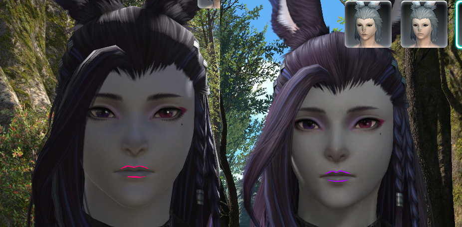
Veena face 3, mouth 1, eyebrows 2, eyes 4.
Overall, it's much improved from the first benchmark! The good;
The contours of the jaw are visible again, the dark halfmoon over the top half of the eyes is lessened so she doesn't look so ominous, the lips are glossier again, and the pupils are bigger again but the colour accuracy is still much better than the original Veena eyes.
The bad;
The line between the upper and lower lip is still missing its curve and is a straight line rather than a defined upper lip (this is an issue on almost everyone, it seems.), the already sparse Veena eyebrows are a little better, but still very smudgy and barely visible compared to currently.


I really don't know what to say about the eyebrows, but since there are complaints from other people that their character's eyebrows are suddenly too dark, I'd just like to once again suggest that you please let us color our eyebrows independently from the hair. I don't know how difficult this is to do from a technical perspective, but it would solve the issue of eyebrows being too light or too dark at the same time.(3)
-
06-05-2024 05:48 PM #47Player
- Join Date
- Jul 2022
- Posts
- 37
- Character
- Erine Carmin
- World
- Lamia
- Main Class
- Summoner Lv 100
Yeah the eyebrows are another issue on their own. I swap between grey and the lightest pink, and my character looks eyebrowless on the benchmark. I find it funny and I don't mind the look, but I know it will bother a lot of people. It is prevalent in a lot of races so it will probably be fixed.
Originally Posted by Yencat
Quoting own post so it is also in this Viera specific thread.
The character isn't actually smiling in the before, but the shading in the corners of the mouth and the loss of shape in the circled area make the mouth look downturned, and it looks like she's posing for a mug shot instead of having a more serene, neutral expression.
I really don't know what to say about the eyebrows, but since there are complaints from other people that their character's eyebrows are suddenly too dark, I'd just like to once again suggest that you please let us color our eyebrows independently from the hair. I don't know how difficult this is to do from a technical perspective, but it would solve the issue of eyebrows being too light or too dark at the same time.(2)
-
06-05-2024 05:57 PM #48Player
- Join Date
- Aug 2022
- Location
- taken by a strange mood
- Posts
- 149
- Character
- Shayun Ragara
- World
- Zalera
- Main Class
- Dark Knight Lv 100
Face 3 Lip 3 at least is noticeably different and it's not just shadow. unredlined, as a base; the redlined comparison is below (don't use for color comparison, I forgot to fuck with the benchmark gamma); the alignment is slightly off, i think, but it's not so far off that the lip shape should be changed as drastically as it is. If it was the only thing that got skipped in editing over it would be acceptable, to be clear, since his resting severe depression face hasn't been impacted, but it looks slightly... thinner isn't the word, scrunched? in a way I'm not a fan of. It's clearest in the cupid's bow, the peaks are higher and the dip is lower which when combined with how the lip color has been drawn in makes his mouth seem slightly smaller in comparison even though looking at the actual corners it clearly isn't. Even at my most generous, it's a narrower shape (the lower lip is less offensive, since it seems to be an issue of the texture being less blended).
Originally Posted by Halivel
Tbh I do prefer new lips, at least on face 3 for guys. The shape seems to be generally the same for that one from what I observed, with most changes coming from new rendering and shading to give it more volume. The harsh shadow on the upper lip in Live version makes it look like they're different, but upon closer look they're honestly looking fairly identical in general outline. I'd need to fetch my tablet to draw over it and compare, though. (That's for face 3 only though, I didn't closely go over other faces for male Viera, and female Viera have more apparent differences where new rendering and shading doesn't really explain those)
The shading on the nose, on the other hand... Where's the bunny, SE. Where's the bunny?
Also looking at this I'm being reminded of how much I hate how thinned out the thick eyelashes option has been made... but yeah, it's part of broader changes in how the lips are being drawn and is part of a stylistic shift I do not enjoy even if, standalone, it would be tolerable.
Not my best work, my hands kept spasming at bad times, but you can see the what i'm talking about a bit better re: lips. It's minor compared to a lot, it's just... symptom of a broader problem I've seen a lot elsewhere.(0)
-
06-05-2024 06:10 PM #49Player
- Join Date
- Jun 2014
- Posts
- 1,309
- Character
- Feiya Harlow
- World
- Odin
- Main Class
- Dancer Lv 100
I hope so! But I do have some doubts considering it is already an issue in the game right now with certain hair and skin color combinations.
Originally Posted by Cherrizini
Yeah the eyebrows are another issue on their own. I swap between grey and the lightest pink, and my character looks eyebrowless on the benchmark. I find it funny and I don't mind the look, but I know it will bother a lot of people. It is prevalent in a lot of races so it will probably be fixed.
The mouths seem a little off on almost everyone, so unless it was a deliberate choice I have more hopes of them fixing that.(0)
-
06-05-2024 06:43 PM #50Player
- Join Date
- Sep 2015
- Location
- Golmore
- Posts
- 1,590
- Character
- Elja Djt-dvre
- World
- Sagittarius
- Main Class
- Black Mage Lv 100
Hmm...
Originally Posted by Rudje
Face 3 Lip 3 at least is noticeably different and it's not just shadow. unredlined, as a base; the redlined comparison is below (don't use for color comparison, I forgot to fuck with the benchmark gamma); the alignment is slightly off, i think, but it's not so far off that the lip shape should be changed as drastically as it is. If it was the only thing that got skipped in editing over it would be acceptable, to be clear, since his resting severe depression face hasn't been impacted, but it looks slightly... thinner isn't the word, scrunched? in a way I'm not a fan of. It's clearest in the cupid's bow, the peaks are higher and the dip is lower which when combined with how the lip color has been drawn in makes his mouth seem slightly smaller in comparison even though looking at the actual corners it clearly isn't. Even at my most generous, it's a narrower shape (the lower lip is less offensive, since it seems to be an issue of the texture being less blended).
Also looking at this I'm being reminded of how much I hate how thinned out the thick eyelashes option has been made... but yeah, it's part of broader changes in how the lips are being drawn and is part of a stylistic shift I do not enjoy even if, standalone, it would be tolerable.
Not my best work, my hands kept spasming at bad times, but you can see the what i'm talking about a bit better re: lips. It's minor compared to a lot, it's just... symptom of a broader problem I've seen a lot elsewhere.
What's interesting is that mouth 1 doesn't seem to face the same issue, and as far as I understand they should all technically adjust from the same baseline model. Its cupid line is practically the same. Which makes the difference in mouth 3 a touch weird.
(Pardon me my slightly un-perfect drawing)
 (0)
(0)Last edited by Halivel; 06-05-2024 at 06:48 PM.


 Reply With Quote


Quick Navigation
General Discussion
Top
- Forums
- Japanese Forums
- ニュース
- テクニカルサポート
- 不具合報告
- プロデューサーレター
- ゲームシステム
- クラス&ジョブ
- ウェブサイト/アプリフィードバック
- 雑談
- この装備を武具投影したい!!
- あのジョブのUIレイアウトが知りたい!
- ジェネラルディスカッション
- ワールド(Group JP)
- ワールド(Group NA/EU/OC)
- Sargatanas(LEGACY)
- Balmung(LEGACY)
- Hyperion(LEGACY)
- Excalibur(LEGACY)
- Ragnarok(LEGACY/EU)
- Adamantoise
- Behemoth
- Cactuar
- Cerberus(EU)
- Coeurl
- Goblin
- Malboro
- Moogle(EU)
- Ultros
- Diabolos
- Gilgamesh
- Leviathan
- Midgardsormr
- Odin(EU)
- Shiva(EU)
- Exodus
- Faerie
- Lamia
- Phoenix(EU)
- Siren
- Famfrit
- Lich(EU)
- Mateus
- Brynhildr
- Zalera
- Jenova
- Zodiark
- Omega(EU)
- Louisoix(EU)
- Spriggan(EU)
- Twintania(EU)
- Phantom(EU)
- Sagittarius(EU)
- Alpha(EU)
- Raiden(EU)
- Bismarck(OC)
- Ravana(OC)
- Sephirot(OC)
- Sophia(OC)
- Zurvan(OC)
- Halicarnassus
- Maduin
- Marilith
- Seraph
- 初心者用
- コミュニティイベント
- 開催中
- 終了
- 第8回14時間生放送
- 第68回FFXIVプロデューサーレターLIVE
- 第65回FFXIVプロデューサーレターLIVE
- 第64回FFXIVプロデューサーレターLIVE
- 第60回FFXIVプロデューサーレターLIVE
- 第56回FFXIVプロデューサーレターLIVE
- 第53回FFXIVプロデューサーレターLIVE
- 出張!ひろしチャレンジ 応援プレゼント企画
- 第50回FFXIVプロデューサーレターLIVE
- 第49回FFXIVプロデューサーレターLIVE
- ハウジングコーディネートコンテスト
- 第44回FFXIVプロデューサーレターLIVE
- 第43回FFXIVプロデューサーレターLIVE
- 第42回FFXIVプロデューサーレターLIVE
- 第41回FFXIVプロデューサーレターLIVE
- 第40回FFXIVプロデューサーレターLIVE
- 第39回FFXIVプロデューサーレターLIVE
- 第38回FFXIVプロデューサーレターLIVE
- 第37回FFXIVプロデューサーレターLIVE
- 第35回FFXIVプロデューサーレターLIVE
- ハウジングデコレーションコンテスト
- 第34回FFXIVプロデューサーレターLIVE
- 第33回FFXIVプロデューサーレターLIVE
- 出張FFXIVプロデューサーレターLIVE in LAS VEGAS (2016)
- 髙井浩の○○チャレンジ!応援企画
- 第31回FFXIVプロデューサーレターLIVE
- 紅蓮祭スクリーンショットコンテスト 2016
- 第30回FFXIVプロデューサーレターLIVE
- 第28回FFXIVプロデューサーレターLIVE
- サントラ発売記念!奏天のイシュガルドコンテスト
- 第27回FFXIVプロデューサーレターLIVE
- 星芒祭 4コマスクリーンショットコンテスト
- 第26回FFXIVプロデューサーレターLIVE
- 第25回FFXIVプロデューサーレターLIVE
- パンプキンクッキーコンテスト
- 髪型デザインコンテスト
- 第24回FFXIVプロデューサーレターLIVE
- 第23回FFXIVプロデューサーレターLIVE
- 第22回FFXIVプロデューサーレターLIVE
- エオルゼア百景 in 装備コーディネートコンテスト
- 第21回FFXIVプロデューサーレターLIVE
- 思い出スクリーンショットコンテスト
- フリーカンパニーPRキャンペーン
- 第20回FFXIVプロデューサーレターLIVE
- FFXIVプロデューサーレターLIVE特別編
- ヴァレンティオンデーチョコレートコンテスト
- 闘会議2015 予想イベント
- 降神祭スクリーンショットコンテスト
- 星芒祭スクリーンショットコンテスト
- 第19回FFXIVプロデューサーレターLIVE
- 第18回FFXIVプロデューサーレターLIVE
- 出張FFXIVプロデューサーレターLIVE in LAS VEGAS
- 新生FFXIV キャプションコンテスト
- 紅蓮祭スクリーンショットコンテスト
- 第17回FFXIVプロデューサーレターLIVE
- 新生FFXIV 1周年記念PVコンテスト
- ミラプリ スクリーンショットコンテスト
- 第16回FFXIVプロデューサーレターLIVE
- 第15回FFXIVプロデューサーレターLIVE
- 第14回FFXIVプロデューサーレターLIVE
- エッグハントスクリーンショットコンテスト
- 出張プロデューサーレターLIVE
- 第13回FFXIVプロデューサーレターLIVE
- プリンセスデースクリーンショットコンテスト
- 第12回FFXIVプロデューサーレターLIVE
- 降神祭スクリーンショットコンテスト
- 星芒祭スクリーンショットコンテスト
- ヴァレンティオンデースクリーンショットコンテスト
- フリーカンパニー紹介PVコンテスト
- 第11回FFXIVプロデューサーレターLIVE
- 第10回FFXIVプロデューサーレターLIVE
- 守護天節スクリーンショットコンテスト
- 第9回FFXIVプロデューサーレターLIVE
- 出張プロデューサーレターLIVE in 幕張
- English Forums
- Information
- Technical Support
- Bug Reports
- Letters from the Producer
- Gameplay
- Classes & Jobs
- Feedback
- Community
- General Discussion
- Worlds(Group JP)
- Worlds(Group NA/EU/OC)
- Sargatanas(LEGACY)
- Balmung(LEGACY)
- Hyperion(LEGACY)
- Excalibur(LEGACY)
- Ragnarok(LEGACY/EU)
- Adamantoise
- Behemoth
- Cactuar
- Cerberus(EU)
- Coeurl
- Goblin
- Malboro
- Moogle(EU)
- Ultros
- Diabolos
- Gilgamesh
- Leviathan
- Midgardsormr
- Odin(EU)
- Shiva(EU)
- Exodus
- Faerie
- Lamia
- Phoenix(EU)
- Siren
- Famfrit
- Lich(EU)
- Mateus
- Brynhildr
- Zalera
- Jenova
- Zodiark
- Omega(EU)
- Louisoix(EU)
- Spriggan(EU)
- Twintania(EU)
- Phantom(EU)
- Sagittarius(EU)
- Alpha(EU)
- Raiden(EU)
- Bismarck(OC)
- Ravana(OC)
- Sephirot(OC)
- Sophia(OC)
- Zurvan(OC)
- Halicarnassus
- Maduin
- Marilith
- Seraph
- New Player Help
- Community Events
- Current Events
- Past Events
- Contests and Sweepstakes
- Fan Festival 2023 in London
- 10th Anniversary Mosaic Art Sweepstakes (NA/EU)
- Fan Festival 2023 in Las Vegas
- Ask Your Questions for the PAX East 2023 Q&A
- Crystalline Conflict Community Cup (North America)
- Letter from the Producer LIVE Part LXVIII
- Letter from the Producer LIVE Part LXV
- Letter from the Producer LIVE Part LXIV
- Letter from the Producer LIVE Part LX
- Everything’s on the Line! Screenshot Contest (NA)
- Ask Yusuke Mogi Your Questions for the PAX East 2020 Panel
- “A Star Light Party” Screenshot Contest (EU/PAL)
- Star Companion Screenshot Sweepstakes (NA)
- Letter from the Producer LIVE Part LVI
- “This is All Saints’ Wake” Screenshot Contest (EU/PAL)
- A Glamourous Guise Screenshot Contest (NA)
- Memoirs of Adventure Creative Writing Contest (NA)
- Ask Yoshi-P and Banri Oda Your Questions for the gamescom 2019 Q&A
- Letter from the Producer LIVE Part LIII
- Cosplay Contest at gamescom 2019 (EU)
- Become the Darkness Screenshot Sweepstakes! (NA)
- From Light to Darkness Screenshot Contest (EU/PAL)
- Frights and Delights Comic Contest (EU/PAL)
- Cosplay Contest at Japan Expo 2019 (EU)
- Ogre Pumpkin Carve Off Contest: The REDUX (NA)
- My new Viera and Hrothgar" Twitter Screenshot Contest (NA/EU)
- ”Sea Breeze Celebration” Screenshot Contest (NA)
- An Egg-Squisite Season Screenshot Contest (EU/PAL)
- The Eorzean Interior Design Contest (NA)
- Letter from the Producer LIVE Part XLIX
- Letter from the Producer LIVE Part L
- FLOWERS FOR ALL SCREENSHOT CONTEST
- The Eorzean Interior Design Contest (EU)
- Highlights of the Year Contest (EU)
- Fan Festival 2018 in Las Vegas (NA)
- Starlight Scenarios Comic Contest (NA)
- Fan Festival 2019 in Paris (EU)
- The "As Good As Gold" Screenshot Contest (NA)
- Glamour Extravaganza Contest (EU)
- Letter from the Producer LIVE: E3 2018 Edition
- Letter from the Producer LIVE Part XLIV
- Letter from the Producer LIVE Part XLIII
- The "Be My Valentione!" Creative Writing Contest (NA)
- Letter from the Producer LIVE Part XLII
- Letter from the Producer LIVE Part XLI
- Holiday Greetings Contest (EU)
- Starlight Starbright Screenshot Contest (NA)
- Letter from the Producer LIVE Part XL
- Ogre Pumpkin Carve Off Contest (NA)
- Letter from the Producer LIVE Part XXXIX
- Letter from the Producer LIVE Part XXXVIII
- PAX West 2017 (NA)
- Sightseeing Screenshot Contest! (EU)
- Letter from the Producer LIVE Part XXXVII
- And… Action! (NA)
- The Heavensdub Contest (NA)
- Letter from the Producer LIVE Part XXXV
- House Party Screenshot Contest (EU)
- Bright-Eyed Superstars Contest (NA)
- Letter from the Producer LIVE in Frankfurt (EU)
- Letter from the Producer LIVE Part XXXIV
- Starlight Celebration Haiku Contest (EU)
- Letter from the Producer LIVE Part XXXIII
- The “Eorzean Home Makeover (Extreme)” Contest (NA)
- Fan Festival 2017 (EU)
- Spooky Story Contest (EU)
- Letter from the Producer LIVE in Las Vegas (2016)
- The Rising Screenshot Contest (EU)
- Letter from the Producer LIVE Part XXXI
- "Do You Even /Pose?" Showdown! (NA)
- Fan Festival 2016 (NA)
- Dream Holiday Contest (EU)
- Letter from the Producer LIVE: E3 2016 Edition
- Heavensward Primal Haiku Contest (NA)
- Letter from the Producer LIVE Part XXX
- Letter from the Producer LIVE Part XXIX
- Letter from the Producer LIVE Part XXVIII
- Heavensward Music Contest (NA)
- Heavensward Music Contest (EU)
- Letter from the Producer LIVE Part XXVII
- Starlight Celebration Comic Strip Contest (NA)
- Starlight Celebration Comic Strip Contest (EU)
- Letter from the Producer LIVE Part XXVI
- Airship Components: Research and Development (NA)
- All Saints’ Wake Screenshot Contest (EU)
- Letter from the Producer LIVE Part XXV
- Retainer Ad-Venture Contest (EU)
- Cartographers and Seekers Contest (NA)
- Hairstyle Design Contest
- Letter from the Producer LIVE Part XXIV
- Letter from the Producer LIVE Part XXIII
- Letter from the Producer LIVE Part XXII
- Letter from the Producer LIVE Part XXI
- Memories of Eorzea Screenshot Contest (NA)
- Memories of Eorzea Screenshot Contest (EU)
- Heavensward Free Company Recruitment Contest (NA)
- Heavensward Free Company Recruitment Contest (EU)
- A Realm Redubbed Contest (NA)
- Letter from the Producer LIVE Part XX
- Letter from the Producer LIVE – Special Edition
- The Great Eorzean Cook-Off Contest (EU)
- Be My Valentione Contest (NA)
- Heavensturn Screenshot Contest (NA)
- Heavensturn Screenshot Contest (EU)
- Starlight Celebration Screenshot Contest (NA)
- Starlight Celebration Screenshot Contest (EU)
- Letter from the Producer LIVE Part XIX
- Letter from the Producer LIVE Part XVIII
- Letter from the Producer LIVE in Las Vegas
- Grant a Wish Contest (EU)
- Letter from the Producer LIVE Part XVII
- Moonfire Faire Screenshot Contest (NA)
- Moonfire Faire Screenshot Contest (EU)
- Fan Festival 2014 (NA)
- Fan Festival 2014 (EU)
- FFXIV: ARR One Year Anniversary Video Contest (NA)
- FFXIV: ARR One Year Anniversary Video Contest (EU)
- Letter from the Producer LIVE Part XVI
- Eorzea IRL Contest (NA)
- Letter from the Producer LIVE: E3 Edition
- Letter from the Producer LIVE Part XV
- Letter from the Producer LIVE Part XIV
- Hatching-tide Screenshot Contest (NA)
- Hatching-tide Screenshot Contest (EU)
- Letter from the Producer LIVE Part XIII
- Little Ladies' Day Screenshot Contest (NA)
- Little Ladies' Day Screenshot Contest (EU)
- Valentione's Day Screenshot Contest (NA)
- Valentione's Day Screenshot Contest (EU)
- Letter from the Producer LIVE Part XII
- Heavensturn Screenshot Contest (NA)
- Heavensturn Screenshot Contest (EU)
- Starlight Celebration Screenshot Contest (NA)
- Starlight Celebration Screenshot Contest (EU)
- FFXIV: ARR Free Company Recruitment Contest (NA)
- FFXIV: ARR Free Company Recruitment Contest (EU)
- Letter from the Producer LIVE Part XI
- XIII Days – Your Fate is Sealed Contest (NA)
- Letter from the Producer LIVE Part X
- Doppelganger Screenshot Contest (NA)
- All Saints’ Wake Haiku Contest (EU)
- Letter from the Producer LIVE Part IX
- Ask Your Questions for the Mini Letter from the Producer LIVE at TGS!
- Sightseeing Screenshot Sweepstakes (NA/EU)
- Forums français
- Informations
- Assistance technique
- Rapports de problèmes
- La lettre du producteur
- Système de jeu
- Classes & Jobs
- Avis et retours sur les sites et l’appli
- Discussion
- Discussion générale
- Mondes (Japon)
- Mondes (Amérique du N./Europe/Océanie)
- Sargatanas(LEGACY)
- Balmung(LEGACY)
- Hyperion(LEGACY)
- Excalibur(LEGACY)
- Ragnarok(LEGACY/EU)
- Adamantoise
- Behemoth
- Cactuar
- Cerberus(EU)
- Coeurl
- Goblin
- Malboro
- Moogle(EU)
- Ultros
- Diabolos
- Gilgamesh
- Leviathan
- Midgardsormr
- Odin(EU)
- Shiva(EU)
- Exodus
- Faerie
- Lamia
- Phoenix(EU)
- Siren
- Famfrit
- Lich(EU)
- Mateus
- Brynhildr
- Zalera
- Jenova
- Zodiark
- Omega(EU)
- Louisoix(EU)
- Spriggan(EU)
- Twintania(EU)
- Phantom(EU)
- Sagittarius(EU)
- Alpha(EU)
- Raiden(EU)
- Bismarck(OC)
- Ravana(OC)
- Sephirot(OC)
- Sophia(OC)
- Zurvan(OC)
- Halicarnassus
- Maduin
- Marilith
- Seraph
- Aide aux nouveaux joueurs
- Événements communautaires
- Evénements en cours
- Evénements passés
- Concours et tirages au sort
- Fan Festival 2023 de Londres
- Concours pour la mosaïque du 10e anniversaire
- « La lettre du producteur LIVE » : 68e émission
- « La lettre du producteur LIVE » : 65e émission
- « La lettre du producteur LIVE » : 64e émission
- Concours de captures d’écran d'exploration - Édition 2020
- « La lettre du producteur LIVE » : 60e émission
- Concours de captures d’écran - Une petite fête des étoiles entre amis
- « La lettre du producteur LIVE » : 56e émission
- Concours de captures d’écran – C’est ça la Veillée des Saints
- Mes questions à Yoshi-P et Banri Oda pour le Q&R de gamescom 2019 !
- « La lettre du producteur LIVE » : 53e émission
- Concours de cosplay à la gamescom 2019
- Concours de captures d’écran : De la Lumière aux Ténèbres
- Concours Pistolame à Japan Expo 2019 !
- Concours de Cosplay à Japan Expo 2019
- « Ma Viéra & mon Hrothgar » - Concours Twitter de capture d'écran
- Fabulœuf concours de captures d’écran
- « La lettre du producteur LIVE » : 50e émission
- « La lettre du producteur LIVE » : 49e émission
- Concours des meilleurs moments de l'année 2018
- Concours de BD’pouvante
- Concours de décoration d’intérieur
- Fan Festival 2019 à Paris
- Concours “Les dieux de la mode”
- « La lettre du producteur LIVE » : 44e émission
- « La lettre du producteur LIVE » : 43e émission
- « La lettre du producteur LIVE » : 42e émission
- « La lettre du producteur LIVE » : 41e émission
- Concours de cartes de vœux
- « La lettre du producteur LIVE » : 40e émission
- « La lettre du producteur LIVE » : 39e émission
- « La lettre du producteur LIVE » : 38e émission
- Concours de captures d’écran d’exploration
- « La lettre du producteur LIVE » : 37e émission
- « La lettre du producteur LIVE » : 35e émission
- Concours de captures d’écran spécial « House Party »
- Lettre du producteur LIVE à Francfort
- « La lettre du producteur LIVE » : 34e émission
- Concours de haïkus pour la fête des étoiles
- « La lettre du producteur LIVE » : 33e émission
- Concours d’histoires effrayantes
- Posez vos questions pour la lettre Live à Las Vegas (2016)
- Concours de captures d’écran pour la fête de la Commémoration
- « La lettre du producteur LIVE » : 31e émission
- Concours office de tourisme d’Éorzéa
- « La lettre du producteur LIVE » : 30e émission
- « La lettre du producteur LIVE » : 29e émission
- « La lettre du producteur LIVE » : 28e émission
- Concours de musique d’Heavensward
- « La lettre du producteur LIVE » : 27e émission
- Concours de comic strip pour la fête des étoiles
- « La lettre du producteur LIVE » : 26e émission
- Concours de captures d’écran pour la Veillée des saints
- « La lettre du producteur LIVE » : 25e émission
- Concours « Les aventures de mon servant »
- Concours de création de coupe de cheveux
- « La lettre du producteur LIVE » : 24e émission
- « La lettre du producteur LIVE » : 22e émission
- « La lettre du producteur LIVE » : 23e émission
- Concours de captures d’écran – Souvenirs d’Éorzéa
- Les compagnies libres recrutent pour Heavensward
- « La lettre du producteur LIVE » : 20e émission
- La lettre du producteur LIVE : émission spéciale
- Le grand concours culinaire d’Éorzéa
- Concours de captures d’écran pour la fête de la transition
- Concours de captures d’écran pour la fête des étoiles
- « La lettre du producteur LIVE » : dix-huitième émission
- Posez vos questions pour la lettre Live à Las Vegas
- Concours « Le jeu des souhaits »
- « La lettre du producteur LIVE » : 19e émission
- Fan Festival 2014
- Concours de captures d’écran pour les feux de la mort
- « La lettre du producteur LIVE » : dix-septième émission
- Concours vidéo pour le premier anniversaire
- « La lettre du producteur LIVE » : seizième émission
- « La lettre du producteur LIVE » : quinzième émission
- « La lettre du producteur LIVE » : quatorzième émission
- Concours de captures d’écran pour la chasse aux Prœufs
- « La lettre du producteur LIVE » : treizième émission
- Concours de captures d’écran pour la fête des demoiselles
- « La lettre du producteur LIVE » : douzième émission
- Concours de captures d’écran pour la fête de la transition
- Concours de captures d’écran pour la fête des étoiles
- Concours de captures d’écran pour la Valention
- Les compagnies libres recrutent
- « La lettre du producteur LIVE » : onzième émission
- « La lettre du producteur LIVE » : dixième émission
- Concours Haiku d'Éorzéa - la Veillée des saints
- « La lettre du producteur LIVE » : neuvième émission
- Posez vos questions pour la lettre Live à Makuhari
- Deutsches Forum
- Ankündigungen
- Technischer Support
- Fehler melden
- Briefe des Produzenten
- Spielsystem
- Charakterklassen & Jobs
- Feedback
- Diskussionen
- Allgemeine Diskussionen
- Welten(Group JP)
- Welten(Group NA/EU/OC)
- Sargatanas(LEGACY)
- Balmung(LEGACY)
- Hyperion(LEGACY)
- Excalibur(LEGACY)
- Ragnarok(LEGACY/EU)
- Adamantoise
- Behemoth
- Cactuar
- Cerberus(EU)
- Coeurl
- Goblin
- Malboro
- Moogle(EU)
- Ultros
- Diabolos
- Gilgamesh
- Leviathan
- Midgardsormr
- Odin(EU)
- Shiva(EU)
- Exodus
- Faerie
- Lamia
- Phoenix(EU)
- Siren
- Famfrit
- Lich(EU)
- Mateus
- Brynhildr
- Zalera
- Jenova
- Zodiark
- Omega(EU)
- Louisoix(EU)
- Spriggan(EU)
- Twintania(EU)
- Phantom(EU)
- Sagittarius(EU)
- Alpha(EU)
- Raiden(EU)
- Bismarck(OC)
- Ravana(OC)
- Sephirot(OC)
- Sophia(OC)
- Zurvan(OC)
- Halicarnassus
- Maduin
- Marilith
- Seraph
- Für Einsteiger
- Community-Veranstaltungen
- Aktuelle Veranstaltungen
- Vergangene Veranstaltungen
- Wettbewerbe und Gewinnspiele
- Mosaik-Gewinnspiel zum 10. Jubiläum
- Fan Festival 2023 in London
- Der 68 Teil des „FINAL FANTASY XIV Produzentenbriefs LIVE”
- Der 65 Teil des „FINAL FANTASY XIV Produzentenbriefs LIVE”
- Der 64 Teil des „FINAL FANTASY XIV Produzentenbriefs LIVE”
- Reisetagebuch-Screenshot-Gewinnspiel
- Der 60. Teil des „FINAL FANTASY XIV Produzentenbriefs LIVE”
- Sternenlichtertrupp-Screenshot-Wettbewerb
- Der 56. Teil des „FINAL FANTASY XIV Produzentenbriefs LIVE”
- Allerschutzheiligen Schauer-Spektakel-Screenshot-Wettbewerbs
- Eure Fragen an Naoki Yoshida und Banri Oda für die Q&A-Session auf der gamescom 2019
- Der 53. Teil des „FINAL FANTASY XIV Produzentenbriefs LIVE”
- Cosplay-Wettbewerb auf der gamescom 2019
- Vom Licht in die Dunkelheit Screenshot-Wettbewerb
- Cosplay-Wettbewerb auf der Japan Expo 2019
- „Viera & Hrothgar Makeover“ Twitter-Screenshot-Wettbewerb
- Wundereiersuche Screenshot-Wettbewerb
- Der 50. Teil des „FINAL FANTASY XIV Produzentenbriefs LIVE”
- Der 49. Teil des „FINAL FANTASY XIV Produzentenbriefs LIVE”
- Highlights des Jahres Wettbewerb
- Spuk und Schabernack Comic-Wettbewerb
- Inneneinrichtungs-Wettbewerb
- Fan Festival 2019 in Paris
- Extravaganza-Wettbewerb
- Der 44. Teil des „FINAL FANTASY XIV Produzentenbriefs LIVE”
- Der 43. Teil des „FINAL FANTASY XIV Produzentenbriefs LIVE”
- Der 42. Teil des „FINAL FANTASY XIV Produzentenbriefs LIVE”
- Der 41. Teil des „FINAL FANTASY XIV Produzentenbriefs LIVE”
- Wintergrüße-Wettbewerb
- Der 40. Teil des „FINAL FANTASY XIV Produzentenbriefs LIVE”
- Der 39. Teil des „FINAL FANTASY XIV Produzentenbriefs LIVE”
- Der 38. Teil des „FINAL FANTASY XIV Produzentenbriefs LIVE”
- Sightseeing-Screenshot-Wettbewerb
- Der 37. Teil des „FINAL FANTASY XIV Produzentenbriefs LIVE”
- Der 35. Teil des „FINAL FANTASY XIV Produzentenbriefs LIVE”
- House Party! Screenshot-Wettbewerb
- Brief des Produzenten LIVE in Frankfurt
- Der 34. Teil des „FINAL FANTASY XIV Produzentenbriefs LIVE”
- Sternenlichtfest Haiku-Wettbewerb
- Der 33. Teil des „FINAL FANTASY XIV Produzentenbriefs LIVE”
- Gruselgeschichten-Wettbewerb
- Stellt eure Fragen für den Brief des Produzenten – Live in Las Vegas (2016)
- Fest der Wiedergeburt Screenshot-Wettbewerb
- Der 31. Teil des „FINAL FANTASY XIV Produzentenbriefs LIVE”
- Traumurlaub-Wettbewerb
- Der 30. Teil des „FINAL FANTASY XIV Produzentenbriefs LIVE”
- Der 29. Teil des „FINAL FANTASY XIV Produzentenbriefs LIVE”
- Der 28. Teil des „FINAL FANTASY XIV Produzentenbriefs LIVE
- Heavensward Musik-Wettbewerb
- Der 27. Teil des „FINAL FANTASY XIV Produzentenbriefs LIVE
- Sternenlichtfest Comicstrip-Wettbwerb
- Der 26. Teil des „FINAL FANTASY XIV Produzentenbriefs LIVE
- Allerschutzheiligen-Fest Screenshot-Wettbewerb
- Der 25. Teil des „FINAL FANTASY XIV Produzentenbriefs LIVE
- Die Abenteuer des Tapferen Gehilfen–Wettbewerb
- Frisuren-Design-Wettbewerb
- Der 24. Teil des „FINAL FANTASY XIV Produzentenbriefs LIVE
- Der 22. Teil des „FINAL FANTASY XIV Produzentenbriefs LIVE
- Der 23. Teil des „FINAL FANTASY XIV Produzentenbriefs LIVE
- Erinnerungen an Eorzea Screenshot-Wettbewerb
- Heavensward-Rekrutierungswettbewerb der freien Gesellschaften
- Der 20. Teil des „FINAL FANTASY XIV Produzentenbriefs LIVE
- Brief des Produzenten – LIVE-Sondersendung!
- Großer, eorzäischer Kochwettbewerb
- Himmelswende Screenshot Wettbewerb
- Sternenlichtfest Screenshot-Wettbewerb
- Der 18. Teil des „FINAL FANTASY XIV Produzentenbriefs LIVE
- Stellt eure Fragen für den Brief des Produzenten – Live in Las Vegas
- Wünsche werden wahr- Wettbewerb
- Der 19. Teil des „FINAL FANTASY XIV Produzentenbriefs LIVE
- Fan Festival 2014
- Feuermond-Reigen Screenshot-Wettbewerb
- Der 17. Teil des „FINAL FANTASY XIV Produzentenbriefs LIVE
- Video-Wettbewerb zum einjährigen Jubiläum
- Der 16. Teil des „FINAL FANTASY XIV Produzentenbriefs LIVE
- Der 15. Teil des „FINAL FANTASY XIV Produzentenbriefs LIVE
- Der 14. Teil des „FINAL FANTASY XIV Produzentenbriefs LIVE
- Wundereiersuche Screenshot-Wettbewerb
- Der 13. Teil des „FINAL FANTASY XIV Produzentenbriefs LIVE
- Prinzessinnenfest Screenshot-Wettbewerb
- Valentiontag Screenshot Wettbewerb
- Der 12. Teil des „FINAL FANTASY XIV Produzentenbriefs LIVE
- Himmelswende Screenshot Wettbewerb
- Sternenlichtfest Screenshot Wettbewerb
- Rekrutierungsvideo-Wettbewerb der Freien Gesellschaften
- Der 11. Teil des „FINAL FANTASY XIV Produzentenbriefs LIVE
- Der 10. Teil des „FINAL FANTASY XIV Produzentenbriefs LIVE
- Allerschutzheiligen-Haiku-Wettbewerb
- Der 9. Teil des „FINAL FANTASY XIV Produzentenbriefs LIVE
- Stellt eure Fragen für den Brief des Produzenten – Live in Makuhari!
- Version 1.0 Forum Archive
- Japanese Forums
- インフォメーション
- サポート
- アップデート
- ゲームシステム
- クラス&ジョブ
- ウェブサイトフィードバック
- 雑談
- 初心者用
- 写真館
- コミュニティイベント
- 開催中
- 終了
- ファイナルファンタジーXIV: 新生エオルゼア キャッチフレーズコンテスト
- 第8回FFXIVプロデューサーレターLIVE
- 出張FFXIVプロデューサーレターLIVE in LA
- 第7回FFXIVプロデューサーレターLIVE
- 第6回FFXIVプロデューサーレターLIVE
- 創作タマゴコンテスト
- 第5回FFXIVプロデューサーレターLIVE
- マイ ベスト チョコボ
- ダラガブを探せ!
- エオルゼア メモリーズ
- 第4回FFXIVプロデューサーレターLIVE
- エオルゼア de 五・七・五
- 第3回FFXIVプロデューサーレターLIVE
- 残暑見舞いコンテスト
- Hidden Artifacts ~新生コンセプトアートクイズ~
- ガルーダトライアル
- 宿屋deつぶやき!イベント (JP)
- LSリクルートポスターコンテスト (JP)
- English Forums
- Information
- Support
- Updates
- Gameplay
- Classes & Jobs
- Feedback
- Community
- New Player Help
- In-Game Media
- Community Events
- Current Events
- Past Events
- Letter from the Producer LIVE Part VIII
- Letter from the Producer LIVE Part VII
- Letter from the Producer LIVE Part VI
- Eorzean Egg Decoration Contest
- Letter from the Producer LIVE Part V
- Eorzea Haiku Contest (EU)
- “Chocobos Rule the World” Contest!
- Memories of Eorzea Contest
- Letter from the Producer LIVE Part IV
- What if Dalamud Contest (EU)
- Tales from Eorzea (NA)
- Culinary Creation Contest (EU)
- Letter from the Producer LIVE Part III
- We Dub to Make it Ours (NA)
- These Grand Company Colors Don't Run!
- Hidden Artifacts
- Grant A Wish Contest (EU)
- Garuda—She's Like the Wind
- Culinary Creation Contest (NA)
- Valentione’s Dialogue Contest (EU)
- Valentione’s Day Love Letter Contest (NA)
- Forums français
- Informations
- Assistance sur le jeu
- Développement
- Système de jeu
- Classes & Jobs
- Avis et retours
- Discussion
- Aide aux nouveaux joueurs
- Galerie multimédia & articles
- Evénements organisés par l'équipe communautaire
- Evénements en cours
- Evénements passés
- « La lettre du producteur LIVE » : huitième émission
- « La lettre du producteur LIVE » : septième émission
- « La lettre du producteur LIVE » : sixième émission
- Concours : « Décoration d’Œufs Éorzéens »
- « La lettre du producteur LIVE » : cinquième émission
- Concours « Haïkus d’Eorzéa »
- Concours « Les Chocobos à la Conquête du Monde » !
- Concours « Souvenirs d’Eorzéa »
- « La lettre du producteur LIVE » : quatrième émission
- Concours : « Et si Dalamud était... »
- Concours de création culinaire
- « La lettre du producteur LIVE » : troisième émission
- Soutenons les grandes compagnies !
- Questions pour un Eorzéen
- Concours du jeu des souhaits
- L’épreuve de Garuda
- Concours de dialogue de la Valention
- Deutsches Forum
- Ankündigungen
- Support
- Update
- Spielsystem
- Charakterklassen & Jobs
- Feedback
- Diskussionen
- Für Einsteiger
- Medien
- Community-Veranstaltungen
- Aktuelle Veranstaltungen
- Vergangene Veranstaltungen
- Der 8. Teil des „FINAL FANTASY XIV Produzentenbriefs LIVE
- Der 7. Teil des „FINAL FANTASY XIV Produzentenbriefs LIVE
- Der 6. Teil des „FINAL FANTASY XIV Produzentenbriefs LIVE
- Eorzäischer Ei-Dekorations-Wettbewerb
- Der 5. Teil des „FINAL FANTASY XIV Produzentenbriefs LIVE“
- Eorzea-Haiku-Wettbewerb
- Chocobos, die Herrscher der Welt
- Erinnerungen an Eorzea
- Der 4. Teil des „FINAL FANTASY XIV Produzentenbriefs LIVE“
- Was, wenn Dalamud … wäre?
- Kulinarische Kreationen
- Der 3. Teil des „FINAL FANTASY XIV Produzentenbriefs LIVE“
- Farben, die nicht die Segel streichen!
- Verborgene ARTefakte
- Wünsche werden wahr-Wettbewerb
- Garuda – Grausame Herrin der Stürme
- Valentione Dialog-Wettbewerb
- Japanese Forums
«
Previous Thread
|
Next Thread
»


