

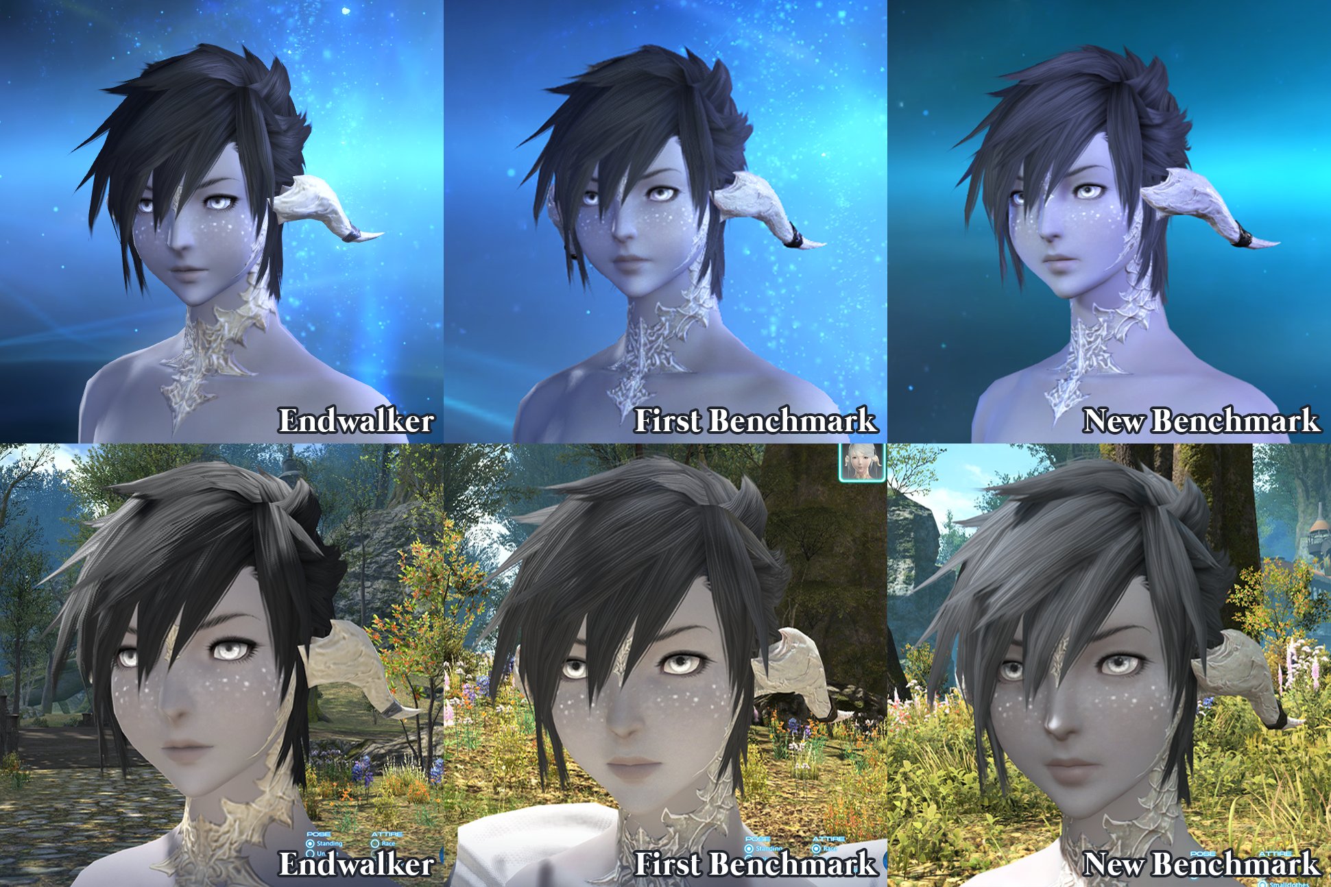
I wanted to make a thread for Au Ra discussion in the new benchmark, seperate to the old thread, so it's easier to break down! You can see the old thread here, lots of good discussion there.
My main issues with the first benchmark, outside of general lighting/seam issues/etc. that most races encountered, were these:
- Mouth: shapes were changed, and the shading on lips had a much harsher line on the "None" lip colour option
- Eyes: At least in my experience for Female Face 1, the eye shapes were very different in a way that seemed to be an intentional stylistic choice, as opposed to simply a case of lighting. The iris was smaller, but the pupil much larger. The upper lid "eyeliner" option is also far less pronounced, which makes the eye shape itself also look a lot different. It vastly changes my WoL's overall look.
Good news is that the mouth issue seems fixed in the new benchmark, at least for Face 1! I was relieved to see it on the list of points mentioned in the Lodestone update. Likewise, new lighting also helps overall. Thumbs up from me.
On the other side, the eyes have the same issues as before. I realise the majority of updates to this benchmark were lighting-based, as opposed to stylistic changes. Comparisons:
The lighting looks good on the colour, but there is still the same issues of:
- A smaller iris, but larger pupil. The iris does not reach the bottom of the eye's waterline any more, which I think is the biggest difference. The shading means the pupil stands out more vs. before, when it was slightly more blended into the colour of the iris.
- The upper eyelid is far less dark and defined. I would even say that it looks less defined in the updated benchmark. I have the "eyeliner" option in Other Features turned on, but it makes very little difference vs. having it turned off. I believe darkening this option to make it comparable with the current game's version would help a lot!
This is the case across all eye shapes, at least on Female Face 1, so picking another one isn't an easy fix.
Things definitely are a lot better! And I know I sound fussy with these details, but I still wanted to highlight areas that I feel a little disappointed over, since Yoshida and the developers said they'd still be listening and that it was an ongoing process. I'm really appreciative of how much they are listening.
Please do share your own comparisons, things you are happy or sad about! I'm really interested to see how Au Ra have been updated, since they had some of the more polarising changes (both Female and Male, Raen and Xaela) in the initial benchmark.
Hybrid View
-
06-03-2024 11:44 PM #1Player

- Join Date
- Oct 2018
- Location
- Ul'dah
- Posts
- 39
- Character
- Albi Re'oh
- World
- Cactuar
- Main Class
- Black Mage Lv 100
New Benchmark (June): Au Ra Feedback
(22)Last edited by Glyphs; 06-04-2024 at 12:30 AM.
-
06-04-2024 12:23 AM #2Player

- Join Date
- Apr 2024
- Location
- Gridania
- Posts
- 43
- Character
- Asteri Wyrmsong
- World
- Diabolos
- Main Class
- Viper Lv 100
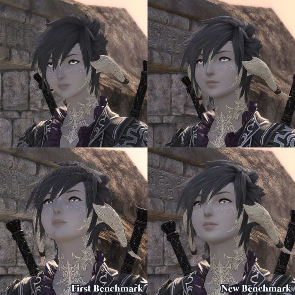
o/ Already posted in the Face 2 thread that existed since the first Benchmark, but cross-posting!
Face 2 returning to raise concerns that I had in the first iteration of the Benchmark:- Lips are still affected, the shape is different and more compact, with the dimples not as prominent and the lip shine still mostly non-existent. This actually looks much better in movement but is still a concern for the idle poses. It feels like my character has a permanent "duck face" and no amount of Fantasia can help since it was already the thin/wide option out of the four available ones.

- Eyebrows have a hard dark gray line for white hair colors, they used to be softer looking.
- Scales look too flat against the skin, as if they're just a sheet covering the skin rather than scales growing over the skin. They're still very ivory and "dirty" looking because of the color choices, I miss my off-white cream scales. :< I wish they had simply given us scale color options instead of outright changing the colors.
- Minor, but the top eyelashes only point downwards now, where they used to having a small flick upwards on the outer end.
I will say the catchlights now look a LOT better and help fight the dead-eye look of the first Benchmark, I'm really happy with how my character looks in the actual benchmark when it comes to the eyes specifically! The lighting helps a ton to make my character look much better than in the first benchmark too but my worries remain that the shapes have been altered and no amount of lighting was gonna help. :')
Slider version: https://imgsli.com/MjY5Mzcw

Previous Benchmark V1.0 post:
 Originally Posted by Asteri
 (10)
(10)
-
06-05-2024 09:22 PM #3Player
- Join Date
- Apr 2024
- Location
- Gridania
- Posts
- 43
- Character
- Asteri Wyrmsong
- World
- Diabolos
- Main Class
- Viper Lv 100
Spent a bit comparing again and noticed new things for FemRa Face 2 while comparing from the side!
Originally Posted by Asteri
Apologies for the use of most likely the improper terms to describe this, my vocabulary for facial terms is limited. :'D
- The natural eyeshadow is of a different shape in DT, more pointed, going past the eye and curving upwards. It used to be more rounded and stopped with the eyelid.
- The top lip was a soft curve from the corner of the lip to the middle. Now it starts thinner and has a sudden raise when close to the middle of the lip, it gives a sharper triangular effect.
- Bottom lip is the reverse, where before it started thin and became more plump and now it is generally more plump all around.
- The chin is very noticeably changed too, it used to be full and rounded outwards, now it is rounded inwards.
I understand changes needed to happen, but I chose Face 2 because of its more rounded face with Jaw 1, because of its thinner lips for Mouth 3, because of it's more "girl next door" appearance compared to the traditional "prettier" looks. I'm very worried as I don't recognize my character in the Benchmark v1.1 outside of a very few specific emotes that widen the lips such as Chuckle.
I hope there will be some changes to it before Dawntrail releases, it worries me and dampers my excitement for the expansion because I no longer see the character I absolutely fell in love with years ago now. I don't want to play MSQ with a stranger...
Slider for comparison: https://imgsli.com/MjcwMDU4
Current VS Benchmark
 (6)
(6)Last edited by Asteri; 06-05-2024 at 10:40 PM.
-
06-05-2024 10:36 PM #4Player

- Join Date
- May 2024
- Location
- Gridania
- Posts
- 2
- Character
- Odgerel Kagon
- World
- Sephirot
- Main Class
- Ninja Lv 72
THIS! This is why I chose Face 2 as well. It's very confronting seeing my WoL in both 1.0 and 1.1 Benchmark with the changes they've made to it.Asteri: I chose Face 2 because of its more rounded face(5)Last edited by TheLiterateWolf; 06-05-2024 at 10:40 PM.
-
06-04-2024 12:26 AM #5Player

- Join Date
- Jan 2023
- Posts
- 65
- Character
- T'eliza Jomai
- World
- Malboro
- Main Class
- Pugilist Lv 38
The update is definitely notably better for face 4 F Au Ra. Unfortunately I still feel it is lacking attention to some of the more prominent and consistent feedback given which is a shame.
It definitely feels like a significant chunk of identity is still lost in my opinion. The face still is significantly rounder and dulled out which loses the sharpness that me and my friends have come to love, it was a big reason of why I picked face 4 to begin with. The eyes and lips are different shapes now and the chin still looks very strange. All of it kind of results in a stare that looks kind of unnatural and "frightened" almost, as if you caught my character by surprise in the way the lip is pouted and the eyes are widened- like I ate something sour by surprise. This is a large difference versus a pretty tough and sharp look from before, and a major style change that I'm personally not a big fan of at all.
Overall I'm definitely glad that it is better than before (however that bar was quite low considering how wildly different face 4 looked in the previous benchmark), but considering their lack of attention to some of the points I saw repeated a lot throughout this whole time, I can't help but feel disappointed.(15)
-
06-04-2024 01:04 AM #6Player

- Join Date
- Apr 2022
- Location
- Limsa Lominsa
- Posts
- 2
- Character
- Devola Noir
- World
- Jenova
- Main Class
- Summoner Lv 100
Overall, this is a big improvement from before. The lighting adjustments are great and really help pull out many defining features that were missing with the previous benchmark. I'm honestly very grateful, since I know this update is such a large undertaking.
After playing around with the changes, the only issue I really have is with the eyes.
The pupils being so dilated changes their look. This seems to be the case with all four face options.
This was something that was present in the previous benchmark, and was brought up by other players, so I'm curious if this is a change the team wants to stick with?

 (10)
(10)
-
06-04-2024 05:29 AM #7Player

- Join Date
- Mar 2011
- Location
- Gridania
- Posts
- 88
- Character
- Kalandra Scathgealach
- World
- Excalibur
- Main Class
- Warrior Lv 100
1000% this!
Here is a side by side comparison. She feels like a different character now. And face 4 has the roundness of face 1 that I don't like and the eyes feel less defined/sever. It would be nice if we could keep the general lines of the face and with the new textures.
Originally Posted by Alice9
(11)Last edited by Irishfae; 06-04-2024 at 05:35 AM.
-
06-05-2024 01:49 AM #8Player

- Join Date
- Nov 2023
- Posts
- 8
- Character
- Ainsel Kagon
- World
- Louisoix
- Main Class
- White Mage Lv 100
Limbal rings
Hello, I already tried to post this as it's own post but I feel like no one is going to see it so I'm copypasting it here. And I apologize because I have been trying to have the pictures visible for 1hour to no avail. And I'm annoyed at this because I feel like posts without pictures are kind of missed... anyways. So there's only links. For reference, I decided to add a screenshot of the entire face with a bit of background showing so you can see it's actually the night/day and I'm not messing around X)
I couldn't help but notice a weird change in the limbal ring's reaction at night. Where the lighter rings look very nice glowing, you can't really say the same for darker rings. I don't really know if it was intended or not, but the glow of it makes it somehow disappear? (Well it doesn't help that my choice of colours is dark blue on light blue so it does seem invisible) Black limbal ring seems to be the only exception. I'm assuming it is because of the glow on a dark colour, it's just light theory really. My issue is that it was/is not like this as of pre-graphic update.
I joined here screenshots of my character currently, with the same colours
DAY https://ibb.co/HtH1fnk NIGHT https://ibb.co/SBZrPj7
As you can see, the limbal ring is still visible even at night. And that's the case for all "dark" limbal rings past a certain lightness.
Here is now the same colours but in Benchmark. As you can see the limbal ring is almost invisible in the night.
DAY https://ibb.co/3hYq7wk NIGHT https://ibb.co/2jZw01j
For reference, I am using the RGB: 36, 43, 56 in the benchmark as well as in current version. The before last darkest blue in the blue line.
Overall I don't know if it's just colour theory, an intended change, or a bug, but someone told me to post in on the forums maybe so that's what I did. Point still stands that it was way more visible in pre-dawntrail.
Here are some more screenshots, with other colours of the eye base while still keeping the same colour of the limbal ring so you can judge by yourself. Thank you for reading!
DAY: https://ibb.co/jbLKVYh NIGHT:https://ibb.co/wNJwpdg
DAY https://ibb.co/LP2RNrw NIGHT https://ibb.co/jkPXsJV
DAY: https://ibb.co/C6t2jnn NIGHT: https://ibb.co/2dMnQ4n
I would be really grateful if fellow au'ra players could give me their feedback on this because I didn't see anyone with this issue, as most people use a light limbal ring from what I've gathered. Please and thank you <3(4)Last edited by Lutin; 06-05-2024 at 02:01 AM.
-
06-05-2024 02:48 AM #9Player
- Join Date
- Mar 2011
- Location
- Gridania
- Posts
- 88
- Character
- Kalandra Scathgealach
- World
- Excalibur
- Main Class
- Warrior Lv 100
Here is a close up of what I'm pretty sure are your colors in the DT bench (easier for others to see :-) ):
It does look like the the nighttime shot eats some of the saturation, but the ring is still there and the same size. There also seems to be a weird 'pop' of the ring in the DT bench that isn't in game currently. I only see it in my purple eye, so there might be something happening with lighter color irises.
Here is what my character's eyes look like current with different lighting vs bench.
For reference these are the colors:
In game shot in my house and outside:
What it looks like in DT:
Note, I don't think the larger pupil size is helping this either.
Originally Posted by Lutin
(8)Last edited by Irishfae; 06-05-2024 at 02:49 AM. Reason: clarification
-
06-05-2024 03:10 AM #10Player
- Join Date
- Nov 2023
- Posts
- 8
- Character
- Ainsel Kagon
- World
- Louisoix
- Main Class
- White Mage Lv 100
Thank you for your time Irishfae!!!! <3 I don't find the pupils to be an issue on my part, neither the ring size, but I can understand it for the people that don't like it. Maybe they should/will let people choose between old style and new style eyes? I think I heard/read something around these lines somewhere but I can't remember when and where. For me, just the saturation of the colour disappearing at night is the most weird to me X) Your purple also seems less saturated with the underlying light effect in DT. Interesting! It makes me wonder if it's intentional or not since it's not like this in current version as you said.
(1)Last edited by Lutin; 06-05-2024 at 03:14 AM.
 Reply With Quote


