I do really like all the changes but on face 4 on 1080p Res I did notice a hole in my nose and a seam. Comparing with a friend with better resolution settings, 2k and up don't have the problem/much minor.

-
06-04-2024 01:58 AM #11Player

- Join Date
- Jun 2024
- Posts
- 2
- Character
- Leneo Feld
- World
- Cactuar
- Main Class
- White Mage Lv 90
(6)
-
06-04-2024 02:02 AM #12Player

- Join Date
- May 2012
- Posts
- 57
- Character
- Clouse Sydonis
- World
- Mateus
- Main Class
- Dragoon Lv 91
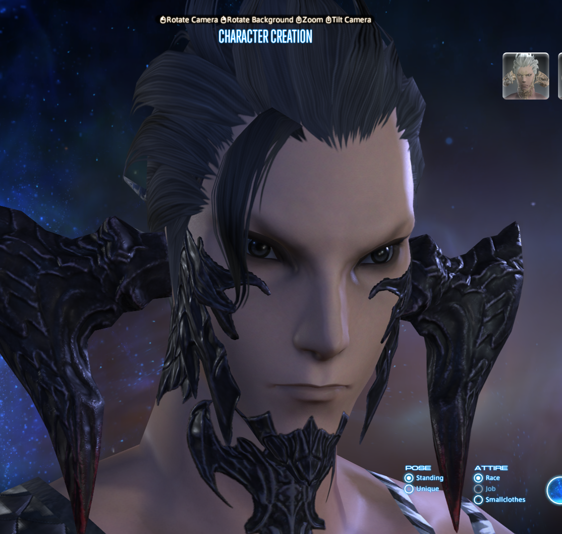
Trash Horn Shadows
https://imgur.com/a/Hw1AkIW
Trash Horn Shadows(3)Last edited by Remnance; 06-04-2024 at 02:09 AM.
-
06-04-2024 02:14 AM #13Player

- Join Date
- Jun 2021
- Posts
- 334
- Character
- Khlea Elakha
- World
- Louisoix
- Main Class
- Viper Lv 100
Looks pretty bad. The shadows aren't great either
 Originally Posted by Remnance
 (0)
(0)
-
06-04-2024 02:34 AM #14Player

- Join Date
- Sep 2011
- Location
- Limsa Lominsa
- Posts
- 23
- Character
- Cyn Theia
- World
- Sargatanas
- Main Class
- Astrologian Lv 100
Posted in the old thread, but I'll put it here too...
- Mouth 1 & Lip Color:
Not much to say here. The shape is still off, I also miss the upturned corners, but I might get over it eventually. I know gloss was added - but its still nearly invisible in most lighting. - Eye Shape 3:
While I'm not skilled or knowledgeable enough to give a detailed drawing, or anatomical breakdown, here's a side-by-side.
While subtle, the updated benchmark's eyes seem more rounded, dilated, & droopy, giving off the impression of either being drowsy or high.
The original eyes are sharper, especially on the inner corners, & have a more ambivalent look to them. Giving her a calm & determined expression.
However this could be due to the next complaint. - Upper Eyelid (Optional Feature):
In the current game version, the Au'Ra's upper eyelid feature gives a strong eyeliner & soft, feathery eyeshadow effect to the eyes.
The updated benchmark appears to be just a soft eyeliner - which is ironically a little weaker than that of a current Au'Ra without the feature at all.
There isn't anything really wrong with this, however for those wishing to achieve a more dramatic makeup appearance, that only leaves us with the fairly limited face paint options.
Personally, I like Face Paint 4 (Outer Eyeshadow) w/ Upper Eyelid feature. The combined appearance is both subtle & dramatic, giving a soft, two-toned eyeshadow effect to the middle & corner of her eyes. Unfortunately this option also isn't as distinct in the updated benchmark. The eyeshadow is a lot smaller, & the color drops off a lot shorter from the edge of her eye.
While I understand that its possible perhaps a majority of players prefer the new look of both the Upper Eyelid Feature & Face Paint 4 - it would be nice if these were closer to the original. These features are optional, so it should be easy to justify retaining their original appearance.
At the very least, with hair, eyebrows, and eyelashes being a lot lighter and less defined overall than as in the current game, it would be nice to have more options to make up for the differences. (2+ Face Paint options + more makeup variety?)
In any case, I sincerely hope the team will continue to improve our character appearances based on feedback throughout Dawntrail.
Current Game / Updated Benchmark (v11):
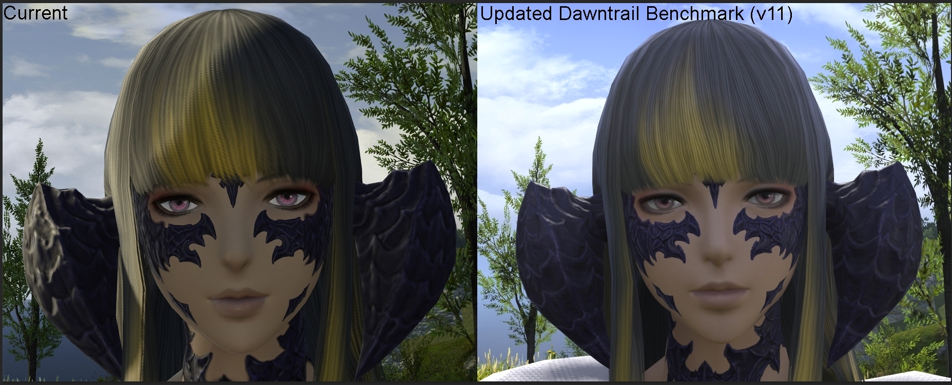
Forgive me for the hairstyle, this is what it changed to in the benchmark. Could've changed it for the screenshots, but eh...(6)
-
06-04-2024 02:50 AM #15Player

- Join Date
- Nov 2017
- Posts
- 14,003
- Character
- Aurelie Moonsong
- World
- Bismarck
- Main Class
- Summoner Lv 90
Are you talking about the "sideburns"? They've always been like that. Originally Posted by Raida
(1)
Originally Posted by Raida
(1)
-
06-04-2024 03:09 AM #16Player

- Join Date
- Apr 2024
- Posts
- 16
- Character
- Cinaedh Vik
- World
- Jenova
- Main Class
- Sage Lv 100
Face 4 Femra and 1.0 was good, 1.1 is better! Looks amazing. My only nitpick is SE caved to people who don't understand lighting and added one fake catchlight back into the irises
(2)
-
06-04-2024 03:33 AM #17Player

- Join Date
- Mar 2011
- Location
- Gridania
- Posts
- 88
- Character
- Kalandra Scathgealach
- World
- Excalibur
- Main Class
- Warrior Lv 100
I have one that I find really annoying with the improved lighting and one nit-picky one. Generally though, I like the changes and I love the new scale texture. (I spelled Limbal wrong like an idiot in the screenshots, please forgive me)
1) Lips still aren't right - but hard to explain what feels off
2) Shadows look odd around the mouth especially when looking at it from a bit of a distance. And in some of them the lighting makes the eye in shadow look strange.
From the Bench trailer - same character. The shadow and lighting just makes her mouth look real off
3) Wish list item - Make it so the iris doesn't extend past the limbral ring (can be seen in first screenshot) And additionally return the pupil to the original size so we can see the color of the iris better. It sort of gets lost now.
4) HUGE Wish list - Cutscenes with really awkward shadows
WP Hard last cutscene (I have a 2.0 screenshot when my char was a lala and no weird lighting)
Lips are consistently shadowed oddly on au ra (or at least this head type) - I have screenshots from 3.0 to current
(9)Last edited by Irishfae; 06-05-2024 at 04:44 AM. Reason: adding screenshot from the trailer
-
06-04-2024 03:48 AM #18Player

- Join Date
- Jun 2021
- Posts
- 26
- Character
- Setsue Edakumi
- World
- Phoenix
- Main Class
- Dancer Lv 100
I want to thank the devs for their work on the update and listening to our feedback. The lighting updates are very welcome and the eye highlights especially are a lot better, but I feel like concerns with au ra haven't been addressed and parts look outright unfinished.
On face 1 femra, there are still scales under the horns that are outright missing.
Here is current game (left) and old benchmark (right).

And below is the new benchmark.

Very disappointed to see it looks identical to before. This is on the level of a bug to me. Face 3 and 4 have their under-horn scales just fine, this is purely a face 1 issue where they look cut off.
Also, the low resolution scales on the back neck, visible with a solid neck seam line, that were present in the old benchmark are also unchanged:

These are the bare minimum I feel that need to be fixed. They feel like quality control issues.(14)Last edited by execlinca; 06-04-2024 at 03:49 AM. Reason: fixed image embed
-
06-04-2024 04:55 AM
Player
-
06-04-2024 05:29 AM #19Player
- Join Date
- Mar 2011
- Location
- Gridania
- Posts
- 88
- Character
- Kalandra Scathgealach
- World
- Excalibur
- Main Class
- Warrior Lv 100
1000% this!
Here is a side by side comparison. She feels like a different character now. And face 4 has the roundness of face 1 that I don't like and the eyes feel less defined/sever. It would be nice if we could keep the general lines of the face and with the new textures.
 Originally Posted by Alice9
(11)
Originally Posted by Alice9
(11)Last edited by Irishfae; 06-04-2024 at 05:35 AM.
-
06-04-2024 05:49 AM #20Player

- Join Date
- Jan 2023
- Posts
- 5
- Character
- Yerentai Kharliq
- World
- Cactuar
- Main Class
- Black Mage Lv 90
Male Face 3 Feedback - Part 1
Hello and Thank you for a new Thread for the Benchmark. I'd like to give some Feedback because I'm not really happy with some updates. I need to split it in two because I'm adding a lot of images, which I have resized and added links to higher quality images so they don't look as crunchy!
I also have to add that my PC has only a "Fairly High" rating. I realised that Appearances make a huge difference if you have better hardware, so maybe some of my issues are because of that.
For now, I will refer to the "old" Benchmark as "BM1" and the new as "BM2".
Lighting and Eye Reflection/Limbal Ring Issues
The overall comparison looks promising. I like the lighting updates - it gets closer to his original skincolor again, and some colors are more vibrant.

(https://imgur.com/syheaK8)
Switching from the Character Creation ("CC") to the gameplay, the lighting starts to get weird...

(https://imgur.com/cTw8Z2r)
The overall lighting looks more "blocky" to me, and less smooth. The blue/green lighting also seems odd, although it looks like that these are reflections from the ocean? But what really is obvious - and makes me really sad - is the changes to eye lighting. It looks like while being outside, some kind of 'veil' has been added to the eyes. My friend mentioned it's because of HDRI, but... idk, it just changes his expression and overall look A LOT imo. His eyes are the most pretty thing of him imo and to see it changed so much from BM1 to BM2 just makes me really sad.

(https://imgur.com/sLBDDMy)
(CC is the Aetherial Sea here)
It seems to be an issue with outside lighting, since it is most prominent in the outdoor areas, while the indoor areas of Gridania and the Aetherial Sea are less veiled and greyed.

(https://imgur.com/DW0emrc)
What irritates me the most is this "grey comb" - in lack of a better term - added to the eye due to the reflections. It gives the eye an overall greyish appearance and dulls the colors a lot.

I can hope that this effect is maybe tuned down, especially for darker eye colors or those with dark accents. His limbal rings are black and right now they look grey. I liked the lighting of BM1, since it added more realism and made the color more visible. Maybe a compromise can be found.
(continued in part 2!)(7)
 Reply With Quote