

You can tell these fairy tales to children at night. You don't need to be a graphic artist to understand that new shapes are a free interpretation of existing shapes. They don't have the task of recreating 2d graphics from the Nintendo era. They have enough of the current polygons to add better textures, polygons, lighting so that the character remains the same and at the same time looks like an improvement. To leave everything as it is and improve the details, you need to try a little. It takes a lot of effort to change ALL the current details of the face, and make them different, which we see in the benchmark. I see you are concerned about likes and this is an indicator for you. Take my gorgeous dislike for this square enix work.
Originally Posted by Plushy

Thread: Updated benchmark
-
06-17-2024 01:14 AM #511Player

- Join Date
- Apr 2024
- Location
- New Gridania
- Posts
- 79
- Character
- Llymlaen Greene
- World
- Cerberus
- Main Class
- Goldsmith Lv 93
(15)Last edited by LlymlaenGreene; 06-17-2024 at 01:53 AM.
-
06-17-2024 01:16 AM #512Player

- Join Date
- Dec 2021
- Posts
- 882
- Character
- Aco Nale
- World
- Moogle
- Main Class
- Dragoon Lv 100
The main issue is that the amount of options in the character creator is too limited to fine-tune many of the changes. The JP have also shared this sentiment in their own feedback thread.
Originally Posted by Plushy
If we did have, for instance, five more lip options per face type, then players would be able to adjust more (even though some wouldn't be happy regardless), but it's sadly not the case.
The graphical update on characters should have been accompanied with a character creator overhaul. I hope we can at least get it in 8.0.(11)
-
06-17-2024 01:55 AM #513Player
- Join Date
- Apr 2024
- Location
- New Gridania
- Posts
- 79
- Character
- Llymlaen Greene
- World
- Cerberus
- Main Class
- Goldsmith Lv 93
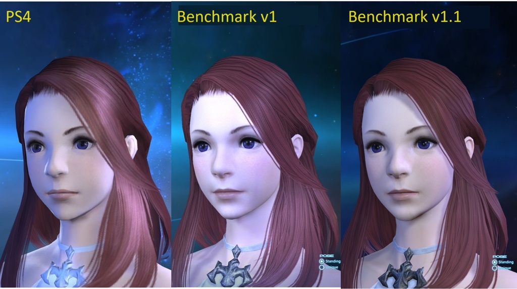
I can't speak for everyone, but I was expecting something like this. It's just the same shape and improved, clearer textures. With new shadows, subsurface scattering and many other modern things. *these have only upscaled textures*


I'm also messing around with the graphics editor a bit and I got my character back, hehe. I just put in my old eyes, mouth and lips. And she didn't change anything else. However, the nose has not been able to make the colors of the new skin, brightness, contrast and saturation have changed many times and this is the best option.
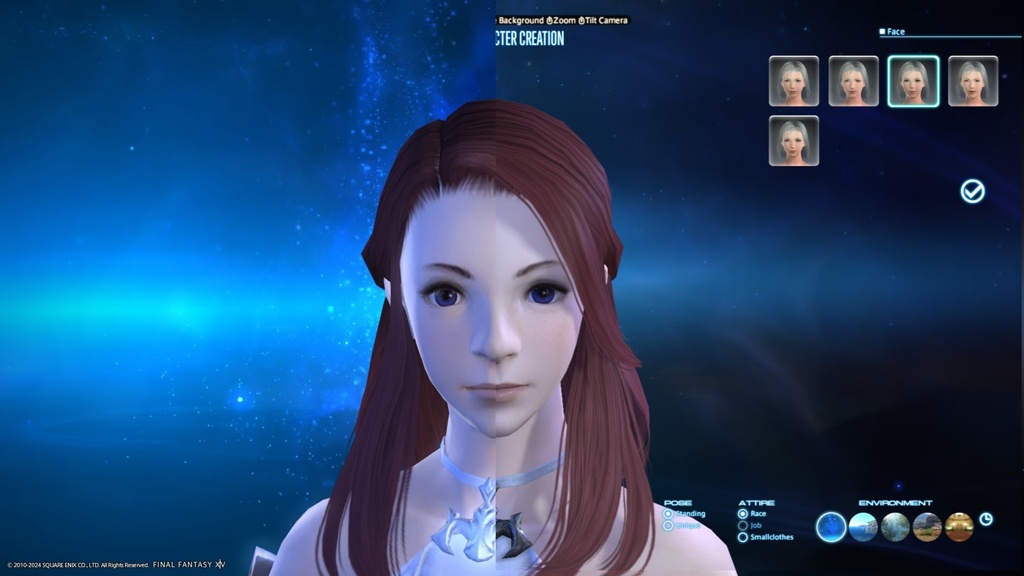
what i added

pictures.
old hyur

benchmark version

edit version

(15)Last edited by LlymlaenGreene; 06-17-2024 at 04:27 AM.
-
06-17-2024 02:21 AM #514Player

- Join Date
- Nov 2017
- Posts
- 14,097
- Character
- Aurelie Moonsong
- World
- Bismarck
- Main Class
- Summoner Lv 90
Cross-posting with the female Midlander specific thread.
I'm still bogged down in trying to do some more detailed diagrams and things, but I really need to get something posted as time draws short.
The graphics update hasn't captured my Midlander well at all.
Specifically this is face 3, jaw 3, eye shape 4, eyebrows 4, nose 5, mouth 3.
Some improvements were made since the first version of the benchmark - the heavy crease over the eyelid has been erased, and it helps her to look a bit better - but the eyes and the expression are still wrong. It feels like she has lost her confidence.
Comparison of all three including previous benchmark:
Comparison of current appearance and new benchmark only:
And at a wider distance:
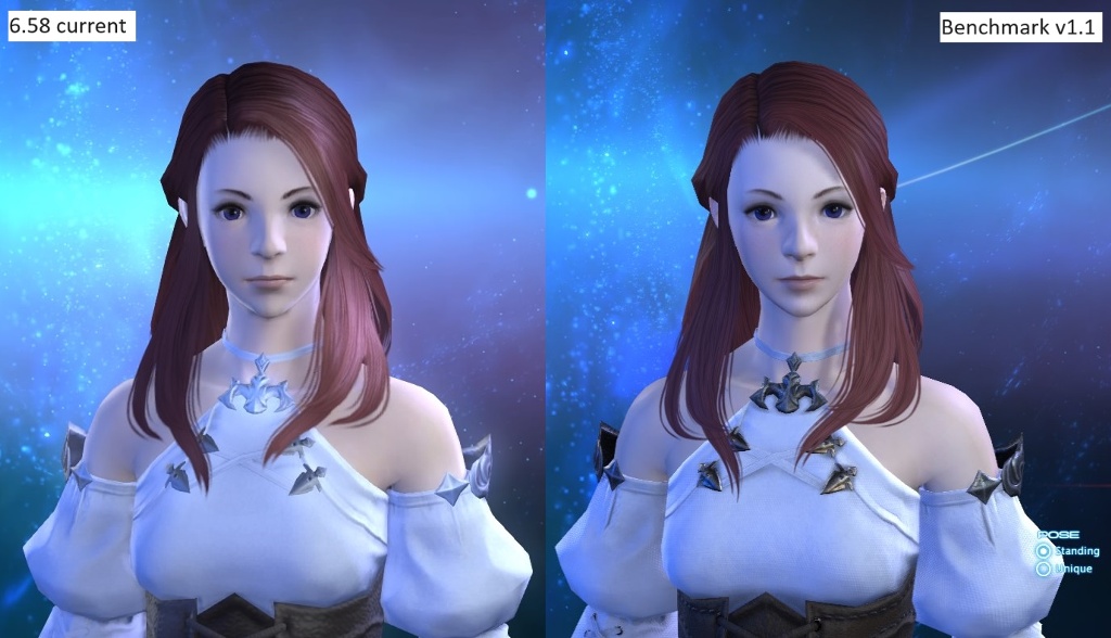
You cannot tell me that these are the same person. The basic attributes might be the same but the details are all wrong.
---
General issues with the face:
- The eyes are vertically lower and horizontally wider, giving them a drooping appearance and making her look sleepy or ill.
- The nose seems to be bigger and dominates the face in a way it didn't previously.
- The underside of the nose is more slanted instead of being fairly flat, so you see more of it from a front angle.
- The lips are larger - it seems like the shadow under the bottom lip has been reinterpreted as part of the lip. (Someone previously pointed out this had happened on one of the Au Ra faces, and I can now see that it has happened here too.)
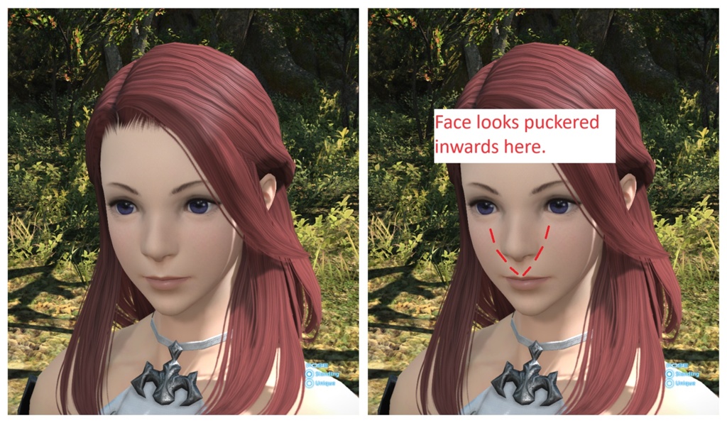
- There is a weird pucker on the face (see below).
- The neck is narrower where it meets the head.
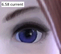
The eyes are my biggest issue. You can see in this comparison gif that it goes from being a very "upwards" sort of shape with the arc of the eyelashes basically centred over the pupil, to being low over the eye and heavily weighted towards the outside corner, which has been pushed outwards and become more slanted. It drastically changes the feel of the character.
Specifically regarding the pucker on the face, it's difficult to describe but you can see it in this following picture from the benchmark. As soon as I saw the benchmark I immediately felt like she was pulling a weird face, although I couldn't say what gave the impression until I had it at the right angle for these creases to catch the light. From pulling some faces in the mirror, to get diagonal-inward lines like this to appear on my own face I had to make an exaggerated "ooh" sound with my lips sticking out. It's not a straight resting face at all.
Additionally there are some strange shadows being cast by the hair onto the face:
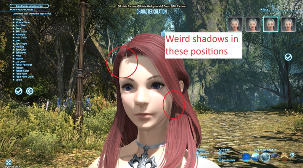
And some particular weird lighting on the eyelid rims of the benchmark model, so they're brightly lit high up and then have shadows lower down, where the original version has a more controlled, permanently dark outer rim that better frames the eyes.
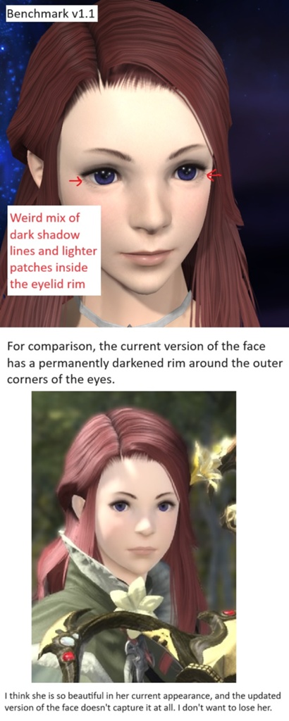
I wrote it on the image but I'll say it again - my current character is beautiful and I don't want to lose her. She has a perfect balance of looking friendly and confident and sweet-natured, and the benchmark doesn't capture any of it. The soul isn't right.(14)Last edited by Iscah; 06-17-2024 at 03:14 AM. Reason: Added character settings
-
06-17-2024 01:19 PM #515Player

- Join Date
- Mar 2011
- Location
- Gridania
- Posts
- 88
- Character
- Kalandra Scathgealach
- World
- Excalibur
- Main Class
- Warrior Lv 100
Exactly this!
Originally Posted by Iscah
I have 8 years and thousands of hours of screenshots and video with my character (as she is now) and this new version doesn't feel like the same one I spent those thousands of hours journeying with. It is super frustrating. I get that not everyone cares what their character looks like (my brother hits random and that is it, he's good) and I get that some people really like the changes and super stoked to try the updated races. You guys are the lucky ones.
But this is such a disappointing change for me that I'm thinking of using an alt in the beginning and hoping that they allow us to keep the original lines before using my main again.
And, related, adding some new pictures I put together. I really don't understand why the lines/shapes were changed. It feels like someone was looking at the original model, and then tried to redraw it from memory and got really close, but not quite (the new ones are lovely - they just aren't my character) and called it a day.
(14)
-
06-17-2024 01:24 PM #516Player

- Join Date
- Dec 2014
- Location
- Limsa Lominsa
- Posts
- 2,021
- Character
- Rexipher Evergrey
- World
- Odin
- Main Class
- Dark Knight Lv 100
I'm sorry.
Originally Posted by LlymlaenGreene
But when that came up while scrolling down the post I burst out laughing.
I wasn't expecting a couple of eyes, nose and a mouth floating like that.
No bad intentions.
Just looked funny.(14)
-
06-17-2024 05:36 PM #517Player

- Join Date
- May 2019
- Posts
- 255
- Character
- Cheap Shot
- World
- Balmung
- Main Class
- Summoner Lv 100
I feel exactly the way you do. It's 5 or 6 years for me, and a screenshots folder that's 30GB. I still have the original fantasia I was given but I love my character so much I've never used it. Another free fantasia isn't going to fix this for me, especially when there's only two or three extremely similar options per facial feature to switch to. I've honestly felt depressed about this whole thing. My character doesn't feel like my character anymore to me either. You inspired me to make a split screen comparison. I made mine a video. Hopefully this works. I also made one to show the missing lip gap as well as the change in face profile.
Originally Posted by Irishfae
Video of front on comparison: https://i.imgur.com/f2crDvz.mp4


I really want them to spend more time making things closer. Faces is how most of us recognize others. It's too uncomfortable for me to see these changes.(17)
-
06-18-2024 01:42 AM #518Player

- Join Date
- Oct 2022
- Posts
- 222
- Character
- Mara Sagegrove
- World
- Faerie
- Main Class
- Dark Knight Lv 100
Just checking in as one more person who shares this sentiment. I want to be excited about a new expansion coming out, but instead I'm dreading DT as an oncoming deadline where I'm going to lose my character. As was said above, the graphics update, whether you like your character or not, is not release ready. I just can't understand why they gave us the first look only 2 months before release. Or how the first benchmark made it through QA despite the myriad glaring bugs and nonfunctioning lighting. Originally Posted by azaleai
I've had my WoL for 4 years, never fantasia'd, and have taken well over 1000 gposes with her. I'm angry at the dev team for effectively taking her away by forcing this low-effort "upgrade" on us.(15)
-
06-18-2024 03:24 AM #519Player
- Join Date
- Mar 2011
- Location
- Gridania
- Posts
- 88
- Character
- Kalandra Scathgealach
- World
- Excalibur
- Main Class
- Warrior Lv 100
I wish they would, but same for me, no amount of fantasia is going to fix her.
Originally Posted by Cheapshot
Nicely done! The beginning with the EW part first and the profile view seems to make the change more striking.
Originally Posted by Cheapshot
I think is also nicely showcases the bizarre change in the color palette too. Fair skin is now even fairer (easier to fix, but I'm wondering what sort of technical thing causes that to happen, unless it was an artistic choice. (And before anyone wants to fuss at me for this, yes, lighting does affect how the color is perceived, but this goes beyond changes to the atmospheric lighting - as others have also pointed out.)
Exactly.
Originally Posted by Cheapshot
(Fun little story: One of kids came in while I was typing this up and I still had your video up and he looked at it a moment and said "the eyes are wrong, it doesn't look right" about the DT version. And this coming from someone who doesn't play the game. Just an interesting observation.)(12)Last edited by Irishfae; 06-18-2024 at 03:32 AM.
-
06-18-2024 03:36 AM #520Player

- Join Date
- Jun 2024
- Location
- Carteneau Flats
- Posts
- 10
- Character
- Denamora Acerola
- World
- Cerberus
- Main Class
- Dancer Lv 90
5 years, and 8 thousand hours. One "fantasy" to change the color of the eyes at the very beginning of the journey. 70 gigabytes of screenshots. I really don't like what I saw in the 2nd benchmark, it's like I lost my character. I don't recognize my favorite miqo'te in the new benchmark, and I don't understand why they made it worse, even in such small things as the detail and shine of the eyes, which now look more like the eyes of a rotten fish. I'm afraid of you, Dawntrail.
 (13)
(13)Last edited by Dazedu; 06-18-2024 at 03:53 AM.
 Reply With Quote


