Gonna be lovely to go through the story looking like this

Thread: Updated benchmark
-
06-14-2024 11:51 PM #481Player

- Join Date
- Apr 2024
- Posts
- 62
- Character
- Spiced Cider
- World
- Famfrit
- Main Class
- Black Mage Lv 100
(20)
-
06-15-2024 12:57 AM #482Player

- Join Date
- Apr 2024
- Location
- New Gridania
- Posts
- 85
- Character
- Llymlaen Greene
- World
- Cerberus
- Main Class
- Goldsmith Lv 100
Okay, so it's yours again, forever * satisfied* Llymlaen and this is another attempt to make a review about what has changed and what is wrong with the hyur 1 face that my character uses. After spending a solid amount of time comparing faces, that's what I got. In my opinion, there are a lot of changes and they radically change my feeling of the character * your opinion may not coincide with mine, we are all different and everyone has their own view of things *.
AAnd yes, I will take and listen to the opinion of wise people and try to tell in words what has changed* but these are more abstract and subjective things*. And I'm sorry in advance if I'm being impolite again at some points. I have to say everything I think.
Let's start naturally with the most important thing: the mouth.


There are so many changes here that it's easier to say what hasn't changed. Well, it hasn't changed that it's still a mouth, hahaha. A completely different form. When I chose my mouth, I wanted to see a contented, confident young girl, one might even say smug, but now she is a sad, even scared teenager. The photo will be next. And this change completely contradicts the very concept that the developers introduced us to, saying that they would not change the impressions of our characters. I'm sorry, but I still feel cheated, because right now we have something that is far from your promises. * I still don't understand why almost every element should be changed so dramatically*.
1. The shape of the lips itself. Previously, these were very interesting and cute lips with a bow with twisted shapes, and an interesting, intricate lip line, and a slightly smug smile that sets the tone of the character, but now we have a boring, ordinary shape. A simple, almost straight lip line that bends down strangely at the tips of the lips, creating a sad look. That is, there were very unique individual lips, and now it's just sterile, generic lips * my opinion*. You tried so hard * to leave us the same impressions that in a burst of creative work you made completely different lips. I would like to add them as a new lip type.
2. The corners of the lips are lowered and go straight into the dimples of the lips, which were not there before
3. The color has changed accordingly. I personally prefer the previous one. Dear Schwarzwaelder has already painted everything perfectly for you about colors at Jp forums
4. The lower lip looks bigger and because of this, the lip line is higher.
5. On the new lips, there is a thing under the lips that did not exist before. I prefer without this stuff.
6. The lips are now further away from the nose, which in turn also affects the appearance. Yes, by 3 to 5 pixels, but it is.
To sum up, a completely new kind of lips.(9)Last edited by LlymlaenGreene; 06-15-2024 at 04:48 AM.
-
06-15-2024 12:58 AM #483Player
- Join Date
- Apr 2024
- Location
- New Gridania
- Posts
- 85
- Character
- Llymlaen Greene
- World
- Cerberus
- Main Class
- Goldsmith Lv 100
Then the ears. I won't pay much attention, in general they look better, have a clearer texture, but there are complaints.


1. The ears have become more protruding, farther from the head. In simple words, she has become more lop-eared.
2. The earlobe on the old ears was more voluminous and interesting. On the new ears, it's a simple line.
Next, we move on to the nose


It's actually very interesting here. It used to seem to me that more pixels meant more rounded smooth shapes, but in my case we get exactly the opposite.
1. The nose has become more square. The shadows are square and overall, again, the feeling of a new nose. Previously, it was a cute nose that stood out noticeably, but now it is a nose of a different shape, which has a noticeably straight bridge of the nose, which also does not play in favor of the same impressions, and gives the impression of a more angular, aristocratic nose.
2. The nostrils on the new nose are now further apart, making the tip of the nose larger and also, in combination with the new light, makes the tip more square.
3. There is now a dark spot on the tip of the nose that just looks ugly and out of place.
Next on the list, we have our charming eyes, yes.


Again, the same claims. The shape has been changed for no apparent reason * can you at least tell me why you are radically changing every element?*. I do not know, before the look was more languid, mysterious, flirtatious. Now it looks like a gaze looking into the void. To nowhere.
1. Like the lips, the new shape of the eyes * I'm not surprised anymore*.
2. The tips of the old eyes look up, but the tips of the new eyes now also look slightly down.
3. The new eyes have become simpler! Look at the photos, they used to be more complex, with a lot of details, but now they have lost many features. I thought that with the development of graphics technology, things should become more detailed, and not the other way around.
4. Bags appeared under the eyes, which makes an energetic and lively girl, a tired, sleepy office worker.
5. The pupil has become larger. Again, a deliberate artistic interpretation of the current look.
6. The beginning of the eye at the bridge of the nose has become less pronounced and less detailed, yes, the very corner of the triangle. Too many changes for the eye, don't you think?
7. There is less mascara. The eyes look lighter and simpler.
8. There is no eye shadow over the eyes, because of this, the eye looks different. The look changes from playful to indifferent. And if you look closely, due to the lack of shadow, a strip of pixels has appeared and the eye looks undersized
Eyebrows.


1. They changed the shape, there used to be a more pronounced arch at the tips of the eyebrows.
2. Eyebrows have become lighter.
3. The eyebrows have become straighter and the hairs are the same length. There was also a clear skew in the length of the eyelashes. The eyebrows are also less thick.

The general appearance of the character. A smug, mysterious girl with a gorgeous smile turned into a scared, indifferent tired, sad teenage girl. The facial features in the present form have become more refined. Here's the deal
In my opinion, who has played thousands of hours on this character alone, this is a huge difference. It looks more like aura, to be honest. I'm trying to convey to the developers that if you change the details of the puzzle picture * nose, mouth, eyes, change their shapes as you please*, we will not be able to assemble the same character that was before.(10)Last edited by LlymlaenGreene; 06-15-2024 at 03:06 AM.
-
06-15-2024 12:59 AM #484Player
- Join Date
- Apr 2024
- Location
- New Gridania
- Posts
- 85
- Character
- Llymlaen Greene
- World
- Cerberus
- Main Class
- Goldsmith Lv 100
Well, that's my opinion. And this applies only to one character of the same race, and to be honest, I am not happy that the developers provided me. And imagine how much they still need to fix. The game is about to be released, and absolutely all the parts that can be changed on my character have been changed. This is unthinkable. You will say, because this is a graphic change and they need to be changed. I agree. But they must be changed according to the original. I have provided all the evidence above that the developers literally draw new noses, eyes, ears, me everything they can, simplifying the details and depriving the characters of individuality. In general, this hyur seems to me more like aura lol. * is it all the fault of the standardization of all races, as they said at fanfest? I don't know*.
There are so many flaws and we still don't know what our characters will look like, because they continue to improve our characters.(6)Last edited by LlymlaenGreene; 06-15-2024 at 04:06 AM.
-
06-15-2024 01:52 AM
- Reason
- Found out how to do it :)
-
06-15-2024 01:57 AM #485Player

- Join Date
- Aug 2021
- Posts
- 639
- Character
- Katja Eruyt
- World
- Moogle
- Main Class
- White Mage Lv 90
Just found an article explaining it
all good!
(0)Last edited by SherlottaEryut; 06-15-2024 at 03:37 AM.
-
06-15-2024 01:57 AM #486Player

- Join Date
- Jul 2011
- Location
- Gridania
- Posts
- 400
- Character
- Brynne Lagaao
- World
- Siren
- Main Class
- Warrior Lv 100
You go on your PC to where the game saves character data (usually in Documents/My Games somewhere) and copy the Character .dat file that is associated with your character. Then go to where the benchmark saves character data (same directory, different folder) and paste the character data there. Rename it so it follows the benchmark character data format, and your character is now in the benchmark.
 Originally Posted by SherlottaEryut

Excellent lol they probably explained it better than I did.
Originally Posted by SherlottaEryut
(1)
-
06-15-2024 05:22 AM #487Player

- Join Date
- Jul 2021
- Posts
- 199
- Character
- Luna Puella
- World
- Midgardsormr
- Main Class
- Red Mage Lv 100
I'm not really feeling very excited for Dawntrail due to all of this. Excuse the "doomposting", but I don't feel very optimistic about the "future tweaks" at all right now. I understand developer time (I'm not asking for an immediate resolution, I know that isn't realistic) but everything feels a bit too ambigious to feel confident about. Especially when Au Ra essentially wasn't even touched (outside of limbrals) in the 1.1 Benchmark. I worry that even if the tweaks do come my character is just permanently going to have her likeness destroyed.
I just feel so disappointed following the PLL, seeing all the new places to explore and what's coming - I just don't think my experience in Dawntrail is going to be as enjoyable when I wasn't as fortunate and got very clear changes like enlarged lip size forced onto my character. I think it's great for those who are content and happy but it personally feels crushing.
I also disagree with the sentiment of Fantasia or "getting used to it", there is no way to look similar to as before if you are using very specific settings.(24)Last edited by lunartears; 09-01-2024 at 07:25 AM.
-
06-15-2024 12:14 PM #488Player

- Join Date
- Oct 2023
- Posts
- 29
- Character
- Acheno Oronir
- World
- Diabolos
- Main Class
- Dragoon Lv 64
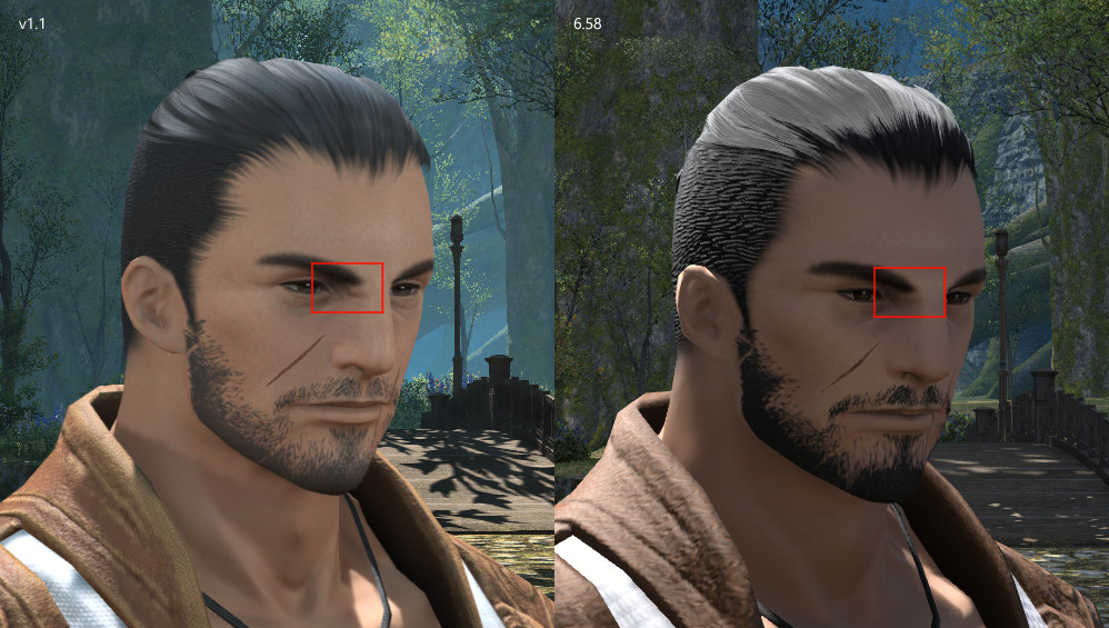
I would like to expand on the bolded part of my message and properly explain how I feel face 4 Highlander changed. I have revised my previous screenshots to communicate these changes more clearly. First, however, I would like to thank the development team for their efforts on benchmark v1.1. The lighting improvements are amazing!
Originally Posted by Risough
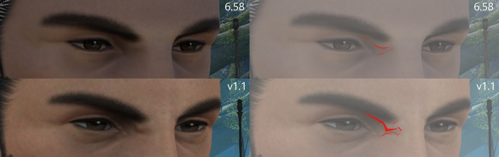
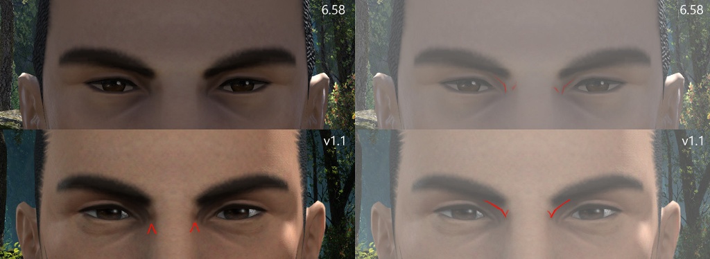
The furrows of the character’s brow have been made much deeper. In this view you can see that the brow has soft shadows in 6.58. In the updated benchmark there is instead a prominent wrinkle. This issue is consistent regardless of which eyebrow option is selected. I have tried to show the soft shading of the original in contrast to the graphic shape of the benchmark in my drawing.
These wrinkles are also visible from the front. The wrinkle is very subtle in the shading of the current version. In the benchmark the crease creates a harsh line between the bridge of the nose and the eye.
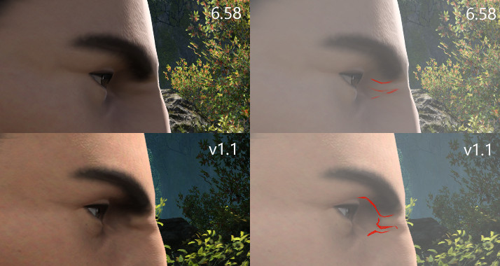
From the side you can see the wrinkle is again much deeper and darker. There is also an unnatural angle where the wrinkle crosses the border of the eye socket.
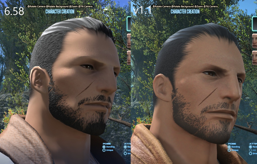
I have also taken a screenshot of my character without face paint for those who find it distracting. Here you can clearly see the deep brow wrinkle in contrast to the subtle shading of the current graphics. It is especially noticeable on the bridge of the nose.
Overall, I feel the impression of face 4 highlander has been significantly changed by the deepened furrows. Compared to 6.58, the character feels older and much grumpier. I feel my character has changed significantly. I would appreciate it if the brows could be adjusted to remove the prominent furrow. Could you please somehow correct the shading to be softer like in the current graphics?
I know the development team is doing their best and I am sorry to ask more of them, but please accept my feedback for consideration.(6)Last edited by Risough; 06-15-2024 at 03:07 PM.
-
06-15-2024 01:31 PM #489Player

- Join Date
- Apr 2024
- Location
- Limsa Lominsa
- Posts
- 25
- Character
- Mountaindew Bajablast
- World
- Goblin
- Main Class
- Pictomancer Lv 100
I like a lot of the changes made in the updated benchmark version, however, there are there are still two issues I have with the changes: I don't like the change to the mouth and nose. My character's face is Face 2 for Male Viera.
The mouth, specifically the lips, appear to be a different shape and more flat and wider. I picked the smallest mouth option (4) but it looks like the size of the current Endwalker default mouth option (1).
The nose looks much more human-like instead of being more rabbit-like. They've made the part in between the nostrils wider. I picked the most thin/small nose option (3) but once again it looks like the current Endwalker default nose option (1).
I hope these changes can be fixed because it would be very unfortunate if Viera lose some of their rabbit-like feeling to become more human-like, that's how I feel anyways.

 (9)
(9)Last edited by DemiBajamut; 06-16-2024 at 12:22 PM. Reason: fixed typo and added more info
-
06-15-2024 03:45 PM #490Player

- Join Date
- Apr 2024
- Posts
- 13
- Character
- Liren'ra Kolin
- World
- Mateus
- Main Class
- Rogue Lv 100
https://forum.square-enix.com/ffxiv/...pe-still-F-ed.
Adding a link to this thread about the problems with male miqo'te faces. My feedback is a reply to that about facial structures changed to make male miqo'te face 1 look moronic and vacant, scars too long, and eyes better than the first benchmark but still lacking the current shimmer and turning lifeless and dead as soon as you zoom out even a little.
Black hair is also washed out.
I do want to thank the devs for putting the moonkeeper fangs back, but there is so much that is still wrong as if it got translated into a bad copy.(8)
 Reply With Quote