This is happening with almost all the models I've tried. Some are worse (au ra f head 4) and some not too bad (my keeper of the moon looks pretty good)
Originally Posted by Sky7

Thread: Updated benchmark
-
06-06-2024 07:58 PM #391Player

- Join Date
- Mar 2011
- Location
- Gridania
- Posts
- 88
- Character
- Kalandra Scathgealach
- World
- Excalibur
- Main Class
- Warrior Lv 100
(3)
-
06-06-2024 08:43 PM #392Player

- Join Date
- Jul 2023
- Location
- Gridania
- Posts
- 19
- Character
- Wynn Leiye
- World
- Shiva
- Main Class
- Bard Lv 100
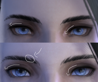
Having my issues with image-URLs so now I got imgur ^^
I created some GIFs for especially the huge changes in the eyebrows on my Moon Miqo - Face 2 - Eyes 6 - Eyebrows 4


also the direct comparison of the eyebrows to the second change in benchmark 1.1

and for extreme example - eyebrows 2 in comparison (as these are always the most straight ones)
 (6)
(6)
-
06-06-2024 08:52 PM #393Player

- Join Date
- May 2024
- Posts
- 42
- Character
- Eshanah Dorh
- World
- Twintania
- Main Class
- Red Mage Lv 100
I totally agree with you, they have achieved to truly upgrade the characters and they did a pretty good job keeping the original ideas/shapes polygon-wise. (The only exception might be some mouths, but I don't think that could be easily fixed or should be fixed in some cases.) Originally Posted by Astronis
At least on my female highlander it is true and they are one of the more problematic races here I think - yes, she felt extremely off for me at first (it was the reason to join the forums actually), but I've got out the ruler and her features anatomically are extremely close to the original.
https://forum.square-enix.com/ffxiv/...=1#post6472664
We should consider the new lighting as well - I believe it causes a lot of the face to look different - faces shorter/smaller, cheeks shaped differently, etc. - because it looks more dimensional now. But the lighting is a huge, huge improvement, even if it makes the face look off.
There are also some differences caused by the new textures too - I assume the creases, some eye shape or some mouth differences or how we perceive the distance between the eyes are because of this.
All in all, I could recommend sitting down and comparing the faces in minute details, it was what made me accept a lot of differences, including the mouth. - When I compared the original with the benchmark, I asked myself: 'If I was the artist, what would I have done?' There are a lot of really minor differences, which makes the character look off, but if I was sitting next to the artist, I would have agreed to commit to them - upgrade the nose, yes, giving eyebrow definition, yes, define the texture at the corners of the mouth, yes, define the creases to look more dimensional, yes, etc...
Of course, there will be changes, but in the end, you can compare the original and tweak the textures to feel more similar. - And I do think we should only look at the characters to see what defines the face, what improves upon it and what is important to change to get closer to that definition. Not necessarily to achieve the same, but to get closer to it if needed.
I think there might be more characters out there where the differences could be more acceptable for the owner if he/she tries to see the details thus. And in the long run, we will get used to or even get attached to these new differences too...
I know it is extremely based on my case and my opinion, and I don't know if all the characters would work like this... Please don't stone me for it.(6)
-
06-06-2024 09:34 PM #394Player

- Join Date
- Feb 2019
- Location
- Aldrassil
- Posts
- 2,595
- Character
- Larirawiel Caennalys
- World
- Shiva
- Main Class
- White Mage Lv 100
They have screwed up the facial normal maps again. Especially female Miqo's are extremely affected by this. Almost every female Miqo picture, i saw, has this crazy smile. For some reasons the FF14 art team struggles hard when it comes to create proper normal maps. Either they do some try&error stuff or something else.
Originally Posted by Sky7
Cheers(6)
-
06-06-2024 09:59 PM #395Player
- Join Date
- Mar 2011
- Location
- Gridania
- Posts
- 88
- Character
- Kalandra Scathgealach
- World
- Excalibur
- Main Class
- Warrior Lv 100
Just wanted to take a moment to thank the the whole team for their efforts. I know I'm being critical of some of the changes, but I am also really looking forward to Dawntrail and the graphical update and thanks to everyone working on it for their work.
(8)
-
06-06-2024 10:03 PM #396Player

- Join Date
- Oct 2022
- Posts
- 223
- Character
- Mara Sagegrove
- World
- Faerie
- Main Class
- Dark Knight Lv 100
crossposting for visibility
Originally Posted by noumen0nn
(10)
-
06-06-2024 10:54 PM #397Player

- Join Date
- Apr 2024
- Posts
- 12
- Character
- The Nightingale
- World
- Seraph
- Main Class
- Arcanist Lv 100
Female Highlander Face 1
The eyeshape on face 1 for female highlander is also off and makes the character look completely different?
It is eyeshape 3 that I have the most gripes with because suddenly the outer eye corner droops down instead of going up and the inner corner has been made less angular as well.
Let us not forget the gap in the eyebrow as well.
Reposted here for visibility!(10)
-
06-07-2024 01:14 AM #398Player

- Join Date
- Mar 2015
- Posts
- 37
- Character
- Hejligan Nagiljeh
- World
- Odin
- Main Class
- Ninja Lv 63
I play female Miqo'te. For me, they made the eye-region more similar to the current build (but I still think they could make it much more similar). For example, the completely different eyelashes making it look like mascara is applied. They fixed it so it looks less like heavy amounts of mascara are applied, but it is still a very different model of the eyelashes, it still looks like mascara is applied, just not the massive amounts of the old benchmark. So on that very particular feature, it is sort of a semi-fix at most, just as an example. But still, even the shape of the eye is slightly more oval and less round.
In general I still have an issue with the look being very... Different. The mouth is a component to it, but there seems to be more (including the eye-region, even though it is improved). I really hope they can fix that. I have a friend whose male Miqo'te now just has a completely different feel because his mouth is so different, it looks like he is constantly smirking.
Considering that they did improve on some of the feedback - for example my eyebrows now look far more similar to the current build, both the model and colour, in comparison to the old benchmark - I really hope they can fix the rest of the issues. The problem is mostly still a fundamental difference in geometry and models. But there is still an issue relating to how colours interact and how strong they are: I don't want my character to look like she has applied mascara and poorly applied lipstick that seems to shift her default expression.
On another note, unfortunately, even though the eyes are improved, they still have a weird layer which makes them feel less alive than before. The benchmark did not fix that point, despite it being a stated intention, only improved it a bit.(3)Last edited by Hejligan; 06-07-2024 at 04:10 AM.
-
06-07-2024 03:27 AM #399Player

- Join Date
- Nov 2014
- Posts
- 783
- Character
- Gyson Kincaid
- World
- Balmung
- Main Class
- Gladiator Lv 100
I disagree with different being a good thing. The goal was supposed to be improve the visuals while staying as true as possible to the original look. Whether anyone thinks the new nose looks better or worse, more interesting or less interesting, etc. is irrelevant.. it it looks like quite different from the nose it was meant to imitate and that is something that should be addressed.
Originally Posted by Astronis
Options are nice but you have options.. there are multiple noses already to chose from. I certainly wish there were more, but that doesn't mean we should replace the existing choices that players have gotten used to.
Originally Posted by Astronis
I don't understand this claim that the original thinness of the nose was a result of a lack of polygons. There are other nose options for male Highlanders that can in no way be described as being "thin", so it doesn't seem like a lack of polygons was the reason for making this particular nose thin. It is more likely it was made on the thinner side as an option to stand apart from the noses that are on the thicker side.
I suspect you just prefer this nose option over the others but have always wanted it to be a bit thicker, and that is certainly understandable but I can't agree with the idea of everyone just going along with the change to fulfill your wish at the cost of pushing their personal preferences aside.

Left is Endwalker, Right is Dawntrail. Face Type 2 is being used.
My character's nose (Type 6) was altered in the update (as were several other aspects, unfortunately) and I dislike the change. From brow to tip, the entire ridge of the nose is now more squared off and blocky, where as previously it was more smoothed/rounded. This gives the ridge the appearance of being wider. I dislike it. I chose the nose originally because it was the one I preferred, and I do not think it was too thin. If the goal was to stay true to the original, it failed. A result isn't an improvement simply because it has more polygons. If you can do something correctly in 100 polygons, using 1000 polygons to do it incorrectly doesn't make it better.
I could go on.. as I also dislike the changes to the mouth. Mouth Type 4 lips now appear larger, both in width and height. This is likely because the shape of the upper lip has changed. Significant space has been added into the cupids bow, where previously nearly none existed. Mouth Type 4 is the smallest sized mouth available to male Highlanders and should have remained as a small option, rather than being sized closer to the other larger options already available.
The hair, while more detailed when zoomed in extremely close, seems much less detailed when viewed from any reasonable distance. I believe this is due to the lack of shading that is now present in the hair, causing it to look very flat. Two-tone colors no longer blend nearly as well as they used to, and for the lighter color I am using the darkest shade available. I can not make it darker without switching to a different color entirely. Again, this seems to be a problem with lost shading or variance in its color, so rather than each tone having areas that are slightly lighter and slightly darker and allowing the sections to blend together better, each section now appears separate and distinct (which is not good when it's supposed to be a blend). I have not seen these issue on all hairstyles, so it seems to be a problem with this particular hairstyle.
The chin (Jaw Type 4) is a bit shorter than pre-Dawntrail, making the head look more squared instead of oval.
The skin tone (RGB 169, 133, 104) has changed and is darker than it is on live. I don't know how this can happen when we literally have the RGB values, but there it is.
And of course, the cursed Face Paint (Eyebrows) we're stuck with.. the placement of these markings is positioned significantly higher on the brow than it was pre-Dawntrail. This makes the character look more "surprised" all the time. Why can't it just be at the same position it's been for the past 10 years? Plus, now the coloring is off. Even with the darkest color (black) selected, the shade appears lighter or less vibrant than it currently is on live. This makes it difficult to pass these markings off as eyebrows, as the lighter they appear the more fake they look.
My friend asked me "what in the world is going on with that black eyeliner at the top of your eye?" I don't even know what the deal is there. Probably a result of some changes to shading, but it looks bad.
All of these are little things, but the little things add up and result in a character I don't recognize. I do not feel "upgraded".(12)Last edited by Gyson; 06-07-2024 at 03:49 AM.
-
06-07-2024 05:29 AM #400Player
- Join Date
- Mar 2024
- Posts
- 757
- Character
- Astronis Smythe
- World
- Mateus
- Main Class
- Dark Knight Lv 100
I saw your post originally and thought you did a very fair deep-dive on the small differences. I'm glad doing that helped you accept the differences. Yeah, they do look different to us, but of course the devs were never, ever going to make a higher-poly model look identical to a low-poly model. It would defeat the purpose! Why even bother updating the model at that point? And you are right, the lighting change *really* affects how we perceive our characters.
Originally Posted by riani
The first go round there were 100% a good few things that needed to be addressed. Big things like some wonky mouth scaling that made Lalafel teeth completely change shape to quite subtle things, like the height and angle of my Highlander's brow ridge. Those things were fixed and they needed to be. Now...most of the differences people are pointing out are extremely subtle. They exist! People aren't making them up. But to keep on spending dev time addressing them...I just don't think it's necessary outside a very few things. Everyone's WoLs look great and it's so obvious the devs took great care in trying to preserve the original appearances as much as was within their abilities while still upgrading the models and textures and lighting.(2)
 Reply With Quote