
No one here is upset because you had an opinion. If you think someone has to be upset to question you, that's not my problem. But go ahead and ignore all the things I said that were on topic and just focus on pretending I'm seething with rage so you can feel right again.
Originally Posted by Warkupo

-
04-15-2024 06:38 PM #391Player

- Join Date
- Aug 2013
- Location
- Eureka Orthos
- Posts
- 2,007
- Character
- Gunnar Mel'nik
- World
- Diabolos
- Main Class
- Bard Lv 100
(7)
-
04-15-2024 06:44 PM #392Player

- Join Date
- Jan 2022
- Location
- Yak T'el
- Posts
- 1,135
- Character
- Pip Chick
- World
- Omega
- Main Class
- Scholar Lv 100
I think Pip may have taken steroids backstage

 (15)
(15)
-
04-15-2024 06:53 PM #393Player

- Join Date
- Apr 2024
- Location
- Gridania
- Posts
- 59
- Character
- Khuja Rela
- World
- Moogle
- Main Class
- Dancer Lv 63
Hello!
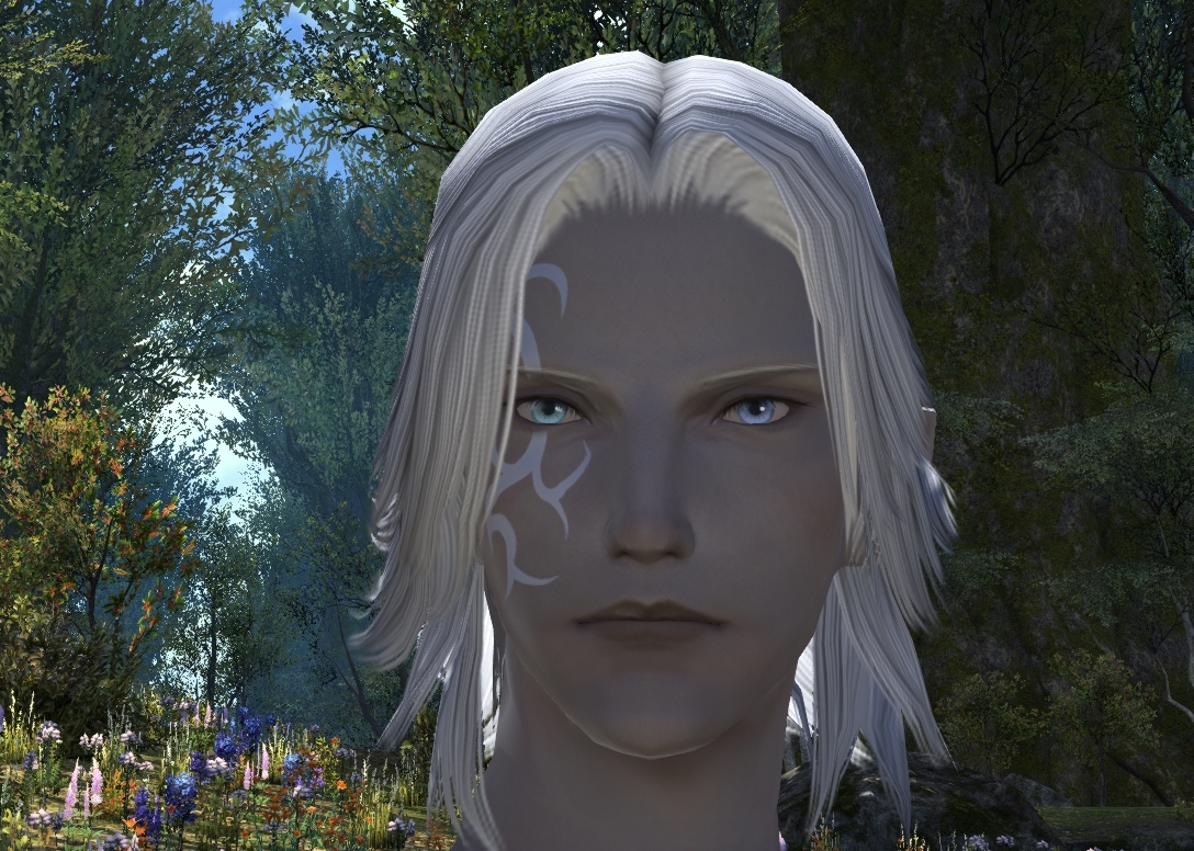
First of all: I'm grateful for the effort the developers put into upgrading graphics for the game, the higher resolution, the grass moving, the metallic gold etc look amazing! Thank you!. But I believe bad choices were made for player characters. I will try to give feedback to help hopefully.
I don't ask to be changed ASAP or Dawntrail should be delayed, I just hope it can be adressed in a most agreeable way for all us who are unhappy.
Miqo'te
1-Eyebrows are bigger and dark. I liked them small and blue.
2-Beauty mark like a small dot. It looks less realistic which doesn't make sense with the new skin texture. I liked her big egg-shaped blended beauty mark.
3-she had shiny lips and a cute smile. Now the mouth is neutral looking and matte.
4-the new skin shine looks like a silicone doll. It feels odd, but I could get used to it.
5-Nose is wider. I liked the small nose.

Midlander
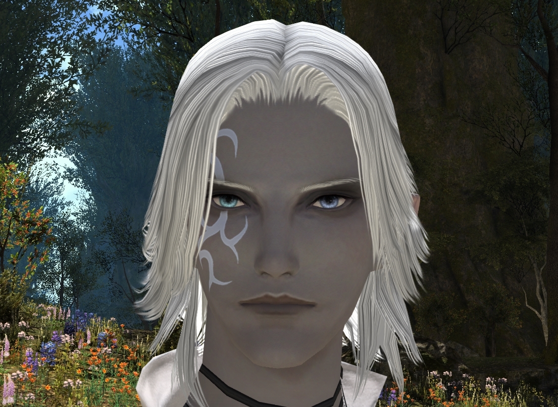
1. Hair looks stiff and fake, it also changed color. Personally, I liked the softness of the previous hair, even if it's a lower resolution.
2. Eyes look dead.
3. Lips are changed in shape and color, I liked the gradation of my character lips and I don't want PINK lips for her
4. Jaw and chin are rounder. I chose Face 2 because it was more masculine shaped.
5. Scar looks orange! unnatural.

Lalafell
I'm very very upset with this one...
1. Hair looks fake and also highlights are changed in color and shape. I don't like it.
2. Eyes look dead. this looks the same running the Benchmark trailer and moving camera. They look flat. Like if my character that had bright yellow gems, now has paper stickers on her face.
3. Eyebrows now thinner and neutral, facial expression changed.
4. Mouth changed too much. She used to smile and have upper lips and shine.
She got the worse, it makes me sad, upset and dissapointed.

Elezen
I love her as is!
On a more positive note... my elezen didn't have much of a facial expression from the start, so I'm happy...(lol). I love the ears being translucent.
Only... what's with this mouth shape when screaming??

Final notes
-I feel there is a try to be more realistic, despite they said they wouldn't go realistic and characters would remain as similar as before. I feel betrayed on this.
-Eyes look dead, I understand they have a real-time reflection now, but it failed. If can't be fixed, I think they should be back to the fake eye lights.
Or be optional.
-A lot of faces have changed in shape, nose, eyes, chin, lips... this should be optional. Some faces didn't change that much so I don't think this is about polygons, looks like an artistic choice.
-Female faces have been forcibly added extra make up
Thank you for reading until the end!
(7)
-
04-15-2024 07:11 PM #394Player

- Join Date
- Jun 2014
- Posts
- 1,311
- Character
- Feiya Harlow
- World
- Odin
- Main Class
- Dancer Lv 100
When I first loaded the preset for my current character I was a little bit shocked and I kind of disliked it, looking at it longer it did start to grow on me though, and in the benchmark itself vs. the character creation screen she especially looks great and I'm very happy with it!


I do have a small nitpick though, they seem have added freckles to every female Midlander face (these are NOT pores or texture, I can see the texture in the skin in other shots quite well and it looks great, these are painted on blemishes.) It's quite obvious on my monitor, but to better illustrate what I'm talking about I upped the contrast so that hopefully everyone can see what I mean. Graphic design is clearly not my passion so bear with me.


I don't mind freckles/blemishes or whatever it is, but it wasn't there before (or at least not this noticeable) and ideally it should be optional, the marks on the chin bother me especially because it looks like blackheads or stubble.(6)Last edited by Yencat; 04-15-2024 at 08:32 PM.
-
04-15-2024 08:07 PM #395Player

- Join Date
- Dec 2019
- Posts
- 987
- Character
- Xynnel Valeroyant
- World
- Balmung
- Main Class
- Astrologian Lv 100
EW first; DT second.
I don't hate it.
The shadows around the eyes don't bother me, since I've played around with ReShade and some of the options actually do give it in varying degrees.
I do think they should adjust the shine on the eyes though.
Also for the love of the Twelve, its 2024. If we bought/grinded for the other hairs (or even if we didn't) in game let us use them in the Benchmark FFS
Edit: I should add, going throw the Benchmark itself character looks fine
I'm less worried about the outdoor lighting than indoor where I've had the most issue with my character. Specifically when the light is overhead.
I don't know if I'm reassured or not.(1)Last edited by ASkellington; 04-15-2024 at 08:17 PM.
I'm tired of being told to wait for post-patches and expansions for fixes and increased healing requirements that are never coming. Healers are not fun in all forms of content like all jobs should be, they're replaced by tanks and dps due to low healing requirements and their dps kit is small for 0 reason, when in the past we had more options and handled things just fine. I refuse to play healer in roulette come DT. I refuse to heal EXs, I refuse to go into Savage, and I am boycotting Ultimate.
#FFXIVHEALERSTRIKE
-
04-15-2024 08:09 PM #396Player

- Join Date
- May 2017
- Location
- Gridania
- Posts
- 190
- Character
- Holo Wisewolf
- World
- Cerberus
- Main Class
- Dancer Lv 100
Can you not just upload photos on this forum? Or am I just missing something obvious?
(0)
-
04-15-2024 08:09 PM #397Player

- Join Date
- Jul 2015
- Posts
- 1,739
- Character
- Livia Bloodletter
- World
- Phoenix
- Main Class
- Dancer Lv 100
For some reason they have made a lot of the stern eye looks into sultry ones... Originally Posted by azaleai
(0)
Originally Posted by azaleai
(0)
-
04-15-2024 08:20 PM #398Player
- Join Date
- Dec 2019
- Posts
- 987
- Character
- Xynnel Valeroyant
- World
- Balmung
- Main Class
- Astrologian Lv 100
There's a button where you can input an image address that I've been using.
Originally Posted by Sacae
 Little green icon. But no you can't actually upload an image.
(0)I'm tired of being told to wait for post-patches and expansions for fixes and increased healing requirements that are never coming. Healers are not fun in all forms of content like all jobs should be, they're replaced by tanks and dps due to low healing requirements and their dps kit is small for 0 reason, when in the past we had more options and handled things just fine. I refuse to play healer in roulette come DT. I refuse to heal EXs, I refuse to go into Savage, and I am boycotting Ultimate.
Little green icon. But no you can't actually upload an image.
(0)I'm tired of being told to wait for post-patches and expansions for fixes and increased healing requirements that are never coming. Healers are not fun in all forms of content like all jobs should be, they're replaced by tanks and dps due to low healing requirements and their dps kit is small for 0 reason, when in the past we had more options and handled things just fine. I refuse to play healer in roulette come DT. I refuse to heal EXs, I refuse to go into Savage, and I am boycotting Ultimate.
#FFXIVHEALERSTRIKE
-
04-15-2024 08:24 PM #399Player

- Join Date
- Jun 2020
- Posts
- 835
- Character
- A'zalie Nitsah
- World
- Louisoix
- Main Class
- Summoner Lv 100
And Yoshida Dared to talk about the Au'ra dead fish eyes in a conference. they look more like dead fish now than before.
Honestly, when I see the number of critics and how unpolished the graphical update is with some races/face models (when it's good on other), how some of hte hairs don't have a HD version yet (For those who don't know, you can copy the creation data from your FFXIV folder, paste it in the benchmark forlder, then rename it, and select that model without any modification, and it will run with non listed haircuts - some already have an HD version, some don't), and they waited super late to give us the date, I feel they're rushing into this because the game begins to really suffer from the wait, and that the launch will be a "this zone is updated, this one halway, this one not" fest, and I expect the whole graphic update that was one of the point they marketed the extension on to end being one of argument against the game. I hope it's my slight paranoïa at work, but I can't help to feel warry.(2)Last edited by CNitsah; 04-15-2024 at 08:43 PM.
-
04-15-2024 08:32 PM #400Player

- Join Date
- Mar 2015
- Posts
- 37
- Character
- Hejligan Nagiljeh
- World
- Odin
- Main Class
- Ninja Lv 63

Left is old, right is new.
I am not very happy about how it changes the overall "look" of my character.
The obvious parts (which seems to be affecting everyone) are the massively thickened, enlongated and uniformed eyelashes, which even affects the lighting on the eyes. Eyebrows are also horizontally wider and a completely different colour.
Then there are the more subtle parts. The lip is horizontally smudged but at the same time appears to be less puffy where the lower lip ends. Ironically, there appears to be less detail on the face: it looks more washed out. It makes the overall face look both less defined and wider. Overall the skin looks... Wrong? Like a layer of cheap make-up has been applied?
But then there are even more subtle things: these pictures are both taken from the default angle when you come in to the editor (though breathing might have affected it slightly), yet why does it look like one has eye contact with my character in the current build, yet not in the benchmark? It looks like the benchmark version is "looking through you" in my opinion, while the release build is looking at you.
Overall the impression is that it looks like my character has applied cheap make-up: smudged lips, a weird quality to the skin which even hides definition, massive eyelashes, different eyebrows. I don't like it.
If I am allowed to be a bit less prosaic, if I met the benchmark version, I would probably be worried and call for an ambulance, because she has more the skin tone and eye-impression of someone who is about to pass out...(10)Last edited by Hejligan; 04-16-2024 at 12:28 AM.
 Reply With Quote


