

Scholar is a great concept, but the class lacks a thematic or visual identity and is too messy.
Thematically, scholar is juggling too many conflicting themes: An arcanist, a combat healer, a tactician, a book mage... with high-tech floating hologram screens, poisons (?), magical fairies, and even angels (!). Bio/Biolysis are very disconnected from the kit, unlike the SGE/WHM DoTs; angelic stuff was more appropriate for WHM's holy theme. As such, SCH ends up being an incoherent jimble jamble of arcane, magic, and holy elements mashed together - without really convincing about any of these.
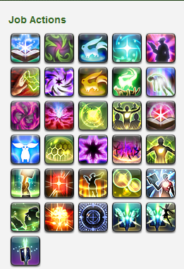
Visually, SCH spells are very contradictory and all over the place: Some skills cause arcane explosions, others biohazard, but others scatter fairy dust, sparkles, and channel angels. Shields look too futuristic for a book healer, and the floating hologram screens are way over the top; not to mention the cringey hologram glasses of Broil.
Spells use the entire color spectrum: some skills are blue and red; explosions are red, but Art of War is purple; Biolysis is blue-ish, but Bio is green; fairy dust is yellow, but the angel is blue; Selene's purple boots are just.... terrible; shields are transparent, but soil is blue; and several spells hardly have any visual at all. I feel so confused by the color scheme that I don't always know which skills are supposed to be mine when there is a visual clutter.
You can actually tell about this mess from the disparity of skill icons and names. Icons are all over the place aesthetically, and names are a weird mix of Latin healing words and English tactical vocabulary. If it were more consistent, like in JP, it would sound more scholarly, but now it just sounds confused. Though these elements are unlikely to change at this point, so not worth discussing.
Compare all this to SGE, who is thematically and visually so neat and organised. All healing spells are blue, damaging spells are pink. There is a clear theme of a high-tech physician, and all skills follow a naming pattern/convention. Even skill icons blend well together. To a lesser extent, WHM and AST are also quite consistent thematically. This comparison really shows the result of a class built from level 1-90 in one go (SGE), by one team with a clear vision, versus a class that has been slowly built over 10+ years by different dev teams with very different ideas (SCH).
Simple solutions: Pick a main theme color and stick with it, apply it to several if not all skills (and icons). Yellow could work (because of the fairy) but it doesn't really matter, as long as it's consistent. The fairies and the angel should have a similar color, all shields should have a similar theme, and attack spells should be more similar. IMHO names also need an overhaul to be more consistent but this is too much to ask for. Simple solution for me: Play sage kek.
- Forum Top
- English Forums
- Classes & Jobs
- Healer Roles
- SCH is a mess, thematically and visually, and needs streamlining
-
12-07-2022 10:27 AM #1Player

- Join Date
- Nov 2022
- Location
- Limsa Lominsa
- Posts
- 22
- Character
- A'than Tia
- World
- Sophia
- Main Class
- Sage Lv 83
SCH is a mess, thematically and visually, and needs streamlining
(10)
-
12-07-2022 05:20 PM #2Player

- Join Date
- Apr 2022
- Posts
- 1,181
- Character
- Wind-up Everyone
- World
- Zodiark
- Main Class
- Arcanist Lv 52
What do you mean? It’s an arcanist (poison tactician) that found a scholar (faerie tactician) job stone.
I don’t understand what you mean about the colour thing, warrior with its four buttons also uses every colour under the sun, white mage should be using brown, blue and greenish on its offensive spells alone not this bland sparkliness it’s been lumped with, ast has incredibly pretty visuals in a multitude of colours, sage is a mess on every level and it’s not like dps are any different (see samurai, dragoon, blue mage).
The mix of archaic words is probably meant to indicate that the job’s been lost since nym fell like at least 20 years before ARR.
Sage is clearly a new job that at best is copied homework and at worst an uninspired joke not even living up to how it was sold to the playerbase. It has not had time to develop any identity beyond “bad scholar” and until it gets a few expansions under its belt is not at all sensible to compare with the established healers (ast, the next most recent being added in heavensward).(13)
-
12-08-2022 04:52 AM #3Player

- Join Date
- Jan 2022
- Posts
- 149
- Character
- Hyohyona Hyona
- World
- Siren
- Main Class
- Scholar Lv 73
Having a jobs actions only be in one colour theme sucks for people like me who have bad eyesight especially when you have to keep the hotbars a certain size so they aren't taking up half the screen. It might not matter once you have muscle memory, but for learning a job and having to glance at the hotbar every now and then, it is easier to mess up icons that have similar colours.
(10)The past is prologue
-
12-08-2022 01:37 PM #4Player

- Join Date
- Jul 2017
- Location
- Gridania
- Posts
- 815
- Character
- Winter Gem
- World
- Brynhildr
- Main Class
- Scholar Lv 100
I'm on the fence with Scholar. I love feeling powerful because it definitely gets the job done when you need healing but I do feel like it's a bit chaotic in terms of lore. Selene doesn't have a reason to exist. Seraph likewise has zero explanation about her origin. The ridiculously high tech animations feel silly coming from a class using a book and a quill pen. It's supposed to be a battle tactician but literally attacks enemies with a skill set nearly identical to to the other healers. One nuke, one dot like all the rest doesn't sound like a healer specializing in the "Art of War." I don't mind the colors and skills icons being varied tho. The hardest thing about Sage was starting a class at level 70 with every skill having a similar icon and animation. I actually like having skills that are distinct in name, icon, and animation. Scholar could benefit from being repackaged for sure. I've always thought that both WHM and SCH needed some help with the early animations. Medica and Succor did not age well just like most of the base kit they have.
(4)
-
12-08-2022 02:42 PM #5Player

- Join Date
- Nov 2017
- Posts
- 14,122
- Character
- Aurelie Moonsong
- World
- Bismarck
- Main Class
- Red Mage Lv 100
I find icons across most jobs to feel very disorganised and un-instinctive. A lot of them feel like the artwork was done at a much bigger size without consideration of how it looks shrunken down, and there's no pattern to combos or good visual cues of the effects.
It's been a while since I played Scholar, but I remember being specifically annoyed by all the faerie spell icons being slight variations of "faerie in a non-descriptive pose" on the same coloured background, with no visual or colour clues as to what they did. I don't think that much could be blamed on change over time.(5)
-
12-08-2022 10:18 PM #6Player

- Join Date
- Feb 2018
- Posts
- 158
- Character
- Alrin Kireen
- World
- Phantom
- Main Class
- Sage Lv 100
Only thing that we Scholars really miss is physical attack.
(0)In darkness, in cold, in the midst of winter where nothing walks the world but death and fear let the brave rejoice: I call the light.
Out of darkness, light. Ouf of silence, song. Ouf of the sun´s death, the birth of each year. Out of cold, fire. Out of death, life. Out of fear, courage to see the day. (Elizabeth Moon - The Deed of Paksenarrion)
-
12-09-2022 04:06 AM #7Player

- Join Date
- Jun 2016
- Location
- Kugane
- Posts
- 1,028
- Character
- Rozemyne Shyahoro
- World
- Leviathan
- Main Class
- Dark Knight Lv 100
Slap your enemy with the book. Slip a few weights inside of it for extra damage.
 Originally Posted by Alrin
 Only thing that we Scholars really miss is physical attack.(3)
-
12-09-2022 07:23 AM #8Pretty much this; before they decided to gut the DPS abilities from SCH, it had a very good spread of color coded abilities.
Originally Posted by fulminating
What do you mean? It’s an arcanist (poison tactician) that found a scholar (faerie tactician) job stone.
It was very nice - outside of a small amount of abilities like Ruin and Bio, you had a very general and uniform theme.
Purples and Reds for Attacks, and Greens for heals.
Scholar can very easily go back to this, especially now that SGE is the "high tech" healer. Make Biolysis, AoW II, Broil III/IV and Chain more in line with this and SCH doesn't have conflicting themes anymore.
SCH is also the only job in the game that switches class types, so I think it's more than fair to give it leeway where other jobs wouldn't.(11)
-
12-09-2022 08:41 AM #9Player

- Join Date
- Dec 2021
- Posts
- 128
- Character
- Luna Yue
- World
- Balmung
- Main Class
- Scholar Lv 100
Here's an idea...instead of wanting to change the class cuz you don't understand it, maybe, I dunno....don't play it and stick with Sage? Crazy concept, I know...
(9)
-
12-09-2022 09:49 AM #10Player

- Join Date
- Aug 2022
- Posts
- 155
- Character
- Agnes Nimue
- World
- Midgardsormr
- Main Class
- Scholar Lv 100
Actually, I think the different colors helps you identify your spells easier than if everything was melted into the same color, so I'm not exactly sure what the issue is with a colorful VFX and spell icons...
Thematically, SCH was a poison mage who chanced upon ancient magic used by tacticians accompanied with their fairy partner, like the other posts said. I think there was a good mix between the scholar, who had offensive and damage prevention abilities, and the fairy, who has supportive and pure healing abilities. It feels like two unique partners with different strengths, covering for each others' weaknesses. I think that's what solidifies SCH's identity as a battlefield strategist.
Unfortunately the poison mage stuff got nuked alongside individual control of the fairy (and one of the fairy's modes) and we're left with two entities that do the same thing, heal heal heal.
The floating holograms are a reference to FFXI SCH's Libra, which is scanning your opponent for weaknesses. It's meant to be imaginary. I don't think the shields look futuristic at all. It's hexagonal, which is the strongest structure in nature. I can understand Seraph being an issue thematically because it never really was explained where she even comes from. She's really lackluster for a fairy that you summon to raise everyone to full heal in your LB3. I agree with the Broil IV glasses, they look lame.(8)
 Reply With Quote


Quick Navigation
Healer Roles
Top
- Forums
- Japanese Forums
- ニュース
- テクニカルサポート
- 不具合報告
- プロデューサーレター
- ゲームシステム
- クラス&ジョブ
- ウェブサイト/アプリフィードバック
- 雑談
- この装備を武具投影したい!!
- あのジョブのUIレイアウトが知りたい!
- ジェネラルディスカッション
- ワールド(Group JP)
- ワールド(Group NA/EU/OC)
- Sargatanas(LEGACY)
- Balmung(LEGACY)
- Hyperion(LEGACY)
- Excalibur(LEGACY)
- Ragnarok(LEGACY/EU)
- Adamantoise
- Behemoth
- Cactuar
- Cerberus(EU)
- Coeurl
- Goblin
- Malboro
- Moogle(EU)
- Ultros
- Diabolos
- Gilgamesh
- Leviathan
- Midgardsormr
- Odin(EU)
- Shiva(EU)
- Exodus
- Faerie
- Lamia
- Phoenix(EU)
- Siren
- Famfrit
- Lich(EU)
- Mateus
- Brynhildr
- Zalera
- Jenova
- Zodiark
- Omega(EU)
- Louisoix(EU)
- Spriggan(EU)
- Twintania(EU)
- Phantom(EU)
- Sagittarius(EU)
- Alpha(EU)
- Raiden(EU)
- Bismarck(OC)
- Ravana(OC)
- Sephirot(OC)
- Sophia(OC)
- Zurvan(OC)
- Halicarnassus
- Maduin
- Marilith
- Seraph
- 初心者用
- コミュニティイベント
- 開催中
- 終了
- 第8回14時間生放送
- 第68回FFXIVプロデューサーレターLIVE
- 第65回FFXIVプロデューサーレターLIVE
- 第64回FFXIVプロデューサーレターLIVE
- 第60回FFXIVプロデューサーレターLIVE
- 第56回FFXIVプロデューサーレターLIVE
- 第53回FFXIVプロデューサーレターLIVE
- 出張!ひろしチャレンジ 応援プレゼント企画
- 第50回FFXIVプロデューサーレターLIVE
- 第49回FFXIVプロデューサーレターLIVE
- ハウジングコーディネートコンテスト
- 第44回FFXIVプロデューサーレターLIVE
- 第43回FFXIVプロデューサーレターLIVE
- 第42回FFXIVプロデューサーレターLIVE
- 第41回FFXIVプロデューサーレターLIVE
- 第40回FFXIVプロデューサーレターLIVE
- 第39回FFXIVプロデューサーレターLIVE
- 第38回FFXIVプロデューサーレターLIVE
- 第37回FFXIVプロデューサーレターLIVE
- 第35回FFXIVプロデューサーレターLIVE
- ハウジングデコレーションコンテスト
- 第34回FFXIVプロデューサーレターLIVE
- 第33回FFXIVプロデューサーレターLIVE
- 出張FFXIVプロデューサーレターLIVE in LAS VEGAS (2016)
- 髙井浩の○○チャレンジ!応援企画
- 第31回FFXIVプロデューサーレターLIVE
- 紅蓮祭スクリーンショットコンテスト 2016
- 第30回FFXIVプロデューサーレターLIVE
- 第28回FFXIVプロデューサーレターLIVE
- サントラ発売記念!奏天のイシュガルドコンテスト
- 第27回FFXIVプロデューサーレターLIVE
- 星芒祭 4コマスクリーンショットコンテスト
- 第26回FFXIVプロデューサーレターLIVE
- 第25回FFXIVプロデューサーレターLIVE
- パンプキンクッキーコンテスト
- 髪型デザインコンテスト
- 第24回FFXIVプロデューサーレターLIVE
- 第23回FFXIVプロデューサーレターLIVE
- 第22回FFXIVプロデューサーレターLIVE
- エオルゼア百景 in 装備コーディネートコンテスト
- 第21回FFXIVプロデューサーレターLIVE
- 思い出スクリーンショットコンテスト
- フリーカンパニーPRキャンペーン
- 第20回FFXIVプロデューサーレターLIVE
- FFXIVプロデューサーレターLIVE特別編
- ヴァレンティオンデーチョコレートコンテスト
- 闘会議2015 予想イベント
- 降神祭スクリーンショットコンテスト
- 星芒祭スクリーンショットコンテスト
- 第19回FFXIVプロデューサーレターLIVE
- 第18回FFXIVプロデューサーレターLIVE
- 出張FFXIVプロデューサーレターLIVE in LAS VEGAS
- 新生FFXIV キャプションコンテスト
- 紅蓮祭スクリーンショットコンテスト
- 第17回FFXIVプロデューサーレターLIVE
- 新生FFXIV 1周年記念PVコンテスト
- ミラプリ スクリーンショットコンテスト
- 第16回FFXIVプロデューサーレターLIVE
- 第15回FFXIVプロデューサーレターLIVE
- 第14回FFXIVプロデューサーレターLIVE
- エッグハントスクリーンショットコンテスト
- 出張プロデューサーレターLIVE
- 第13回FFXIVプロデューサーレターLIVE
- プリンセスデースクリーンショットコンテスト
- 第12回FFXIVプロデューサーレターLIVE
- 降神祭スクリーンショットコンテスト
- 星芒祭スクリーンショットコンテスト
- ヴァレンティオンデースクリーンショットコンテスト
- フリーカンパニー紹介PVコンテスト
- 第11回FFXIVプロデューサーレターLIVE
- 第10回FFXIVプロデューサーレターLIVE
- 守護天節スクリーンショットコンテスト
- 第9回FFXIVプロデューサーレターLIVE
- 出張プロデューサーレターLIVE in 幕張
- English Forums
- Information
- Technical Support
- Bug Reports
- Letters from the Producer
- Gameplay
- Classes & Jobs
- Feedback
- Community
- General Discussion
- Worlds(Group JP)
- Worlds(Group NA/EU/OC)
- Sargatanas(LEGACY)
- Balmung(LEGACY)
- Hyperion(LEGACY)
- Excalibur(LEGACY)
- Ragnarok(LEGACY/EU)
- Adamantoise
- Behemoth
- Cactuar
- Cerberus(EU)
- Coeurl
- Goblin
- Malboro
- Moogle(EU)
- Ultros
- Diabolos
- Gilgamesh
- Leviathan
- Midgardsormr
- Odin(EU)
- Shiva(EU)
- Exodus
- Faerie
- Lamia
- Phoenix(EU)
- Siren
- Famfrit
- Lich(EU)
- Mateus
- Brynhildr
- Zalera
- Jenova
- Zodiark
- Omega(EU)
- Louisoix(EU)
- Spriggan(EU)
- Twintania(EU)
- Phantom(EU)
- Sagittarius(EU)
- Alpha(EU)
- Raiden(EU)
- Bismarck(OC)
- Ravana(OC)
- Sephirot(OC)
- Sophia(OC)
- Zurvan(OC)
- Halicarnassus
- Maduin
- Marilith
- Seraph
- New Player Help
- Community Events
- Current Events
- Past Events
- Contests and Sweepstakes
- Fan Festival 2023 in London
- 10th Anniversary Mosaic Art Sweepstakes (NA/EU)
- Fan Festival 2023 in Las Vegas
- Ask Your Questions for the PAX East 2023 Q&A
- Crystalline Conflict Community Cup (North America)
- Letter from the Producer LIVE Part LXVIII
- Letter from the Producer LIVE Part LXV
- Letter from the Producer LIVE Part LXIV
- Letter from the Producer LIVE Part LX
- Everything’s on the Line! Screenshot Contest (NA)
- Ask Yusuke Mogi Your Questions for the PAX East 2020 Panel
- “A Star Light Party” Screenshot Contest (EU/PAL)
- Star Companion Screenshot Sweepstakes (NA)
- Letter from the Producer LIVE Part LVI
- “This is All Saints’ Wake” Screenshot Contest (EU/PAL)
- A Glamourous Guise Screenshot Contest (NA)
- Memoirs of Adventure Creative Writing Contest (NA)
- Ask Yoshi-P and Banri Oda Your Questions for the gamescom 2019 Q&A
- Letter from the Producer LIVE Part LIII
- Cosplay Contest at gamescom 2019 (EU)
- Become the Darkness Screenshot Sweepstakes! (NA)
- From Light to Darkness Screenshot Contest (EU/PAL)
- Frights and Delights Comic Contest (EU/PAL)
- Cosplay Contest at Japan Expo 2019 (EU)
- Ogre Pumpkin Carve Off Contest: The REDUX (NA)
- My new Viera and Hrothgar" Twitter Screenshot Contest (NA/EU)
- ”Sea Breeze Celebration” Screenshot Contest (NA)
- An Egg-Squisite Season Screenshot Contest (EU/PAL)
- The Eorzean Interior Design Contest (NA)
- Letter from the Producer LIVE Part XLIX
- Letter from the Producer LIVE Part L
- FLOWERS FOR ALL SCREENSHOT CONTEST
- The Eorzean Interior Design Contest (EU)
- Highlights of the Year Contest (EU)
- Fan Festival 2018 in Las Vegas (NA)
- Starlight Scenarios Comic Contest (NA)
- Fan Festival 2019 in Paris (EU)
- The "As Good As Gold" Screenshot Contest (NA)
- Glamour Extravaganza Contest (EU)
- Letter from the Producer LIVE: E3 2018 Edition
- Letter from the Producer LIVE Part XLIV
- Letter from the Producer LIVE Part XLIII
- The "Be My Valentione!" Creative Writing Contest (NA)
- Letter from the Producer LIVE Part XLII
- Letter from the Producer LIVE Part XLI
- Holiday Greetings Contest (EU)
- Starlight Starbright Screenshot Contest (NA)
- Letter from the Producer LIVE Part XL
- Ogre Pumpkin Carve Off Contest (NA)
- Letter from the Producer LIVE Part XXXIX
- Letter from the Producer LIVE Part XXXVIII
- PAX West 2017 (NA)
- Sightseeing Screenshot Contest! (EU)
- Letter from the Producer LIVE Part XXXVII
- And… Action! (NA)
- The Heavensdub Contest (NA)
- Letter from the Producer LIVE Part XXXV
- House Party Screenshot Contest (EU)
- Bright-Eyed Superstars Contest (NA)
- Letter from the Producer LIVE in Frankfurt (EU)
- Letter from the Producer LIVE Part XXXIV
- Starlight Celebration Haiku Contest (EU)
- Letter from the Producer LIVE Part XXXIII
- The “Eorzean Home Makeover (Extreme)” Contest (NA)
- Fan Festival 2017 (EU)
- Spooky Story Contest (EU)
- Letter from the Producer LIVE in Las Vegas (2016)
- The Rising Screenshot Contest (EU)
- Letter from the Producer LIVE Part XXXI
- "Do You Even /Pose?" Showdown! (NA)
- Fan Festival 2016 (NA)
- Dream Holiday Contest (EU)
- Letter from the Producer LIVE: E3 2016 Edition
- Heavensward Primal Haiku Contest (NA)
- Letter from the Producer LIVE Part XXX
- Letter from the Producer LIVE Part XXIX
- Letter from the Producer LIVE Part XXVIII
- Heavensward Music Contest (NA)
- Heavensward Music Contest (EU)
- Letter from the Producer LIVE Part XXVII
- Starlight Celebration Comic Strip Contest (NA)
- Starlight Celebration Comic Strip Contest (EU)
- Letter from the Producer LIVE Part XXVI
- Airship Components: Research and Development (NA)
- All Saints’ Wake Screenshot Contest (EU)
- Letter from the Producer LIVE Part XXV
- Retainer Ad-Venture Contest (EU)
- Cartographers and Seekers Contest (NA)
- Hairstyle Design Contest
- Letter from the Producer LIVE Part XXIV
- Letter from the Producer LIVE Part XXIII
- Letter from the Producer LIVE Part XXII
- Letter from the Producer LIVE Part XXI
- Memories of Eorzea Screenshot Contest (NA)
- Memories of Eorzea Screenshot Contest (EU)
- Heavensward Free Company Recruitment Contest (NA)
- Heavensward Free Company Recruitment Contest (EU)
- A Realm Redubbed Contest (NA)
- Letter from the Producer LIVE Part XX
- Letter from the Producer LIVE – Special Edition
- The Great Eorzean Cook-Off Contest (EU)
- Be My Valentione Contest (NA)
- Heavensturn Screenshot Contest (NA)
- Heavensturn Screenshot Contest (EU)
- Starlight Celebration Screenshot Contest (NA)
- Starlight Celebration Screenshot Contest (EU)
- Letter from the Producer LIVE Part XIX
- Letter from the Producer LIVE Part XVIII
- Letter from the Producer LIVE in Las Vegas
- Grant a Wish Contest (EU)
- Letter from the Producer LIVE Part XVII
- Moonfire Faire Screenshot Contest (NA)
- Moonfire Faire Screenshot Contest (EU)
- Fan Festival 2014 (NA)
- Fan Festival 2014 (EU)
- FFXIV: ARR One Year Anniversary Video Contest (NA)
- FFXIV: ARR One Year Anniversary Video Contest (EU)
- Letter from the Producer LIVE Part XVI
- Eorzea IRL Contest (NA)
- Letter from the Producer LIVE: E3 Edition
- Letter from the Producer LIVE Part XV
- Letter from the Producer LIVE Part XIV
- Hatching-tide Screenshot Contest (NA)
- Hatching-tide Screenshot Contest (EU)
- Letter from the Producer LIVE Part XIII
- Little Ladies' Day Screenshot Contest (NA)
- Little Ladies' Day Screenshot Contest (EU)
- Valentione's Day Screenshot Contest (NA)
- Valentione's Day Screenshot Contest (EU)
- Letter from the Producer LIVE Part XII
- Heavensturn Screenshot Contest (NA)
- Heavensturn Screenshot Contest (EU)
- Starlight Celebration Screenshot Contest (NA)
- Starlight Celebration Screenshot Contest (EU)
- FFXIV: ARR Free Company Recruitment Contest (NA)
- FFXIV: ARR Free Company Recruitment Contest (EU)
- Letter from the Producer LIVE Part XI
- XIII Days – Your Fate is Sealed Contest (NA)
- Letter from the Producer LIVE Part X
- Doppelganger Screenshot Contest (NA)
- All Saints’ Wake Haiku Contest (EU)
- Letter from the Producer LIVE Part IX
- Ask Your Questions for the Mini Letter from the Producer LIVE at TGS!
- Sightseeing Screenshot Sweepstakes (NA/EU)
- Forums français
- Informations
- Assistance technique
- Rapports de problèmes
- La lettre du producteur
- Système de jeu
- Classes & Jobs
- Avis et retours sur les sites et l’appli
- Discussion
- Discussion générale
- Mondes (Japon)
- Mondes (Amérique du N./Europe/Océanie)
- Sargatanas(LEGACY)
- Balmung(LEGACY)
- Hyperion(LEGACY)
- Excalibur(LEGACY)
- Ragnarok(LEGACY/EU)
- Adamantoise
- Behemoth
- Cactuar
- Cerberus(EU)
- Coeurl
- Goblin
- Malboro
- Moogle(EU)
- Ultros
- Diabolos
- Gilgamesh
- Leviathan
- Midgardsormr
- Odin(EU)
- Shiva(EU)
- Exodus
- Faerie
- Lamia
- Phoenix(EU)
- Siren
- Famfrit
- Lich(EU)
- Mateus
- Brynhildr
- Zalera
- Jenova
- Zodiark
- Omega(EU)
- Louisoix(EU)
- Spriggan(EU)
- Twintania(EU)
- Phantom(EU)
- Sagittarius(EU)
- Alpha(EU)
- Raiden(EU)
- Bismarck(OC)
- Ravana(OC)
- Sephirot(OC)
- Sophia(OC)
- Zurvan(OC)
- Halicarnassus
- Maduin
- Marilith
- Seraph
- Aide aux nouveaux joueurs
- Événements communautaires
- Evénements en cours
- Evénements passés
- Concours et tirages au sort
- Fan Festival 2023 de Londres
- Concours pour la mosaïque du 10e anniversaire
- « La lettre du producteur LIVE » : 68e émission
- « La lettre du producteur LIVE » : 65e émission
- « La lettre du producteur LIVE » : 64e émission
- Concours de captures d’écran d'exploration - Édition 2020
- « La lettre du producteur LIVE » : 60e émission
- Concours de captures d’écran - Une petite fête des étoiles entre amis
- « La lettre du producteur LIVE » : 56e émission
- Concours de captures d’écran – C’est ça la Veillée des Saints
- Mes questions à Yoshi-P et Banri Oda pour le Q&R de gamescom 2019 !
- « La lettre du producteur LIVE » : 53e émission
- Concours de cosplay à la gamescom 2019
- Concours de captures d’écran : De la Lumière aux Ténèbres
- Concours Pistolame à Japan Expo 2019 !
- Concours de Cosplay à Japan Expo 2019
- « Ma Viéra & mon Hrothgar » - Concours Twitter de capture d'écran
- Fabulœuf concours de captures d’écran
- « La lettre du producteur LIVE » : 50e émission
- « La lettre du producteur LIVE » : 49e émission
- Concours des meilleurs moments de l'année 2018
- Concours de BD’pouvante
- Concours de décoration d’intérieur
- Fan Festival 2019 à Paris
- Concours “Les dieux de la mode”
- « La lettre du producteur LIVE » : 44e émission
- « La lettre du producteur LIVE » : 43e émission
- « La lettre du producteur LIVE » : 42e émission
- « La lettre du producteur LIVE » : 41e émission
- Concours de cartes de vœux
- « La lettre du producteur LIVE » : 40e émission
- « La lettre du producteur LIVE » : 39e émission
- « La lettre du producteur LIVE » : 38e émission
- Concours de captures d’écran d’exploration
- « La lettre du producteur LIVE » : 37e émission
- « La lettre du producteur LIVE » : 35e émission
- Concours de captures d’écran spécial « House Party »
- Lettre du producteur LIVE à Francfort
- « La lettre du producteur LIVE » : 34e émission
- Concours de haïkus pour la fête des étoiles
- « La lettre du producteur LIVE » : 33e émission
- Concours d’histoires effrayantes
- Posez vos questions pour la lettre Live à Las Vegas (2016)
- Concours de captures d’écran pour la fête de la Commémoration
- « La lettre du producteur LIVE » : 31e émission
- Concours office de tourisme d’Éorzéa
- « La lettre du producteur LIVE » : 30e émission
- « La lettre du producteur LIVE » : 29e émission
- « La lettre du producteur LIVE » : 28e émission
- Concours de musique d’Heavensward
- « La lettre du producteur LIVE » : 27e émission
- Concours de comic strip pour la fête des étoiles
- « La lettre du producteur LIVE » : 26e émission
- Concours de captures d’écran pour la Veillée des saints
- « La lettre du producteur LIVE » : 25e émission
- Concours « Les aventures de mon servant »
- Concours de création de coupe de cheveux
- « La lettre du producteur LIVE » : 24e émission
- « La lettre du producteur LIVE » : 22e émission
- « La lettre du producteur LIVE » : 23e émission
- Concours de captures d’écran – Souvenirs d’Éorzéa
- Les compagnies libres recrutent pour Heavensward
- « La lettre du producteur LIVE » : 20e émission
- La lettre du producteur LIVE : émission spéciale
- Le grand concours culinaire d’Éorzéa
- Concours de captures d’écran pour la fête de la transition
- Concours de captures d’écran pour la fête des étoiles
- « La lettre du producteur LIVE » : dix-huitième émission
- Posez vos questions pour la lettre Live à Las Vegas
- Concours « Le jeu des souhaits »
- « La lettre du producteur LIVE » : 19e émission
- Fan Festival 2014
- Concours de captures d’écran pour les feux de la mort
- « La lettre du producteur LIVE » : dix-septième émission
- Concours vidéo pour le premier anniversaire
- « La lettre du producteur LIVE » : seizième émission
- « La lettre du producteur LIVE » : quinzième émission
- « La lettre du producteur LIVE » : quatorzième émission
- Concours de captures d’écran pour la chasse aux Prœufs
- « La lettre du producteur LIVE » : treizième émission
- Concours de captures d’écran pour la fête des demoiselles
- « La lettre du producteur LIVE » : douzième émission
- Concours de captures d’écran pour la fête de la transition
- Concours de captures d’écran pour la fête des étoiles
- Concours de captures d’écran pour la Valention
- Les compagnies libres recrutent
- « La lettre du producteur LIVE » : onzième émission
- « La lettre du producteur LIVE » : dixième émission
- Concours Haiku d'Éorzéa - la Veillée des saints
- « La lettre du producteur LIVE » : neuvième émission
- Posez vos questions pour la lettre Live à Makuhari
- Deutsches Forum
- Ankündigungen
- Technischer Support
- Fehler melden
- Briefe des Produzenten
- Spielsystem
- Charakterklassen & Jobs
- Feedback
- Diskussionen
- Allgemeine Diskussionen
- Welten(Group JP)
- Welten(Group NA/EU/OC)
- Sargatanas(LEGACY)
- Balmung(LEGACY)
- Hyperion(LEGACY)
- Excalibur(LEGACY)
- Ragnarok(LEGACY/EU)
- Adamantoise
- Behemoth
- Cactuar
- Cerberus(EU)
- Coeurl
- Goblin
- Malboro
- Moogle(EU)
- Ultros
- Diabolos
- Gilgamesh
- Leviathan
- Midgardsormr
- Odin(EU)
- Shiva(EU)
- Exodus
- Faerie
- Lamia
- Phoenix(EU)
- Siren
- Famfrit
- Lich(EU)
- Mateus
- Brynhildr
- Zalera
- Jenova
- Zodiark
- Omega(EU)
- Louisoix(EU)
- Spriggan(EU)
- Twintania(EU)
- Phantom(EU)
- Sagittarius(EU)
- Alpha(EU)
- Raiden(EU)
- Bismarck(OC)
- Ravana(OC)
- Sephirot(OC)
- Sophia(OC)
- Zurvan(OC)
- Halicarnassus
- Maduin
- Marilith
- Seraph
- Für Einsteiger
- Community-Veranstaltungen
- Aktuelle Veranstaltungen
- Vergangene Veranstaltungen
- Wettbewerbe und Gewinnspiele
- Mosaik-Gewinnspiel zum 10. Jubiläum
- Fan Festival 2023 in London
- Der 68 Teil des „FINAL FANTASY XIV Produzentenbriefs LIVE”
- Der 65 Teil des „FINAL FANTASY XIV Produzentenbriefs LIVE”
- Der 64 Teil des „FINAL FANTASY XIV Produzentenbriefs LIVE”
- Reisetagebuch-Screenshot-Gewinnspiel
- Der 60. Teil des „FINAL FANTASY XIV Produzentenbriefs LIVE”
- Sternenlichtertrupp-Screenshot-Wettbewerb
- Der 56. Teil des „FINAL FANTASY XIV Produzentenbriefs LIVE”
- Allerschutzheiligen Schauer-Spektakel-Screenshot-Wettbewerbs
- Eure Fragen an Naoki Yoshida und Banri Oda für die Q&A-Session auf der gamescom 2019
- Der 53. Teil des „FINAL FANTASY XIV Produzentenbriefs LIVE”
- Cosplay-Wettbewerb auf der gamescom 2019
- Vom Licht in die Dunkelheit Screenshot-Wettbewerb
- Cosplay-Wettbewerb auf der Japan Expo 2019
- „Viera & Hrothgar Makeover“ Twitter-Screenshot-Wettbewerb
- Wundereiersuche Screenshot-Wettbewerb
- Der 50. Teil des „FINAL FANTASY XIV Produzentenbriefs LIVE”
- Der 49. Teil des „FINAL FANTASY XIV Produzentenbriefs LIVE”
- Highlights des Jahres Wettbewerb
- Spuk und Schabernack Comic-Wettbewerb
- Inneneinrichtungs-Wettbewerb
- Fan Festival 2019 in Paris
- Extravaganza-Wettbewerb
- Der 44. Teil des „FINAL FANTASY XIV Produzentenbriefs LIVE”
- Der 43. Teil des „FINAL FANTASY XIV Produzentenbriefs LIVE”
- Der 42. Teil des „FINAL FANTASY XIV Produzentenbriefs LIVE”
- Der 41. Teil des „FINAL FANTASY XIV Produzentenbriefs LIVE”
- Wintergrüße-Wettbewerb
- Der 40. Teil des „FINAL FANTASY XIV Produzentenbriefs LIVE”
- Der 39. Teil des „FINAL FANTASY XIV Produzentenbriefs LIVE”
- Der 38. Teil des „FINAL FANTASY XIV Produzentenbriefs LIVE”
- Sightseeing-Screenshot-Wettbewerb
- Der 37. Teil des „FINAL FANTASY XIV Produzentenbriefs LIVE”
- Der 35. Teil des „FINAL FANTASY XIV Produzentenbriefs LIVE”
- House Party! Screenshot-Wettbewerb
- Brief des Produzenten LIVE in Frankfurt
- Der 34. Teil des „FINAL FANTASY XIV Produzentenbriefs LIVE”
- Sternenlichtfest Haiku-Wettbewerb
- Der 33. Teil des „FINAL FANTASY XIV Produzentenbriefs LIVE”
- Gruselgeschichten-Wettbewerb
- Stellt eure Fragen für den Brief des Produzenten – Live in Las Vegas (2016)
- Fest der Wiedergeburt Screenshot-Wettbewerb
- Der 31. Teil des „FINAL FANTASY XIV Produzentenbriefs LIVE”
- Traumurlaub-Wettbewerb
- Der 30. Teil des „FINAL FANTASY XIV Produzentenbriefs LIVE”
- Der 29. Teil des „FINAL FANTASY XIV Produzentenbriefs LIVE”
- Der 28. Teil des „FINAL FANTASY XIV Produzentenbriefs LIVE
- Heavensward Musik-Wettbewerb
- Der 27. Teil des „FINAL FANTASY XIV Produzentenbriefs LIVE
- Sternenlichtfest Comicstrip-Wettbwerb
- Der 26. Teil des „FINAL FANTASY XIV Produzentenbriefs LIVE
- Allerschutzheiligen-Fest Screenshot-Wettbewerb
- Der 25. Teil des „FINAL FANTASY XIV Produzentenbriefs LIVE
- Die Abenteuer des Tapferen Gehilfen–Wettbewerb
- Frisuren-Design-Wettbewerb
- Der 24. Teil des „FINAL FANTASY XIV Produzentenbriefs LIVE
- Der 22. Teil des „FINAL FANTASY XIV Produzentenbriefs LIVE
- Der 23. Teil des „FINAL FANTASY XIV Produzentenbriefs LIVE
- Erinnerungen an Eorzea Screenshot-Wettbewerb
- Heavensward-Rekrutierungswettbewerb der freien Gesellschaften
- Der 20. Teil des „FINAL FANTASY XIV Produzentenbriefs LIVE
- Brief des Produzenten – LIVE-Sondersendung!
- Großer, eorzäischer Kochwettbewerb
- Himmelswende Screenshot Wettbewerb
- Sternenlichtfest Screenshot-Wettbewerb
- Der 18. Teil des „FINAL FANTASY XIV Produzentenbriefs LIVE
- Stellt eure Fragen für den Brief des Produzenten – Live in Las Vegas
- Wünsche werden wahr- Wettbewerb
- Der 19. Teil des „FINAL FANTASY XIV Produzentenbriefs LIVE
- Fan Festival 2014
- Feuermond-Reigen Screenshot-Wettbewerb
- Der 17. Teil des „FINAL FANTASY XIV Produzentenbriefs LIVE
- Video-Wettbewerb zum einjährigen Jubiläum
- Der 16. Teil des „FINAL FANTASY XIV Produzentenbriefs LIVE
- Der 15. Teil des „FINAL FANTASY XIV Produzentenbriefs LIVE
- Der 14. Teil des „FINAL FANTASY XIV Produzentenbriefs LIVE
- Wundereiersuche Screenshot-Wettbewerb
- Der 13. Teil des „FINAL FANTASY XIV Produzentenbriefs LIVE
- Prinzessinnenfest Screenshot-Wettbewerb
- Valentiontag Screenshot Wettbewerb
- Der 12. Teil des „FINAL FANTASY XIV Produzentenbriefs LIVE
- Himmelswende Screenshot Wettbewerb
- Sternenlichtfest Screenshot Wettbewerb
- Rekrutierungsvideo-Wettbewerb der Freien Gesellschaften
- Der 11. Teil des „FINAL FANTASY XIV Produzentenbriefs LIVE
- Der 10. Teil des „FINAL FANTASY XIV Produzentenbriefs LIVE
- Allerschutzheiligen-Haiku-Wettbewerb
- Der 9. Teil des „FINAL FANTASY XIV Produzentenbriefs LIVE
- Stellt eure Fragen für den Brief des Produzenten – Live in Makuhari!
- Version 1.0 Forum Archive
- Japanese Forums
- インフォメーション
- サポート
- アップデート
- ゲームシステム
- クラス&ジョブ
- ウェブサイトフィードバック
- 雑談
- 初心者用
- 写真館
- コミュニティイベント
- 開催中
- 終了
- ファイナルファンタジーXIV: 新生エオルゼア キャッチフレーズコンテスト
- 第8回FFXIVプロデューサーレターLIVE
- 出張FFXIVプロデューサーレターLIVE in LA
- 第7回FFXIVプロデューサーレターLIVE
- 第6回FFXIVプロデューサーレターLIVE
- 創作タマゴコンテスト
- 第5回FFXIVプロデューサーレターLIVE
- マイ ベスト チョコボ
- ダラガブを探せ!
- エオルゼア メモリーズ
- 第4回FFXIVプロデューサーレターLIVE
- エオルゼア de 五・七・五
- 第3回FFXIVプロデューサーレターLIVE
- 残暑見舞いコンテスト
- Hidden Artifacts ~新生コンセプトアートクイズ~
- ガルーダトライアル
- 宿屋deつぶやき!イベント (JP)
- LSリクルートポスターコンテスト (JP)
- English Forums
- Information
- Support
- Updates
- Gameplay
- Classes & Jobs
- Feedback
- Community
- New Player Help
- In-Game Media
- Community Events
- Current Events
- Past Events
- Letter from the Producer LIVE Part VIII
- Letter from the Producer LIVE Part VII
- Letter from the Producer LIVE Part VI
- Eorzean Egg Decoration Contest
- Letter from the Producer LIVE Part V
- Eorzea Haiku Contest (EU)
- “Chocobos Rule the World” Contest!
- Memories of Eorzea Contest
- Letter from the Producer LIVE Part IV
- What if Dalamud Contest (EU)
- Tales from Eorzea (NA)
- Culinary Creation Contest (EU)
- Letter from the Producer LIVE Part III
- We Dub to Make it Ours (NA)
- These Grand Company Colors Don't Run!
- Hidden Artifacts
- Grant A Wish Contest (EU)
- Garuda—She's Like the Wind
- Culinary Creation Contest (NA)
- Valentione’s Dialogue Contest (EU)
- Valentione’s Day Love Letter Contest (NA)
- Forums français
- Informations
- Assistance sur le jeu
- Développement
- Système de jeu
- Classes & Jobs
- Avis et retours
- Discussion
- Aide aux nouveaux joueurs
- Galerie multimédia & articles
- Evénements organisés par l'équipe communautaire
- Evénements en cours
- Evénements passés
- « La lettre du producteur LIVE » : huitième émission
- « La lettre du producteur LIVE » : septième émission
- « La lettre du producteur LIVE » : sixième émission
- Concours : « Décoration d’Œufs Éorzéens »
- « La lettre du producteur LIVE » : cinquième émission
- Concours « Haïkus d’Eorzéa »
- Concours « Les Chocobos à la Conquête du Monde » !
- Concours « Souvenirs d’Eorzéa »
- « La lettre du producteur LIVE » : quatrième émission
- Concours : « Et si Dalamud était... »
- Concours de création culinaire
- « La lettre du producteur LIVE » : troisième émission
- Soutenons les grandes compagnies !
- Questions pour un Eorzéen
- Concours du jeu des souhaits
- L’épreuve de Garuda
- Concours de dialogue de la Valention
- Deutsches Forum
- Ankündigungen
- Support
- Update
- Spielsystem
- Charakterklassen & Jobs
- Feedback
- Diskussionen
- Für Einsteiger
- Medien
- Community-Veranstaltungen
- Aktuelle Veranstaltungen
- Vergangene Veranstaltungen
- Der 8. Teil des „FINAL FANTASY XIV Produzentenbriefs LIVE
- Der 7. Teil des „FINAL FANTASY XIV Produzentenbriefs LIVE
- Der 6. Teil des „FINAL FANTASY XIV Produzentenbriefs LIVE
- Eorzäischer Ei-Dekorations-Wettbewerb
- Der 5. Teil des „FINAL FANTASY XIV Produzentenbriefs LIVE“
- Eorzea-Haiku-Wettbewerb
- Chocobos, die Herrscher der Welt
- Erinnerungen an Eorzea
- Der 4. Teil des „FINAL FANTASY XIV Produzentenbriefs LIVE“
- Was, wenn Dalamud … wäre?
- Kulinarische Kreationen
- Der 3. Teil des „FINAL FANTASY XIV Produzentenbriefs LIVE“
- Farben, die nicht die Segel streichen!
- Verborgene ARTefakte
- Wünsche werden wahr-Wettbewerb
- Garuda – Grausame Herrin der Stürme
- Valentione Dialog-Wettbewerb
- Japanese Forums
«
Previous Thread
|
Next Thread
»


